

How to generate Jetpack Compose Previews from @Composable annotated data

If you have been using Jetpack Compose for a while you will have no doubt become tired of writing previews for every single configuration of your composables, and become lost in large files full of almost-but-not-quite duplicated code producing all of these previews.
We have PreviewParameter to the rescue, but when you want to pass composables or theming to your previews you may have come across a familiar error:
@Composable invocations can only happen from the context of a @Composable function
How can we get around this? Go back to the old way of duplicating each preview and changing the colors and content configuration manually? Not use Material theme values or flexible slot based layouts?
Fear not, there is a way!
First, a recap on PreviewParameter
You may already be familiar with Preview Parameters, but if not, here is a quick summary. Preview parameters are a way of passing a list of data into your preview and generating a separate preview for each data item in the list. You can also pass the same data into multiple previews and generate versions for each preview you need.
They are simple to set up, you first need a PreviewParameterProvider which creates a list of values, one for each preview configuration you wish to generate:
| class TextConfigProvider : PreviewParameterProvider<String> { | |
| override val values: Sequence<String> = sequenceOf( | |
| "Primary text", "Secondary text" | |
| ) | |
| } |
This can then be passed to the preview as a parameter:
| @Preview | |
| @Composable | |
| fun TextComponentPreview( | |
| @PreviewParameter(TextConfigProvider::class) data: String | |
| ) { | |
| MaterialTheme { | |
| Text(data) | |
| } | |
| } |
And this will generate a preview for each data item:

Previews for each data element
You can only pass in one preview parameter per preview, so if you have multiple configuration values to change you will need to create your own custom object.
In this case, I want to pass in the text and a color for the text, so I have a configuration object:
| data class TextConfig( | |
| val color: Color, | |
| val text: String | |
| ) |
Which can then be passed to the PreviewParameterProvider and use in the Preview, accessing each configuration value via the data parameter.
| class TextWithColorConfigProvider : PreviewParameterProvider<TextConfig> { | |
| override val values: Sequence<TextConfig> = sequenceOf( | |
| TextConfig(color = Color.Red, text = "Primary text"), | |
| TextConfig(color = Color.Blue, text = "Secondary text") | |
| ) | |
| } | |
| @Preview | |
| @Composable | |
| fun TextColoredComponentPreview( | |
| @PreviewParameter(TextWithColorConfigProvider::class) data: TextConfig | |
| ) { | |
| MaterialTheme { | |
| Text(data.text, color = data.color) | |
| } | |
| } |
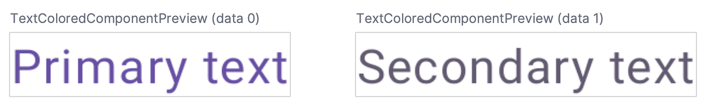
Resulting in the previews:

Previews for each data element, now with color!
Composables in Preview Parameters
As you can see in the data configuration above, I am passing in a Color object to my TextConfig objects, but what if instead we want to use a Material theme colorSchemevalue? Unfortunatly theme colorScheme values are composables, passing these into a PreviewParameterProvider results in an error:
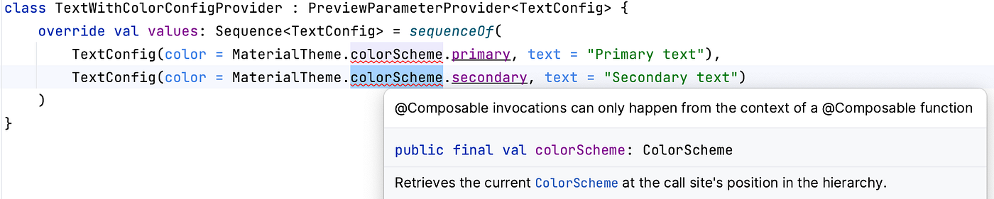
Attempting to access a colorScheme value in a PreviewParameterProvider
The initial way I found to get around this was to not use preview parameters at all and instead create the data within the preview composable itself.
| @Preview | |
| @Composable | |
| fun TextColoredComponentPreviewDataCreatedInside() { | |
| val previewData = sequenceOf( | |
| TextConfig(color = MaterialTheme.colorScheme.primary, text = "Primary text"), | |
| TextConfig(color = MaterialTheme.colorScheme.secondary, text = "Secondary text") | |
| ) | |
| MaterialTheme { | |
| Column(verticalArrangement = Arrangement.spacedBy(8.dp)) { | |
| previewData.forEach {data -> | |
| Text(data.text, color = data.color) | |
| } | |
| } | |
| } | |
| } |
This does work, but has the disadvantage of only creating one preview, requiring you to set up the component repeating within a column or similar and may give a false impression of how the components exist on their own.
 Two configurations within the one preview
Using a Kotlin Functional Interface
A Kotlin functional interface, or a Single Abstract Method (SAM) interface allows you to hide the fact an object contains composables from the PreviewParameterProvider.
To do this, create an interface that has a @Composable annotated function:
| fun interface TextData { | |
| @Composable | |
| fun value(): TextConfig | |
| } |
OUR VIDEO RECOMMENDATION


Jobs
Then create each configuration object using this interface, for better code readability we can use a lambda when creating the object:
| private val primary = TextData { | |
| TextConfig(color = MaterialTheme.colorScheme.primary, text = "Primary text") | |
| } | |
| private val secondary = TextData { | |
| TextConfig(color = MaterialTheme.colorScheme.secondary, text = "Secondary text") | |
| } |
These could also be created in a separate file or at the bottom of the file to ease readability
These can then be passed into the PreviewParameterProvider sequence
| class TextWithColorConfigProvider : PreviewParameterProvider<TextData> { | |
| override val values: Sequence<TextData> = sequenceOf( | |
| primary, secondary | |
| ) | |
| } |
And finally, used in the Preview by accessing the value() function
| @Preview | |
| @Composable | |
| fun TextColoredComponentPreview( | |
| @PreviewParameter(TextWithColorConfigProvider::class) data: TextData | |
| ) { | |
| MaterialTheme { | |
| Text(data.value().text, color = data.value().color) | |
| } | |
| } |
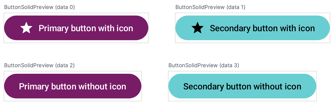
Giving a set of individual previews:
While this does involve adding a bit more boilerplate (since each config object must be created separately), it does have the following advantages:
- Configuration objects can be sensibly named for better code documentation
- Configuration objects and preview parameter lists can be set up and stored in a separate file, making your actual UI code cleaner and easier to understand
- Configuration objects can be recombined in other
PreviewParameterProvidersequences and could be used for many previews. For example, for one component you may only want a subset of previews generated.
Passing in a full Composable as configuration
Using the same technique above we can even pass in a composable to be used as part of the preview of a slot based composable layout. For example, if I want four configurations made up of two color variations and two different button contents:
| data class ButtonConfig( | |
| val buttonContent: @Composable RowScope.(Modifier) -> Unit, | |
| val background: Color, | |
| val contentColor: Color, | |
| ) | |
| fun interface ButtonData { | |
| @Composable | |
| fun value(): ButtonConfig | |
| } | |
| private val primaryWithIcon = ButtonData { | |
| ButtonConfig( | |
| buttonContent = { | |
| ButtonContentWithIcon(text = "Primary button with icon") | |
| }, | |
| background = MaterialTheme.colorScheme.primary, | |
| contentColor = MaterialTheme.colorScheme.onPrimary | |
| ) | |
| } | |
| private val secondaryWithIcon = ButtonData { | |
| ButtonConfig( | |
| buttonContent = { | |
| ButtonContentWithIcon(text = "Secondary button with icon") | |
| }, | |
| background = MaterialTheme.colorScheme.secondary, | |
| contentColor = MaterialTheme.colorScheme.onSecondary | |
| ) | |
| } | |
| private val primaryWithoutIcon = ButtonData { | |
| ButtonConfig( | |
| buttonContent = { | |
| ButtonContentWithoutIcon(text = "Primary button without icon") | |
| }, | |
| background = MaterialTheme.colorScheme.primary, | |
| contentColor = MaterialTheme.colorScheme.onPrimary | |
| ) | |
| } | |
| private val secondaryWithoutIcon = ButtonData { | |
| ButtonConfig( | |
| buttonContent = { | |
| ButtonContentWithoutIcon(text = "Secondary button without icon") | |
| }, | |
| background = MaterialTheme.colorScheme.secondary, | |
| contentColor = MaterialTheme.colorScheme.onSecondary | |
| ) | |
| } | |
| class ButtonConfigProvider : PreviewParameterProvider<ButtonData> { | |
| override val values: Sequence<ButtonData> = sequenceOf( | |
| primaryWithIcon, secondaryWithIcon, primaryWithoutIcon, secondaryWithoutIcon | |
| ) | |
| } | |
| @Composable | |
| fun RowScope.ButtonContentWithIcon(text: String) { | |
| Icon( | |
| imageVector = Icons.Outlined.Star, | |
| contentDescription = "", | |
| modifier = Modifier.padding(end = 8.dp) | |
| ) | |
| Text(text = text) | |
| } | |
| @Composable | |
| fun RowScope.ButtonContentWithoutIcon(text: String) { | |
| Text(text = text) | |
| } | |
| @Composable | |
| fun ButtonComponent( | |
| background: Color, | |
| contentColor: Color, | |
| onClick: () -> Unit, | |
| modifier: Modifier = Modifier, | |
| content: @Composable (RowScope, Modifier) -> Unit, | |
| ) { | |
| val buttonColors = ButtonDefaults.buttonColors( | |
| containerColor = background, | |
| contentColor = contentColor, | |
| ) | |
| Button(colors = buttonColors, onClick = onClick, modifier = modifier) { | |
| content(this, Modifier) | |
| } | |
| } |
We could then use the same PreviewParameterProvider for a different composable if desired.
So next time you need to make a whole lot of previews, even if using composable parameters, consider PreviewParameterProvider!
To check out the full code used here, see ComposablePreviewParameters.kt on Github:
Experiments/ComposablePreviewParameters.kt at main · KatieBarnett/Experiments
Thank-you to Francois Blavoet and Jamie Sanson for helping me find the final solution.
This article was previously published on proandroiddev.com


