

How to implement a navigation bar with smooth custom animations
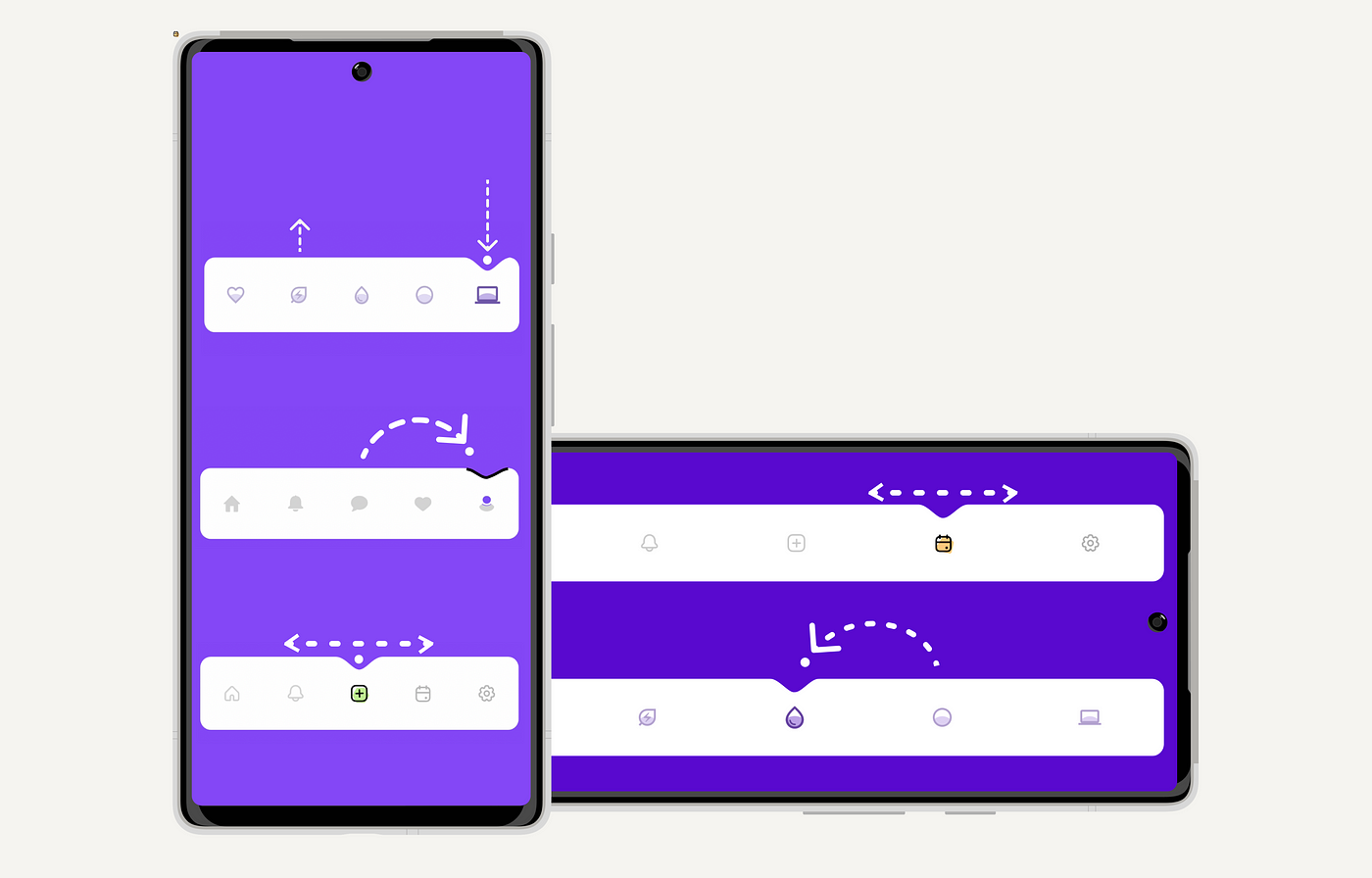
At Exyte we like to challenge ourselves and implement complex design animations when we come across something we really like. Sometimes it becomes an article in our replicating series, and sometimes it ends up as a library. This time we found a great design by Yeasin Arafat @dribbble, and decided to replicate it for both iOS and Android to compare the ease of implementation in SwiftUI and Jetpack Compose. As usual, here’s an accompanying article on how we did it, this one for Jetpack Compose.
The main idea is to create an animated size and position change of a ball and indent.
Bar
First, let’s look at the bar itself. In material3 design, we have such APIs as:
@Composable
fun NavigationBar(
    modifier: Modifier = Modifier,
    containerColor: Color = NavigationBarDefaults.containerColor,
    contentColor: Color = MaterialTheme.colorScheme.contentColorFor(containerColor),
    tonalElevation: Dp = NavigationBarDefaults.Elevation,
    windowInsets: WindowInsets = NavigationBarDefaults.windowInsets,
    content: @Composable RowScope.() -> Unit
): Unit
Example of using the API:
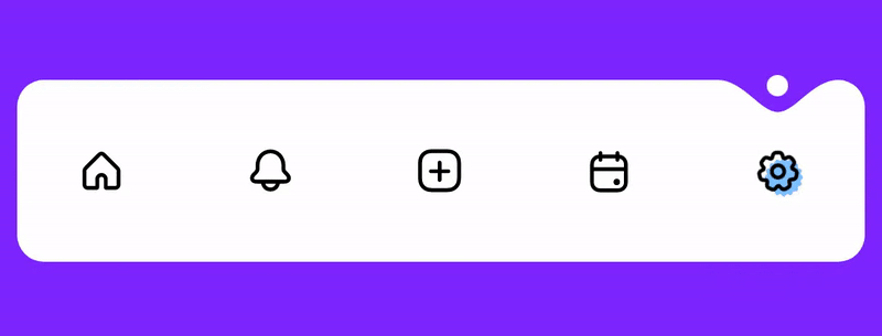
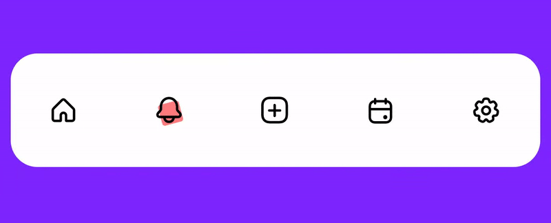
AnimatedNavigationBar(modifier = modifier) {
    dropletButtons.forEachIndexed { index, it ->
        DropletButton(
            modifier = Modifier.fillMaxSize(),
            isSelected = value == index
        )
    }
}
To animate the position change of the ball and the indent and place them to their correct locations, we need to know where the items (buttons) are located. The positioning information can be obtained from outside using onGloballyPositioned, but we don’t want to force the library user to write extra boilerplate code, so we arrange the elements ourselves and get their locations by using a custom layout. For each layout, you need a measure policy that defines how to place the elements. In this fun, we just make the policy remembered to avoid unnecessary calculations. The callback is needed to maintain the position of the elements when they are lined up.
@Composable
fun animatedNavBarMeasurePolicy(
    onBallPositionsCalculated: (ArrayList<Float>) -> Unit
) = remember {
    barMeasurePolicy(onBallPositionsCalculated = onBallPositionsCalculated)
}
In barMeasurePolicy we first measure the elements using max.Width, and then place them and fill the array with their horizontal coordinates.
MeasurePolicy { measurables, constraints ->
    val placeables = measurables.map { measurable ->
        measurable.measure(constraints.copy(maxWidth = itemWidth))
    }
    layout(constraints.maxWidth, height) {
        var xPosition = gap
        val positions = arrayListOf<Float>()
        placeables.forEachIndexed { index, _ ->
            placeables[index].placeRelative(xPosition, 0)
            positions.add(calculatePointPosition(xPosition, placeables[index].width))
            xPosition += placeables[index].width + gap
        }
        onBallPositionsCalculated(positions)
    }
}
We store items’ data in itemPositions :
var itemPositions by remember { mutableStateOf(listOf<Offset>()) }
val measurePolicy = animatedNavBarMeasurePolicy {
    itemPositions = it.map { xCord ->
        Offset(xCord, 0f)
    }
}
Afterwards, we calculate the offset of the selected item:
val selectedItemOffset by remember(selectedIndex, itemPositions) {
    derivedStateOf {
        if (itemPositions.isNotEmpty()) itemPositions[selectedIndex] else Offset.Unspecified
    }
}
Now we identify the animation points for the ball and the indent, for this we have to consider is the shape of the bar. In the layout of NavBar we use the measurePolicy which was created above. animateIndentShapeAsState creates a shape and animates its changes, and we use graphicsLayer to apply the shape.
val indentShape = indentAnimation.animateIndentShapeAsState(
    cornerRadius = cornerRadius.toPxf(density),
    targetOffset = selectedItemOffset
)

Layout(
    modifier = Modifier
        .graphicsLayer {
            clip = true
            shape = indentShape.value
        }
        .background(Color.Transparent),
    content = content,
    measurePolicy = measurePolicy
)
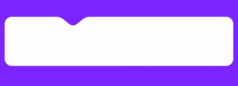
Shape
Let’s talk about the construction of the shape itself. First, we create a shape by implementing the Shape interface:
class IndentRectShape(
    private val indentShapeData: IndentShapeData,
) : Shape {
    override fun createOutline(
        size: Size,
        layoutDirection: LayoutDirection,
        density: Density
    ): Outline =
        Outline.Generic(
            Path().addRoundRectWithIndent(size, indentShapeData, layoutDirection)
        )
}
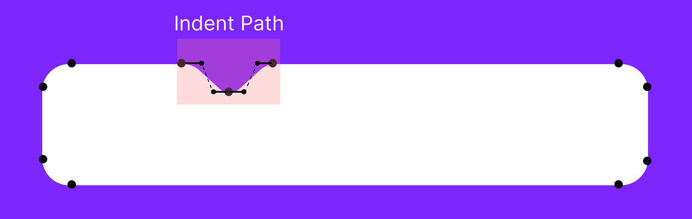
Let’s take a look at the addRoundRectWithIndent function – it creates a path. First, we add IndentPath, and then we add other lines and arcs to build a rounded rectangular shape within the indent. xOffset tells us the coordinates where the indent should be located. The whole addRoundRectWithIndent function code is available here.
fun Path.addRoundRectWithIndent(
    size: Size,
    indentShapeData: IndentShapeData,
): Path {

    return apply {

        addPath(
            IndentPath(
                Rect(
                    Offset(
                        x = xOffset,
                        y = 0f
                    ),
                    Size(indentShapeData.width, indentShapeData.height)
                )
            ).createPath()
        )
        lineTo(width - cornerRadius, 0f)
        arcTo(
            rect = Rect(offset = Offset(width - cornerRadius, 0f), size = arcRectSize),
            startAngleDegrees = 270f,
            sweepAngleDegrees = sweepAngleDegrees,
            forceMoveTo = false
        )
//other arcs and lines
    }
}
Let’s examine the indent. The bezier curve points were provided by our designer, but they were only available for a specific size of the design. So, we develop a class that adjusts dimensions based on a given area — in other words, it scales the indent to the desired size of a given rectangle.
class IndentPath(
    private val rect: Rect,
) {
    private val maxX = 110f
    private val maxY = 34f

    private fun translate(x: Float, y: Float): PointF {
        return PointF(
            ((x / maxX) * rect.width) + rect.left,
            ((y / maxY) * rect.height) + rect.top
        )
    }

    fun createPath(): Path {
        val start = translate(x = 0f, y = 0f)
        val middle = translate(x = 55f, y = 34f)
        val end = translate(x = 110f, y = 0f)

        val control1 = translate(x = 23f, y = 0f)
        val control2 = translate(x = 39f, y = 34f)
        val control3 = translate(x = 71f, y = 34f)
        val control4 = translate(x = 87f, y = 0f)

        val path = Path()
        path.moveTo(start.x, start.y)
        path.cubicTo(control1.x, control1.y, control2.x, control2.y, middle.x, middle.y)
        path.cubicTo(control3.x, control3.y, control4.x, control4.y, end.x, end.y)

        return path
    }
}
Animations
We have created interfaces that help to add different kinds of animations. For indent position animations we created the IndentAnimation interface:
interface IndentAnimation {

    /**
     *@param [targetOffset] target offset
     *@param [shapeCornerRadius] corner radius of the navBar layout
     */
    @Composable
    fun animateIndentShapeAsState(
        targetOffset: Offset,
        shapeCornerRadius: ShapeCornerRadius
    ): State<Shape>
}
Let’s go over the animations based on this interface:
Straight Indent Animation
In the code below we do the following:
- Set the vertical offset, the ball is placed slightly above the nav bar layout as per design.
2. Animate the offset.
3.Return produceState when the offset changes.
4. Implement a helper function that assists in calculating the ball’s offset.
@Stable
class Straight(
    private val animationSpec: AnimationSpec<Offset>
) : BallAnimation {
    @Composable
    override fun animateAsState(targetOffset: Offset): State<BallAnimInfo> {
        if (targetOffset.isUnspecified) {
            return remember { mutableStateOf(BallAnimInfo()) }
        }

        val density = LocalDensity.current
        //1 vertical offset, the ball placed slightly above the nav bar layout as intended by the designer
        val verticalOffset = remember { 2.dp.toPxf(density) }
        val ballSizePx = remember { ballSize.toPxf(density) }
        //2 animate offset
        val offset = animateOffsetAsState(
            targetValue = calculateOffset(targetOffset, ballSizePx, verticalOffset),
            animationSpec = animationSpec
        )
        //3 produce state, when the offset changes
        return produceState(
            initialValue = BallAnimInfo(),
            key1 = offset.value
        ) {
            this.value = this.value.copy(offset = offset.value)
        }
    }

    //4 helper function that assists in calculating the ball's offset.
    private fun calculateOffset(
        offset: Offset, ballSizePx: Float, verticalOffset: Float
    ) = Offset(
        x = offset.x - ballSizePx / 2f, y = offset.y - verticalOffset
    )
}
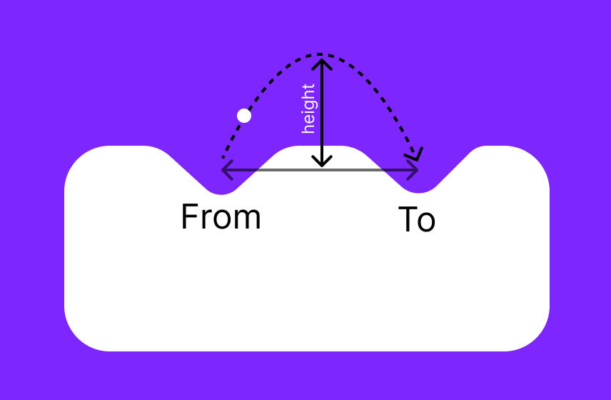
Depth Change Animation
We have also included an animation of the indent depth. It’s a little more complicated because we have two animation steps.
- The indent depth decreases when the user leaves the current state of the navbar by pressing another button.
- The indent depth then increases when the user presses another button and creates a new state of the navbar. First, we declare the fraction which will be animated, and we specify the start and end points of the animation.
val fraction = remember { Animatable(0f) }
var to by remember { mutableStateOf(Offset.Zero) }
var from by remember { mutableStateOf(Offset.Zero) }
After this, the logic of the animation begins. In this case, when a new destination point (targetOffset) appears, we need to start a new animation or change the points. We animate up to 2f because each of the animations will take 1 float value (from 0-1 to exit and 1-2 to enter). Let’s explore this a little further:
LaunchedEffect(targetOffset) {
    when {
        isNotRunning(fraction.value) -> {
            setNewAnimationPoints()
        }
        isExitIndentAnimating(fraction.value) -> {
            changeToAnimationPointWhileAnimating()
        }
        isEnterIndentAnimating(fraction.value) -> {
            changeToAndFromPointsWhileAnimating()
        }
    }
    fraction.animateTo(2f, animationSpec)
}
Let’s look at the three different cases we’ve used above. The first is isExitIndentAnimating. It runs when the user has changed the destination point and the exit (“from”) point has not yet finished its animation.
private fun isExitIndentAnimating(fraction: Float) = (fraction <= 1f)
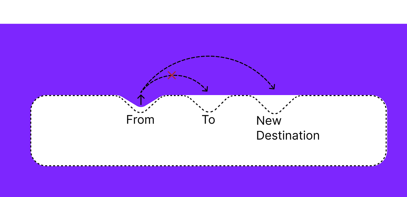
In this case, we simply change the destination point. And the animation ends at the new point with no problem.
fun changeToAnimationPointWhileAnimating() {
    to = targetOffset
}
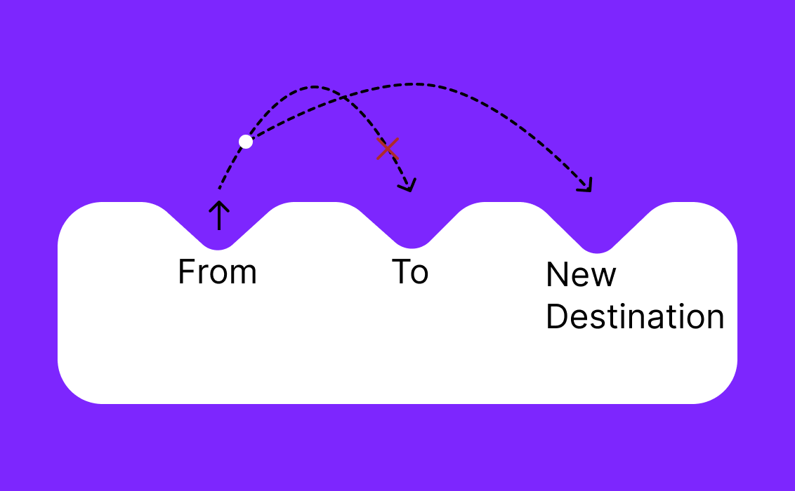
Now consider a more complex case: isEnterIndentAnimating. When the animation is already happening at the to point and at that moment a new targetOffset value arrives (the user chooses a new item of the navbar). In this case, it is necessary to start reducing the depth of the to point and then start the animation at the new destination point.
private fun isEnterIndentAnimating(fraction: Float) = (fraction > 1f)
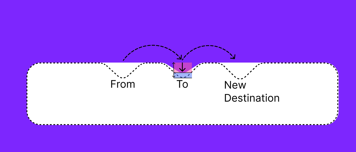
We need to start a reverse height reduction animation in the “to” point. So, from the full fraction of this animation, we subtract the red fraction shown on the picture above and start a new animation from this point.
The last case, isNotRunning, is when there are no animations currently available and we just need to start a new one.
private fun isNotRunning(fraction: Float) = fraction == 0f || fraction == 2f

suspend fun setNewAnimationPoints() {
   from = to
   to = targetOffset
   fraction.snapTo(0f)
}
OUR VIDEO RECOMMENDATION


Jobs
Eventually we produce IndentRectShape state. produceState is called every time the fraction and shapeCornerRadius change.
return produceState(
    initialValue = IndentRectShape(
        indentShapeData = IndentShapeData(
            ballOffset = ballSize.toPxf(density) / 2f,
            width = indentWidth.toPxf(density),
        )
    ),
    key1 = fraction.value,
    key2 = shapeCornerRadius
) {
    this.value = this.value.copy(
        yIndent = calculateYIndent(fraction.value,density),
        xIndent = if (fraction.value <= 1f) from.x else to.x,
        cornerRadius = shapeCornerRadius
    )
}

private fun calculateYIndent(fraction: Float, density: Density): Float {
    return if (fraction <= 1f) {
        lerp(indentHeight.toPxf(density), 0f, fraction)
    } else {
        lerp(0f, indentHeight.toPxf(density), fraction - 1f)
    }
}
Ball and Its Animation
Now let’s talk about the ball and its animation. For this, we use ballAnimInfoState, which will be described later. Let’s see how we make the ball and use it in a composable fun:
ColorBall(
    ballAnimInfo = ballAnimInfoState.value,
    ballColor = ballColor,
    sizeDp = ballSize
)

@Composable
private fun ColorBall(
    modifier: Modifier = Modifier,
    ballColor: Color,
    ballAnimInfo: BallAnimInfo,
    sizeDp: Dp,
) {
    Box(
        modifier = modifier
            .ballTransform(ballAnimInfo)
            .size(sizeDp)
            .clip(shape = CircleShape)
            .background(ballColor)
    )
}
With ballTransform modifier we change its position and scale:
fun Modifier.ballTransform(ballAnimInfo: BallAnimInfo) = this
    .offset {
        IntOffset(
            x = ballAnimInfo.offset.x.toInt(),
            y = ballAnimInfo.offset.y.toInt()
        )
    }
    .graphicsLayer {
        scaleY = ballAnimInfo.scale
        scaleX = ballAnimInfo.scale
        transformOrigin = TransformOrigin(pivotFractionX = 0.5f, pivotFractionY = 0f)
    }
Now let’s talk about the animation. As with the indent, we have several predefined animation options and a basic BallAnimation interface.
interface BallAnimation {

    /**
     *@param [targetOffset] target offset
     */
    @Composable
    fun animateAsState(targetOffset: Offset): State<BallAnimInfo>
}
BallAnimInfo contains offset and scale information.
data class BallAnimInfo(
    val scale: Float = 1f,
    val offset: Offset = Offset.Unspecified
)
Straight ball animation
Now let’s look at how straight animation works. We simply animate the offset and pass the BallAnimInfo parameter, and that’s all there is to it.
val offset = animateOffsetAsState(
    targetValue = calculateOffset(targetOffset, ballSizePx, verticalOffset),
    animationSpec = animationSpec
)
//produce state, when the offset changes
return produceState(
    initialValue = BallAnimInfo(),
    key1 = offset.value
) {
    this.value = this.value.copy(offset = offset.value)
}
Teleporting Ball Animation
The principle of the ‘teleport’ animation is no different from the indent height animation, we again place the “from” and “to” points in the same way, only the animation is different — in this case, we change the scale.
return produceState(
    initialValue = BallAnimInfo(),
    key1 = fraction.value
) {
    this.value = this.value.copy(
        scale = if (fraction.value < 1f) 1f - fraction.value else fraction.value - 1f,
        offset = if (fraction.value < 1f) from else to
    )
}
Parabola Ball Animation
The most interesting case is the parabola animation. For a more flexible and smoother arc trajectory, we use bezier curves.
Let’s specify the starting and ending points:
var from by remember { mutableStateOf(targetOffset) }
var to by remember { mutableStateOf(targetOffset) }
val fraction = remember { Animatable(0f) }
Establish the path and the necessary variables to measure them
val path = remember { Path() }
val pathMeasurer = remember { PathMeasure() }
val pathLength = remember { mutableStateOf(0f) }
val pos = remember { floatArrayOf(Float.MAX_VALUE, Float.MAX_VALUE) }
val tan = remember { floatArrayOf(0f, 0f) }
As we discussed earlier, it is necessary to consider cases when the user selects a new item during ongoing animation. This piece of code takes place inside the LaunchedEffectfunction, presented a bit later on. Here we measure where the ball is at the present moment and set those coordinates for the starting point (from). For the “to”, we set the coordinates of the new destination.
measurePosition()
from = Offset(x = pos[0], y = pos[1])
to = targetOffset
height = maxHeightPx + pos[1]
When the offset is changed, LaunchedEffect is started and does the following:
- Calculates the new height for the trajectory.
2. Sets the starting points — either if the animation is over, or if it’s currently running.
3. Creates the path with the trajectory.
4. Starts the animation.
LaunchedEffect(targetOffset) {
    //calculate the new height
    var height = if (to != targetOffset) {
        maxHeightPx
    } else {
        startMinHeight
    }
    //set points
    if (isNotRunning(fraction.value)) {
        from = to
        to = targetOffset
    } else {
        //if animation is in progress
        measurePosition()
        from = Offset(x = pos[0], y = pos[1])
        to = targetOffset
        height = maxHeightPx + pos[1]
    }
    //create path
    path.createParabolaTrajectory(from = from, to = to, height = height)
    pathMeasurer.setPath(path, false)
    pathLength.value = pathMeasurer.length
    //start animation
    fraction.snapTo(0f)
    fraction.animateTo(1f, animationSpec)
}
Creating a correct offset when changing position, ballSize, fraction.value:
return produceState(
    initialValue = BallAnimInfo(),
    key1 = pos,
    key2 = ballSizePx,
    key3 = fraction.value,
) {
    measurePosition()
    if (pos[0] == Float.MAX_VALUE) {
        BallAnimInfo()
    } else {
        this.value = this.value.copy(
            offset = calculateNewOffset(
                pos,
                ballSizePx,
                verticalOffset
            )
        )
    }
}
Let’s look at the trajectory. We use quadratic Bezier curves to create it:
private fun Path.createParabolaTrajectory(from: Offset, to: Offset, height: Float) {
    reset()
    moveTo(from.x, from.y)
    quadTo(
        (from.x + to.x) / 2f,
        from.y - height,
        to.x,
        to.y
    )
}
А coordinate measurement function that sends the necessary information to the position array:
fun measurePosition() {
    pathMeasurer.getPosTan(pathLength.value * fraction.value, pos, tan)
}
Icons
We have pre-made animation effects for the icons, and will explore them here. Two of them are included in the library and the third one is added as an example so that you too can create your own animated icons.
Wiggle Icons

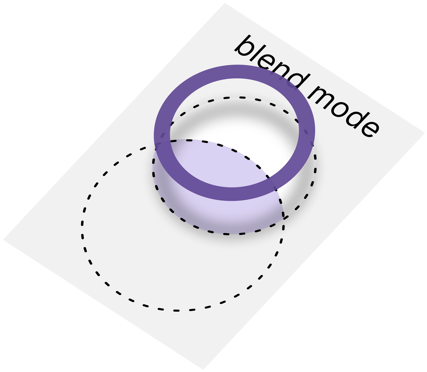
To implement the desired animation the button needs to grow a bit, while its insides wiggle around. The icon is drawn on the canvas, resized and has alpha applied as needed for the animation. We also use graphicsLayer, because only when a new layer is created will the color blending mode be applied. On the canvas, we first draw a background icon, then draw a “wiggle” circle, and apply a SrcIn blend mode. After that, we draw the outline icon. To make it easier to understand, here is a schematic illustration.
Canvas(
    modifier = modifier
        .graphicsLayer(
            alpha = wiggleButtonParams.value.alpha,
            scaleX = wiggleButtonParams.value.scale,
            scaleY = wiggleButtonParams.value.scale
        )
        .fillMaxSize()
        .onGloballyPositioned { canvasSize = it.size.toSize() },
    contentDescription = contentDescription ?: ""
) {
    // "wiggle" circle
    with(backgroundPainter) {
        draw(
            size = Size(sizePx, sizePx),
            colorFilter = ColorFilter.tint(color = backgroundIconColor)
        )
    }
    // background icon
    drawCircle(
        color = wiggleColor,
        center = offset.value,
        radius = wiggleButtonParams.value.radius,
        blendMode = BlendMode.SrcIn
    )
    // outline icon
    with(painter) {
        draw(
            size = Size(sizePx, sizePx),
            colorFilter = ColorFilter.tint(color = outlineColor)
        )
    }
}
We have two different animations — one for wiggle and the other for entering/exiting (alpha and scale).
First, enter and exit animation:
val enterExitFraction = animateFloatAsState(
    targetValue = if (isSelected) 1f else 0f,
    animationSpec = enterExitAnimationSpec
)
Secondly, the wiggle animation:
val wiggleFraction = animateFloatAsState(
    targetValue = if (isSelected) 1f else 0f,
    animationSpec = wiggleAnimationSpec
)
Parameters for animation are
var wiggleButtonParams by remember { mutableStateOf(WiggleButtonParams()) }
val isAnimationRequired by rememberUpdatedState(newValue = isSelected)
We change the parameters depending on the animations:
return produceState(
    initialValue = WiggleButtonParams(),
    key1 = enterExitFraction.value,
    key2 = wiggleFraction.value
) {
    this.value = this.value.copy(
        scale = scaleInterpolator(enterExitFraction.value),
        alpha = alphaInterpolator(enterExitFraction.value),
        radius = if (isAnimationRequired) calculateRadius(
            maxRadius = maxRadius * 0.8f,
            fraction = radiusInterpolator(wiggleFraction.value),
            minRadius = mildRadius * maxRadius
        ) else mildRadius * maxRadius
    )
}
There are interpolators in the code, but there is nothing noteworthy about them, as we simply apply exactly the interpolations that help achieve the desired animation curve. For example, scale and radius animation:
fun scaleInterpolator(fraction: Float): Float = 1 + fraction * 0.2f

fun radiusInterpolator(
    fraction: Float
): Float = if (fraction < 0.5f) {
    fraction * 2
} else {
    (1 - fraction) * 2
}
The droplet button uses the same idea as before, except it’s even simpler this time. You can see the droplet button code here: DropletButton.kt. Let’s consider ColorButtons, which are a bit more complicated.
ColorButtons
Let’s take a closer look at the animation: in each icon we have a background (colored figures), which is scaled and translated to the desired point from the direction the ball came from. Moreover, each icon has its own kind of animation.
To calculate where the background needs to go, we need to understand the direction where the ball comes from and where it goes.
val isFromLeft = remember(prevSelectedIndex, index, selectedIndex) {
    (prevSelectedIndex < index) || (selectedIndex > index)
}
The first case is for the situation when the ball comes to the point, and the second is when it leaves it. We should animate two backgrounds: the leaving and the arriving one.
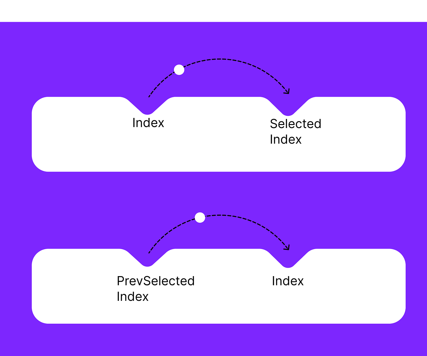
Since both backgrounds need to be animated together, there are also two conditions: one for the outgoing background (bottom part of the picture) and one for the incoming background (top part of the picture)
Animating fraction:
val fraction = animateFloatAsState(
    targetValue = if (isSelected) 1f else 0f,
    animationSpec = backgroundAnimationSpec,
    label = "fractionAnimation",
)
Let’s calculate the required offset:
val offset by remember(isSelected, isFromLeft) {
    derivedStateOf {
        calculateBackgroundOffset(
            isSelected = isSelected,
            isFromLeft = isFromLeft,
            maxOffset = maxOffset,
            fraction = fraction.value
        )
    }
}
The offset sign depends on the direction, and the value depends on the fraction.
private fun calculateBackgroundOffset(
    isSelected: Boolean,
    isFromLeft: Boolean,
    fraction: Float,
    maxOffset: Float
): Float {
    val offset = if (isFromLeft) -maxOffset else maxOffset
    return if (isSelected) {
        lerp(offset, 0f, fraction)
    } else {
        lerp(-offset, 0f, fraction)
    }
}
Here we are drawing the background with the required scale and offset.
Image(
    modifier = Modifier
        .offset(x = background.offset.x + offset.toDp(), y = background.offset.y)
        .scale(fraction.value)
        .align(Alignment.Center),
    painter = painterResource(id = background.icon),
    contentDescription = contentDescription
)
Let’s look at the bell animation icon. We have our fraction to animate rotation.
val fraction = animateFloatAsState(
    targetValue = if (isSelected) 1f else 0f,
    animationSpec = backgroundAnimationSpec,
    label = "fractionAnimation",
)
Drawing the icon:
Icon(
    modifier = modifier
        .rotationWithTopCenterAnchor(
            if (isSelected) degreesRotationInterpolation(
                maxDegrees,
                rotationFraction.value
            ) else 0f
        ),
    painter = painterResource(id = icon),
    contentDescription = null,
    tint = color.value
)
To make it look like a pendulum is spinning we use degreesRotationInterpolation:
private fun degreesRotationInterpolation(maxDegrees: Float, fraction: Float) =
    sin(fraction * 2 * PI).toFloat() * maxDegrees
To rotate in the required anchor (from the top in the middle) we made an extension modifier:
fun Modifier.rotationWithTopCenterAnchor(degrees: Float) = this
    .graphicsLayer(
        transformOrigin = TransformOrigin(
            pivotFractionX = 0.5f,
            pivotFractionY = 0.1f,
        ),
        rotationZ = degrees
    )
Conclusion
Custom navigation bar animations in Android Jetpack Compose are a great way to enhance the user experience of your app. By introducing your own animations, you can create a unique look and feel that reflects your brand or app theme. You can customise the timing, duration and type of animations to achieve the desired effect. With the knowledge gained from this article, you can create custom animations for the navigation bar in your Android apps, or already use the ready-made library we’ve created.
Of course, the main complexity of this implementation lies in math and not in Kotlin code. But hopefully it shows how easy implementing complex animation can be in Jetpack Compose, and you can reuse these approaches for your custom UI. As always, the final solution is available as a library, and we hope to see you again soon for more libraries and tutorials!
This article was previously published on proandroiddev.com


