

In this article, you’ll learn how to create accessible mobile apps for Android OS. It’s quite important nowadays. There are more and more users for who accessibility matters. Additionally, more and more laws require app owners to support accessibility.
First, let’s explain what mobile app accessibility means.
What is accessibility in mobile apps?
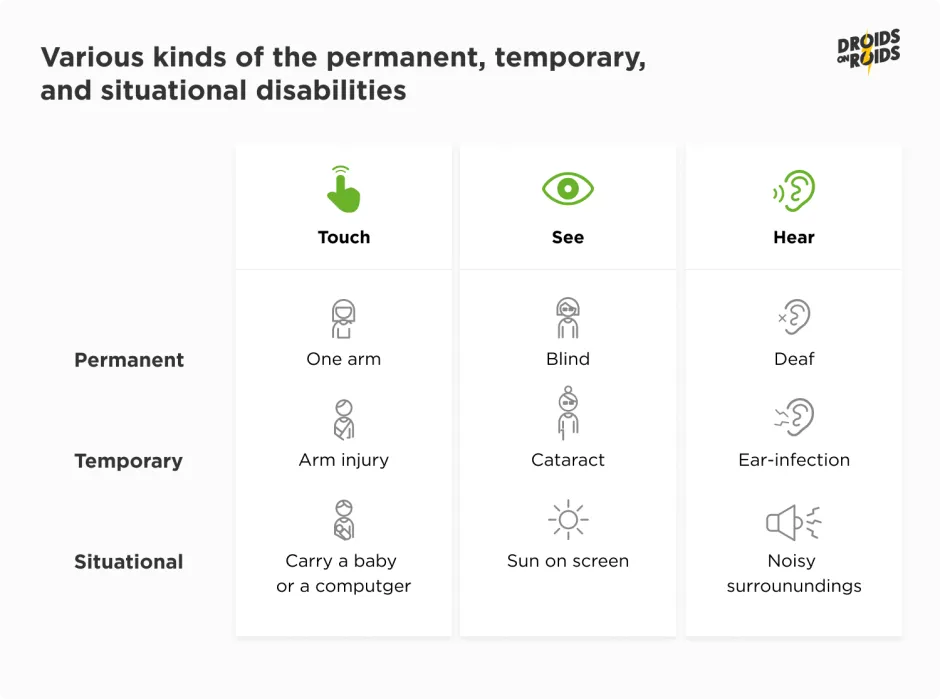
Accessibility means making apps usable for as many people as possible.
It’s not only about disabilities.
Providing accessibility means also caring for users who use mobile devices with small screens or slow internet.
Think of accessibility as treating everyone fairly. Giving them the same chances, no matter their abilities.
We shouldn’t exclude someone from entering a building because they use a wheelchair. So, we also shouldn’t exclude someone from an app because of low or no vision.
Modern buildings should have elevators or ramps. Modern apps should support screen readers and scalable texts.
Mobile app accessibility — why does it matter?
According to the WHO’s fact sheet, more than 1.3 billion people experience some kind of disability. That’s one in six of us, or 16% of the global population. Quite huge numbers and market share!
Yet only a small amount of apps are accessible when I’m writing this article. There aren’t even any known statistics for mobile apps.
However, according to various studies:
- only ~ 3% of websites were accessible in 2022[1]
- and 91.8% of websites failed to meet WCAG standards!
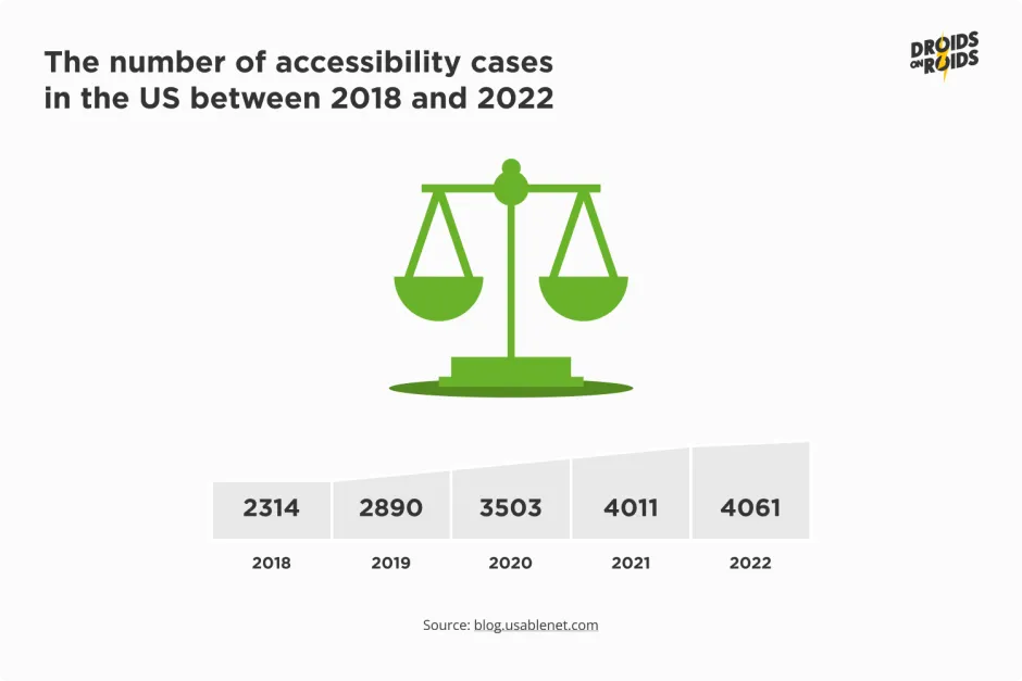
Insufficient accessibility means not only less users but also potential lawsuits.
In 2022 alone, there were over 4,000 cases (in the accessibility field) in the US, and this number is growing.
But there are many more places in the world apart from the USA! Accessibility laws exist also in Canada, European Union, UK, Australia, India, and other countries.
Lawsuits are often very costly.
For example, one lawsuit regarding accessibility award $240,000.00 to blind students against a community college.
Key legal acts enforcing accessibility in mobile apps
Here are some examples of legal acts that require ensuring accessibility in mobile applications:
Let’s summarize this part.
Let’s put it straight: if your app isn’t accessible, you’re not just missing out on reaching a wider audience but also risk legal and financial repercussions as the app owner.
Neglecting accessibility can also tarnish the app owner’s brand image, sending a message that you don’t value all users equally. By prioritizing accessibility, you’re opening your digital door wider, inviting everyone in, and showing that you truly care about each user’s experience.
How can you provide accessibility in your mobile app in under twenty steps?
In the next chapters and parts, you’ll learn how to provide accessibility in your apps in a step by step approach. Everything will be broken down into particular aspects.
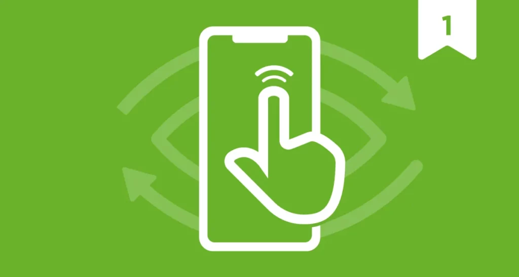
Minimal touch / Pointer target — ensuring smooth and intuitive interactions
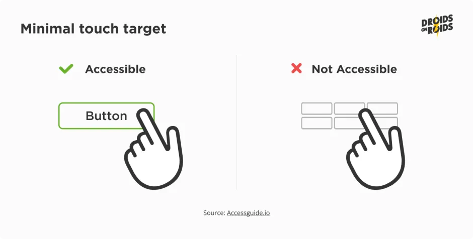
All the buttons and other tappable (clickable) elements shouldn’t be too small.
Remember that some people may be unable to touch a small element. There may be many reasons: motor impairments, low vision, or thick fingers.
The smallest area should be at least48 dp by 48 dp on Android andNote that both dimensions have to be at least 48 dp or 44 pt. Not just one! 44 pt by 44 pt on iOS.
It’ll give a physical size of about 9 mm or 0.35 in. square.
That area is:
- a touch target in the case of touchscreens,
- or a pointer target on non-touch ones.
For example, 45 dp by 100 dp is too low. Despite that, the area is larger than 48 dp by 48 dp. That rule is equivalent of the WCAG 2.5.5 — Target Size.
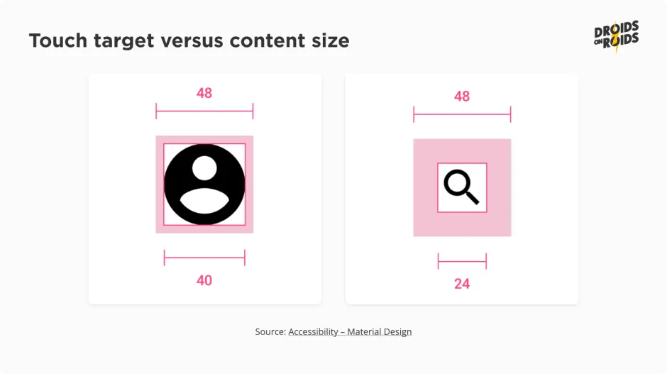
The touch or pointer target is not always the same area as the visible button. Usually, some part of the empty space around it is also clickable. For example, in the picture below, all the touch targets are 48×48 dp, despite the fact that the images inside them are smaller.
It’s crucial to make the touch targets big enough for effortless tapping, ensuring a delightful user experience.
But wait, there’s more!
How can you ensure the minimal touch target in Jetpack Compose?
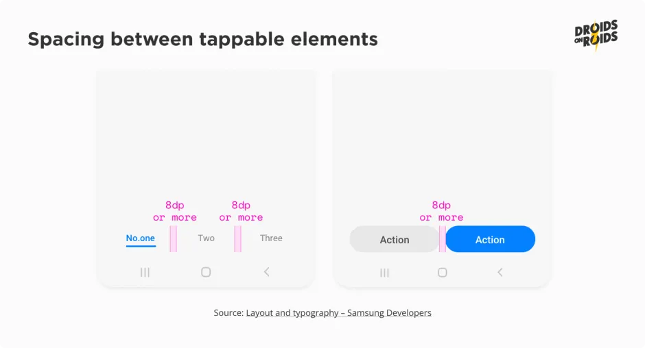
We must add some spacing between those touch areas, preventing missed taps. Remember, this is not for the nimble-fingered folks but also for those with limited mobility who deserve a frustration-free interaction.
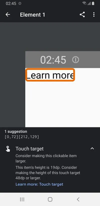
It’s very easy to detect touch areas that are too small automatically. You can launch the Accessibility Scanner app and take a snapshot. Detected touch targets of insufficient size will look like this:
Well, the easiest way is to use standard composables, not custom ones. Composables like Button, CheckBox, or RadioButton take care of their size for you, and they won’t be too small.
In some cases, if you explicitly lower the area, for example, by setting: contentPadding = PaddingValues(0.dp), you may end up with too small a touch target. It’ll happen if the content is not large enough.
The clickable() modifier attempts to expand such composables. It will succeed only if there is enough space in the parent composable in all the needed directions. Consider the following sample:
Column(
    modifier = Modifier.fillMaxSize(),
) {
    Text(
        modifier = Modifier.clickable { },
        text = "Learn more",
    )
}
The touch area will expand to the bottom because there is a free space there. But, there is no space at the top to resize the touch area proportionally. So you will achieve an effect like this:
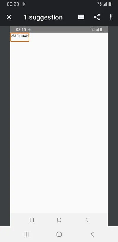
But, if you have code like this:
Column(
    modifier = Modifier.fillMaxSize(),
) {
    Spacer(modifier = Modifier.height(16.dp))
    Text(
        modifier = Modifier.clickable { },
        text = "Learn more",
    )
}
There is a space at the top, so the extended touch area can use it. The compose standard library provides a modifier ensuring the smallest accessible touch area. You may use a minimumInteractiveComponentSize() for that.
No matter what the configuration of the composable in its parent is, a composable will extend. It’ll add the necessary space (padding), separately in both dimensions, to reach the 48 dp.
The content will be in the center. There is a way to achieve more fine-grained control (e.g. more space on the top). You may use the padding() modifier or contentPadding parameter.
In the case of toggleable elements with labels, the entire area should be clickable. Take a look at this checkbox:
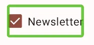
It is important not only for touch targets.
If a label is a separate element, screen readers for blind people will announce it as “ Unlabeled checkbox, double tap to toggle”. It’s not so meaningful. You’ll learn more about the labels in one of the next articles in this series.
Unlocking the power of color — accessibility considerations for color blind users
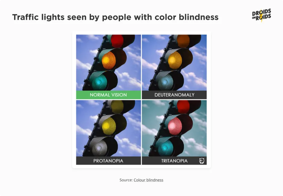
Color blindness or Color Vision Deficiency means decreased ability to perceive certain colors. It stems from the impaired functioning of cells in the eyes that detect specific colors.
This condition can lead to challenges in distinguishing and differentiating between various hues. It often requires adopting alternative strategies to navigate the visual world.
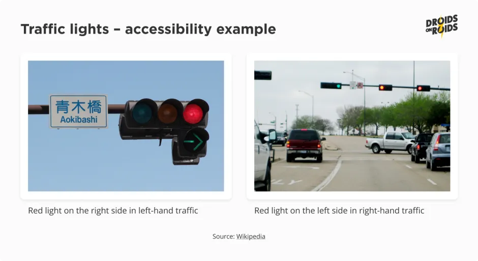
There are various kinds and intensities of color blindness. See how affected people may see traffic lights:
You can simulate the color vision deficiencies on Android devices. Go to Settings ▸ Developer options ▸ Simulate color space and choose one of the options:
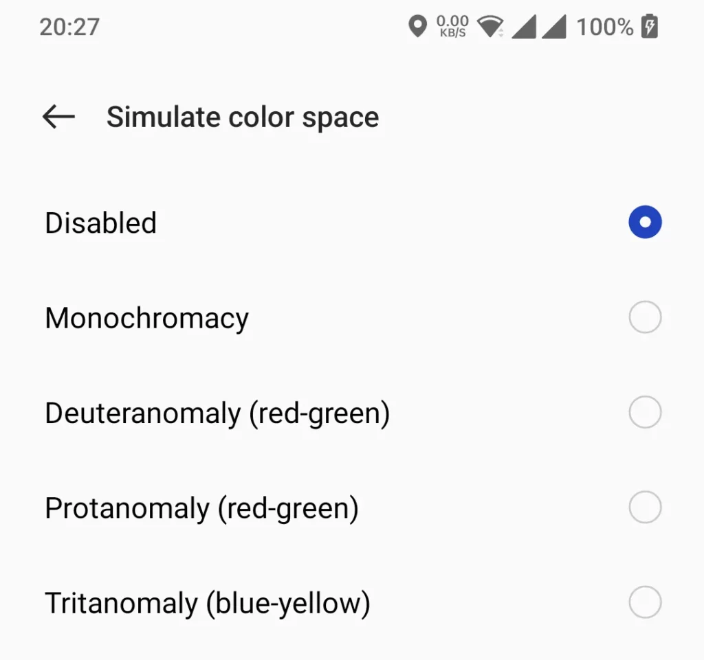
The exact location and name of that option may vary depending on the device manufacturer. Note: the altered colors will be visible only on the physical screens of physical devices! It has no effect on emulators. Screenshots and screen sharing tools like scrcpy or Vysor also won’t show it.
So how can color blindness impact mobile apps? Look at the following example:
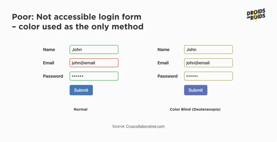
All the input fields may look the same despite the fact that some of them have errors. How can we fix that? The answer is in… traffic lights.
Do you recall that the red light is almost always on top and the green one is at the bottom? In the case of horizontal lights, red is usually on the left side if there is right-hand traffic, like in the USA.
Analogously, it’s on the right side in case of left-hand traffic, such as in Japan, for example.
In the case of traffic lights, color is not the only differentiator. There is also an arrangement. Even if someone is color blind and doesn’t distinguish between red and green, they know where each light is. So, to fix the issue, you have to mark the error with something more than only color. For example, you may show the icons like on the screenshot below:
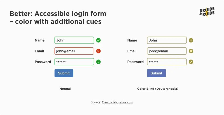
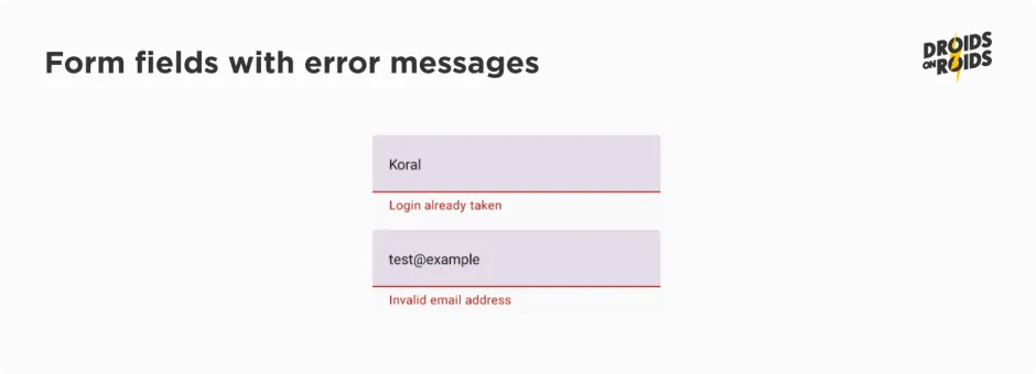
If you have information on what is incorrect, you should display that information. It is better to distinguish an invalid email from cases where the email is already taken. See the following example:
Bridging the gap — unveiling the impact of minimum contrast
There are minimal contrast ratios recommended byWCAG: What is a large text? It’s at least 18 sp or 14 sp in case of bold styles.
The contrast is a difference between the lightness of two colors. We measure it using ratio. In design, we use a ratio based on the number 21. The highest possible contrast between a solid black and white, is 21:1. Similarly, the lowest one is 1:1, between two identical colors.
The higher the contrast, the better the readability. Larger font sizes also require a lower minimum contrast for the same readability. Large text can have a lower contrast ratio.
Keep in mind that people with vision impairments may see worse than you.
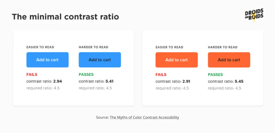
There are minimal contrast ratios recommended by WCAG:
- 3:1 — for large texts,
- 4.5:1 — for small texts and images.
Look at the sample:
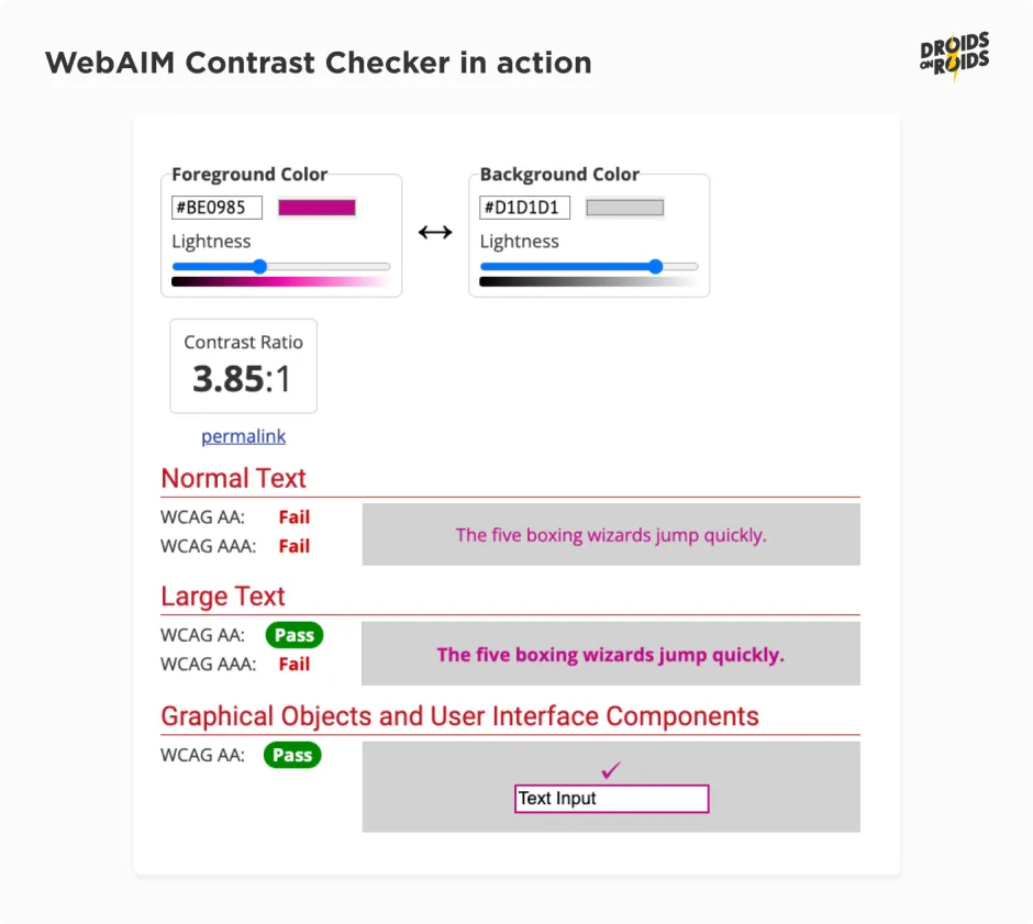
While designing or developing your app, you can use tools like WebAIM Contrast Checker to choose the right colors:
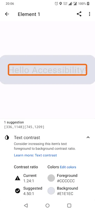
If you already have an app and want to test whether it has contrast issues, you can use the Accessibility Scanner app:
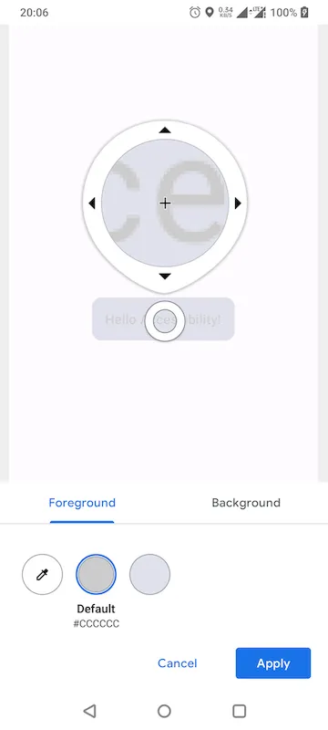
You can even change the colors live and check how the app looks after that:
You’ll learn more about accessibility testing in one of the next parts of this series about mobile app accessibility.
The minimum contrast ratio doesn’t apply to logotypes. Decorative elements, like random letters in the background, are also out of scope.
Shedding light on dark mode — enhancing accessibility and easing eye fatigue
Dark mode is a display setting where the background is dark, often black or dark gray, instead of the traditional light color scheme. Although one may think that dark mode is a matter of style or UX, it can also improve accessibility.
Imagine having floaters in your vision. These small particles float around, blocking your sight wherever they wander. It can be frustrating to experience such visual disruptions. Floaters tend to be more noticeable on a bright background.
Thus, opting for a dark background can enhance the affected users’ experience.

Dark mode reduces the exposure to blue light. It can assist in alleviating digital eye strain, also known as computer vision syndrome. It may occur due to extended periods of screen usage.
Instructions on implementing a dark theme are subject to another complete article. In a nutshell, you need a second color palette. In Jetpack Compose, you can use the isSystemInDarkTheme() function. It returns true if a dark mode is currently on.
Mobile apps accessibility — wrap-up
In conclusion, as mobile app developers, we have an essential role to play in ensuring digital accessibility. In a world where mobile phones are an integral part of our lives, our mobile apps must be designed and tested to be as inclusive as possible.
In the next part on accessible mobile apps, you’ll read about font scaling, focus order, and content labeling.
Read also:
- How Much Does it Cost to Develop an App in 2023? New Cost Breakdown
- Flutter App Development — Pros and Cons
By prioritizing accessibility testing on mobile devices, we can address and resolve accessibility issues before they become barriers for our users.
Remember, the more accessible our apps, the larger our potential user base. Let’s make sure we keep mobile apps accessible and user-friendly for everyone.
In this article, you learned about the reasons for accessible design.
Now you should know how to implement sufficient touch targets, choose recognizable colors and take care of contrast.
Stay tuned, and let me know in the comments below if you have any questions!


