

Recently, Temper team was asked to develop a timeline component, showing a conversation between a user and a client. Every node in conversation should have its own colour, depending on the status of message, and lines, connecting messages, form a gradient transition between colours.
We generously estimated future work and started implementing it with Compose. To our delight, just two hours later, we had a fully functioning timeline 🎉 (please do not tell our manager). So, we wrote this article to give fellow developers some inspiration on how to solve similar challenges with Compose
TL;DR
In this article, we’ll explore:
- creation of a beautiful timeline component without any third-party libraries
- advanced usage of
Modifier.drawBehind()to draw into a Canvas behind your Composable content - testing the performance of Composable code Compose Compiler Reports and Layout Inspector.
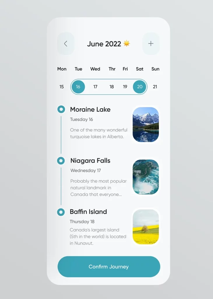
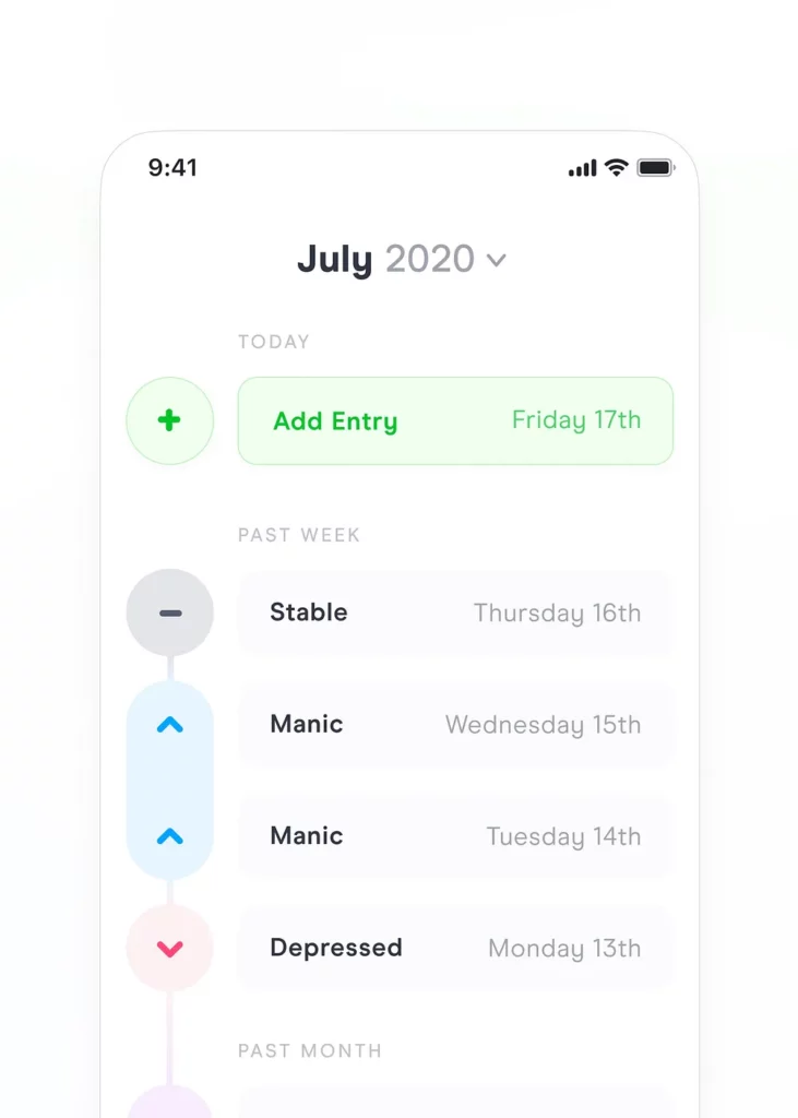
Before we dive in, let’s draw inspiration from some timeline examples on Dribbble:
Imagine a conversation between a candidate and an HR representative. While some hiring stages have already taken place 🟢, there are still future stages to expect ⚪️ meanwhile the current stage may also need your attention or extra actions 🟠.

This timeline is nothing more than a column of nodes. So, our initial focus will be on solving how to draw a single node.
Each timeline item consists of a circle representing a moment in the timeline and some content (in this case, a message). We want this content to be dynamic and passable from outside as a parameter. So, our timeline node doesn’t know anything about what content we will show to the right from the circle.
@Composable
fun TimelineNode(
    content: @Composable BoxScope.(modifier: Modifier) -> Unit
) {
    Box(
        modifier = Modifier.wrapContentSize()
    ) {
        content(Modifier)
    }
}
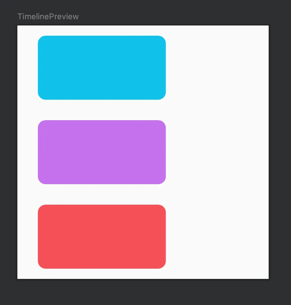
To visualize what we write, we will create a small preview with column of three nodes. We create a MessageBubble composable and use it as the content for each timeline node.
@Composable
private fun MessageBubble(modifier: Modifier, containerColor: Color) {
    Card(
        modifier = modifier
            .width(200.dp)
            .height(100.dp),
        colors = CardDefaults.cardColors(containerColor = containerColor)
    ) {}
}
@Preview(showBackground = true)
@Composable
private fun TimelinePreview() {
    TimelineComposeComponentTheme {
        Column(
            modifier = Modifier
                .fillMaxWidth()
                .padding(16.dp)
        ) {
            TimelineNode() { modifier -> MessageBubble(modifier, containerColor = LightBlue) }
            TimelineNode() { modifier -> MessageBubble(modifier, containerColor = Purple) }
            TimelineNode() { modifier -> MessageBubble(modifier, containerColor = Coral) }
        }
    }
}
Ok, now we have column of TimelineNode , but they are all tightly packed. We need to add some spacing.
Step 1. Adding spacings
According to our design, there should be a 32dp spacing between items (we’ll name this parameter spacerBetweenNodes). Additionally, our content should have a 16dp offset from the timeline itself (contentStartOffset).
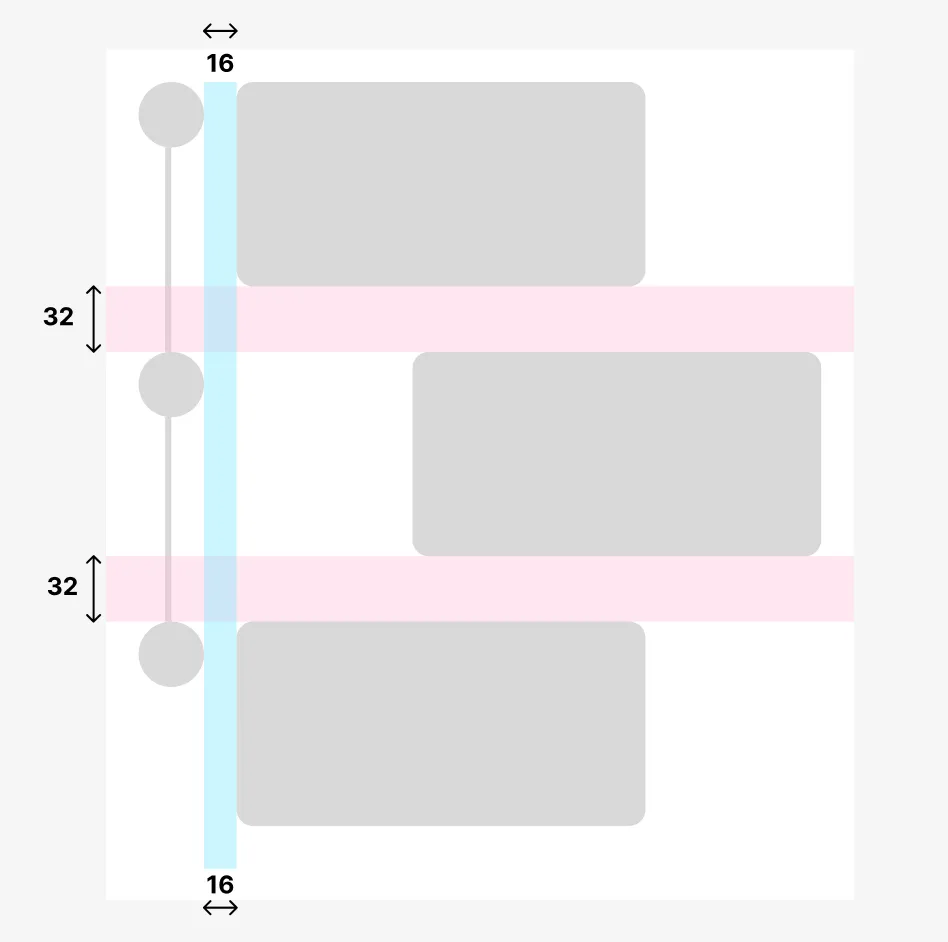
Furthermore, our nodes look different, depending on their position. For the last element, we don’t need to draw a line or add a spacer. To handle this, we’ll define an enum:
enum class TimelineNodePosition {
    FIRST,
    MIDDLE,
    LAST
}
We add those extra parameters to the TimelineNode signature. After that, we apply the required padding to the modifier we pass to the content lambda, which is used to draw the content.
@Composable
fun TimelineNode(
    // 1. we add new parameters here
    position: TimelineNodePosition,
    contentStartOffset: Dp = 16.dp,
    spacerBetweenNodes: Dp = 32.dp,
    content: @Composable BoxScope.(modifier: Modifier) -> Unit
) {
    Box(
        modifier = Modifier.wrapContentSize()
    ) {
        content(
            Modifier
                .padding(
                    // 2. we apply our paddings
                    start = contentStartOffset,
                    bottom = if (position != TimelineNodePosition.LAST) {
                        spacerBetweenNodes
                    } else {
                        0.dp
                    }
                )
        )
    }
}
This TimelineNodePosition enum could be a Boolean flag, you might notice. Yes, it could! If you don’t have any other usage for it, feel free to simplify and adapt the code to your use case.
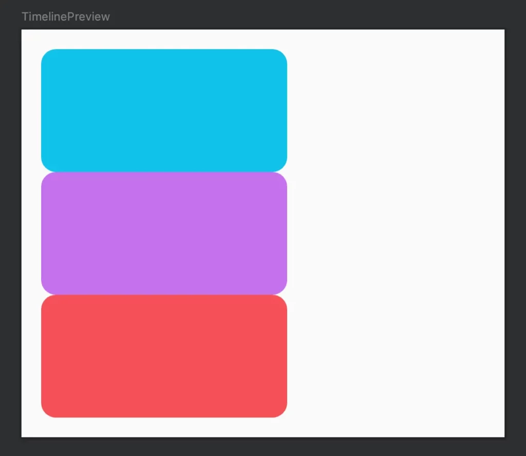
We’ll adjust our preview accordingly:
@Preview(showBackground = true)
@Composable
private fun TimelinePreview() {
    AppTheme {
        Column(...) {
            TimelineNode(
                position = TimelineNodePosition.FIRST,
            ) { modifier -> MessageBubble(modifier, containerColor = LightBlue) }

            TimelineNode(
                position = TimelineNodePosition.MIDDLE,
            ) { modifier -> MessageBubble(modifier, containerColor = Purple) }

            TimelineNode(
                TimelineNodePosition.LAST
            ) { modifier -> MessageBubble(modifier, containerColor = Coral) }
        }
    }
}
With these updates, our timeline elements are now properly spaced:
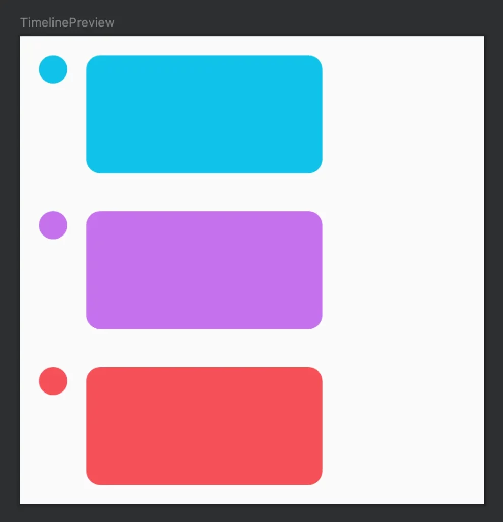
Nice! Our next steps involve adding pretty circles with gradient lines between them. We’ll draw them on the canvas behind each TimelineNode.
Step 2. Draw a circle
Let’s begin by defining a class that describes the circle we want to draw:
data class CircleParameters(
    val radius: Dp,
    val backgroundColor: Color
)
Now you wonder what do we need to draw on a Canvas in Compose. There is a modifier, which can help us in our case — Modifier.drawBehind .
Modifier.drawBehind lets you performDrawScope operations behind the composable content that is drawn on screen.
You can read more about using drawing modifiers on this page:
https://developer.android.com/jetpack/compose/graphics/draw/modifiers
To create a circle in the top-left corner of our canvas, we’ll make use of the drawCircle() function:
@Composable
fun TimelineNode(
    // 1. we add a new parameter here
    circleParameters: CircleParameters,
    ...
) {
    Box(
        modifier = Modifier
            .wrapContentSize()
            .drawBehind {
                // 2. draw a circle here ->
                val circleRadiusInPx = circleParameters.radius.toPx()
                drawCircle(
                    color = circleParameters.backgroundColor,
                    radius = circleRadiusInPx,
                    center = Offset(circleRadiusInPx, circleRadiusInPx)
                )
            }
    ) {
        content(...)
    }
}
Now we have a pretty circle on our timeline canvas!
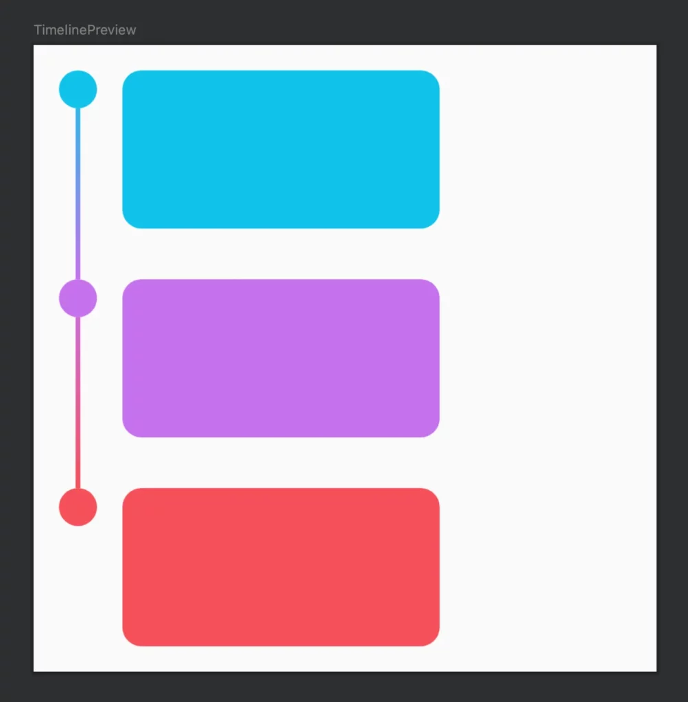
Step 3. Draw a line
Next, we create a class to define the appearance of the line:
data class LineParameters(
    val strokeWidth: Dp,
    val brush: Brush
)
Now it’s time to join our circles with lines. We don’t need to draw a line for the last element, so we will make LineParameters nullable. Our line goes from the bottom of the circle to the bottom of the current item.
.drawBehind {
    val circleRadiusInPx = circleParameters.radius.toPx()
    drawCircle(...)
    // we added drawing a line here ->
    lineParameters?.let{
        drawLine(
            brush = lineParameters.brush,
            start = Offset(x = circleRadiusInPx, y = circleRadiusInPx * 2),
            end = Offset(x = circleRadiusInPx, y = this.size.height),
            strokeWidth = lineParameters.strokeWidth.toPx()
        )

}
To enjoy our work, we should provide the required LineParameters in the preview. As lazy developers, who don’ t want to create gradient brushes again and again, we introduce a utility object:
object LineParametersDefaults {

    private val defaultStrokeWidth = 3.dp

    fun linearGradient(
        strokeWidth: Dp = defaultLinearGradient,
        startColor: Color,
        endColor: Color,
        startY: Float = 0.0f,
        endY: Float = Float.POSITIVE_INFINITY
    ): LineParameters {
        val brush = Brush.verticalGradient(
            colors = listOf(startColor, endColor),
            startY = startY,
            endY = endY
        )
        return LineParameters(strokeWidth, brush)
    }
}
And we do the same for circle creation, even though we don’t have many parameters for circle customization yet:
object CircleParametersDefaults {

    private val defaultCircleRadius = 12.dp

    fun circleParameters(
        radius: Dp = defaultCircleRadius,
        backgroundColor: Color = Cyan
    ) = CircleParameters(radius, backgroundColor)
}
With these utility objects in place, let’s update our preview:
@Preview(showBackground = true)
@Composable
private fun TimelinePreview() {
    TimelineComposeComponentTheme {
        Column(
            modifier = Modifier
                .fillMaxWidth()
                .padding(16.dp)
        ) {
            TimelineNode(
                position = TimelineNodePosition.FIRST,
                circleParameters = CircleParametersDefaults.circleParameters(
                    backgroundColor = LightBlue
                ),
                lineParameters = LineParametersDefaults.linearGradient(
                    startColor = LightBlue,
                    endColor = Purple
                ),
            ) { modifier -> MessageBubble(modifier, containerColor = LightBlue) }

            TimelineNode(
                position = TimelineNodePosition.MIDDLE,
                circleParameters = CircleParametersDefaults.circleParameters(
                    backgroundColor = Purple
                ),
                lineParameters = LineParametersDefaults.linearGradient(
                    startColor = Purple,
                    endColor = Coral
                ),
            ) { modifier -> MessageBubble(modifier, containerColor = Purple) }

            TimelineNode(
                TimelineNodePosition.LAST,
                circleParameters = CircleParametersDefaults.circleParameters(
                    backgroundColor = Coral
                ),
            ) { modifier -> MessageBubble(modifier, containerColor = Coral) }
        }
    }
}
Now we can enjoy colourful gradient between timeline items 🦄.
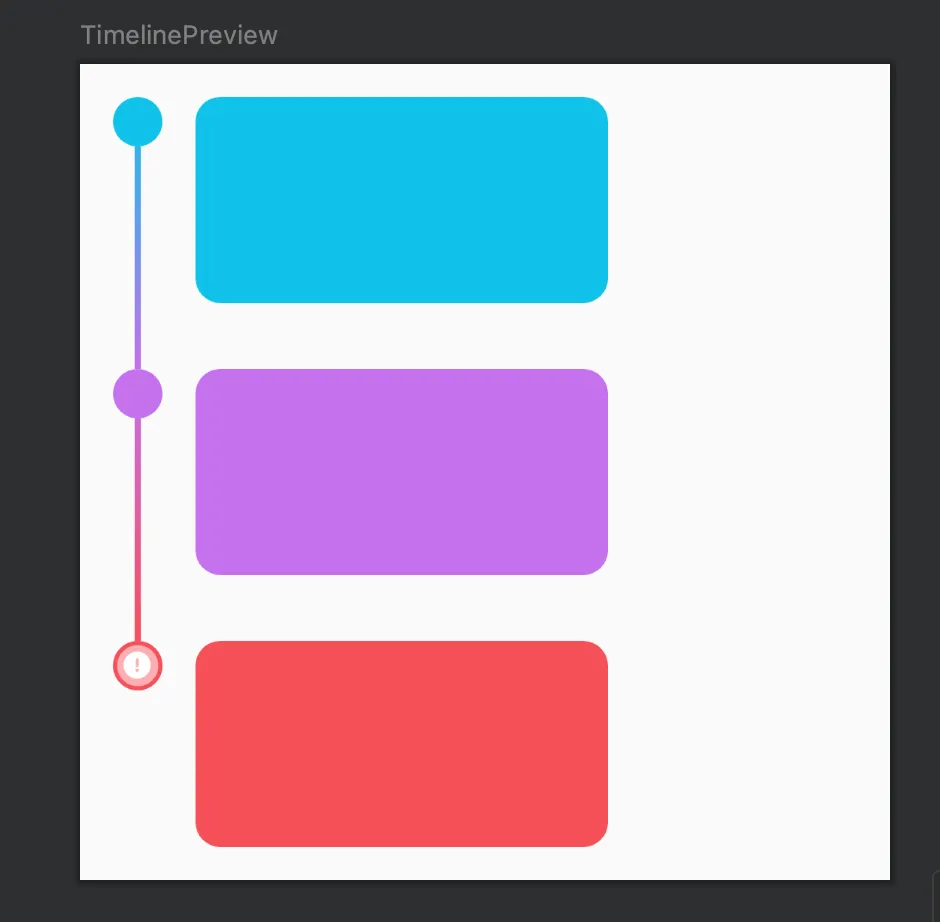
(Optional Step): Go crazy and add extra decoration
Depending on your design, you may want to add icons, strokes or whatever else you can draw on a Canvas. The full version of TimelineNode with an extended set of capabilities is available on GitHub.
In our preview, we manually created the `TimelineNode`s in a Column, but you can also use TimelineNode in LazyColumn and fill all colour parameters dynamically, depending on the status of the message.
Checking stability with Compose Compiler Reports
Quite often you may see unexpected degradation in your UI performance, caused by multiple unnecessary recomposition cycles, you didn’t expect to have. Many non-trivial mistakes can cause such behaviour.
So now it’s time for us to check if our Composables perform well. To do this we will first use Compose Compiler Reports
To enable Compose Compiler Reports in your project, check this article:
https://medium.com/androiddevelopers/jetpack-compose-stability-explained-79c10db270c8
For debugging the stability of your composables we run this gradle task:
./gradlew assembleRelease -PcomposeCompilerReports=true
It generates three output files in your module -> build -> compose_compiler directory:
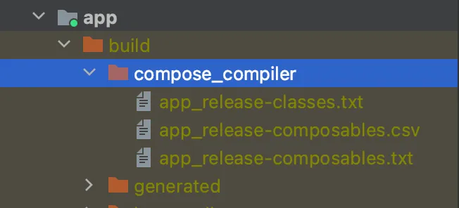
First, let’s check how stable the data models used in our composables are. We go to app_release-classes.txt:
stable class CircleParameters {
  stable val radius: Dp
  stable val backgroundColor: Color
  stable val stroke: StrokeParameters?
  stable val icon: Int?
  <runtime stability> = Stable
}
stable class LineParameters {
  stable val strokeWidth: Dp
  stable val brush: Brush
  <runtime stability> = Stable
}
Great news! All the classes we use as input parameters in our composables are marked as stable. It’s a very good sign, this means that Compose Compiler will understand when the content of this class changes and trigger recomposition only when necessary.
Next, we check the app_release-composables.txt
restartable skippable scheme("[androidx.compose.ui.UiComposable, [androidx.compose.ui.UiComposable]]") fun TimelineNode(
  stable position: TimelineNodePosition
  stable circleParameters: CircleParameters
  stable lineParameters: LineParameters? = @static null
  stable contentStartOffset: Dp
  stable spacer: Dp
  stable content: @[ExtensionFunctionType] Function4<BoxScope, @[ParameterName(name = 'modifier')] Modifier, Composer, Int, Unit>
)
Our TimelineNode composable is completely restartable, skippable and stable (it is so, because all input parameters are stable). And it means that Compose will trigger recomposition only when something in the input parameters REALLY changes.
Checking recompositions count with Layout Inspector
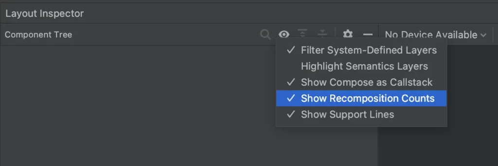
But aren’t we paranoids? We are! Let’s run it in the ✨awesome✨ Layout Inspector and make sure we don’t have any infinite cycle recompositions. Don’t forget to enable “Show recomposition counts” in the Layout Inspector settings.
We added some dummy data to show in our timeline and we use LazyColumn to present this dynamic data.
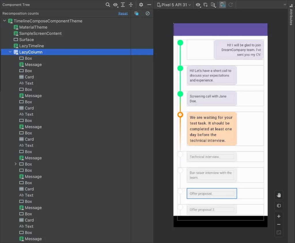
If we just open our app we don’t see any recompositions happening, it’s good. But let’s stress test it a bit. We added a floating action button, which adds new messages at the beginning of the LazyColumn.
Each time we add a new node, we see recomposition of the LazyColumn elements, which is expected. However, we can also see that for some elements recomposition was skipped, because nothing has changed in their content. This is what we always want to achieve, it means that our performance is good enough.
Conclusion
Our job is done, we have a pretty Compose component for displaying timelines. It’s customizable and stable from Compose compiler’s perspective.
We hope you found something useful in this article! Happy coding to everyone💪
Full version of Timeline with an example of usage inside LazyColumn can be found on GitHub.
Special thanks and kudos go to
, whose patient reviews of the code drafts greatly contributed to the quality of the final result, and to
for providing valuable feedback on this article, enhancing its overall clarity.
This article was previously published on proandroiddev.com


