


Data visualizations rely on the visual representation of data. And that data is usually portrayed by some combination of colors. On mobile apps, they also often include different interactions that rely on touch.
But what if your user can’t see? Or if they’re colorblind, and the combination of colors is not visible to them? Or if they use a switch device or hardware keyboard for navigation?
From my experience, data visualizations of apps are often inaccessible for these groups of users, for instance. I wanted to experiment with how much changes and code would be needed to make a line chart more accessible. To my surprise, the amount of code wasn’t that much. Of course, experimenting took some time, but after solving these problems, I now have an example project I can utilize in other projects.
And because I love to share what I’ve learned, I’m writing this series of blog posts to help you to build more accessible graphs with Jetpack Compose. We’ll look at three different aspects:
- Adding information for non-visual access users (so, e.g., a TalkBack user)
- Adding keyboard interaction in addition to touch-based interaction
- Differentiating data by other means than just color
This first blog post in the series is about adding information for non-visual access users, e.g., screen reader users. The following two blog posts will cover adding keyboard interaction and differentiating data with other means than just color. There might be additional posts about voice access and increasing touch target size in the future.
My goal is not to provide a final solution but ideas you can take and improve to use in your codebase. Of course, graphs can be more complex, and these relatively simple solutions might not work for everything, but I hope they’ll give you pointers on improving your graph’s accessibility.
Let’s first talk about the example project I prepared for this experiment.
The Initial Project Code
So, before starting any explorations on making things more accessible, I needed to build a small example app. You can find all the code in this blog post from the Graph Example-project repository. The main-branch contains the final version with all the changes, and the starting-point-branch has the initial code I started tweaking.
Here’s a short video on what I built:
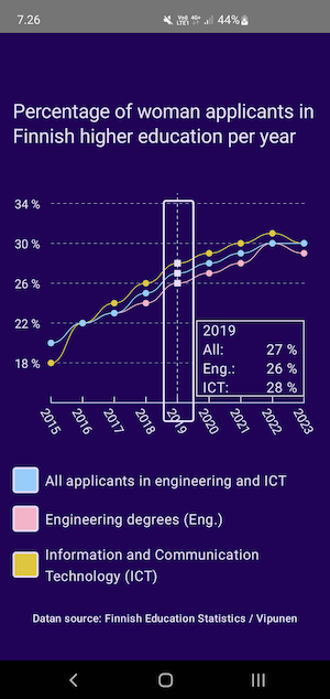
The app has a line graph containing data from woman applicants in Finnish higher education per year (starting from 2015) from two fields: Information Communication Technology and Engineering (non-ICT). The graph shows the percentage of women applicants for these fields individually and displays the total percentages for these two fields.
When a user touches and horizontally drags a pointer over the graph, the selected year’s percentages are shown in the bottom right corner. These values are not available in any other way — so if a user can’t use a pointer, they would miss this information.
Technically, this graph is built with the Canvas-API, which adds some restrictions on how to add, e.g., content description to elements. And that’s something we want to do — as that is one way to communicate the values to someone who can’t see the texts. Let’s next look at how we can add them to the graph.
Adding Content Descriptions to Items on Graph
Because of how the graph is utilizing Canvas-API, it means that it’s completely hidden from accessibility services. In practice, it means that someone using, e.g., TalkBack can’t access the values inside the graph. Also, because the labels on x- and y-axes are built with the drawText-method, they’re unavailable. Here’s an example of how TalkBack reads through the screen:
On the video, I’m navigating through the screen with TalkBack. The video shows that the cursor entirely skips the graph. It reads the title before and the labels under the graph but nothing from it. Let’s start improving the experience by adding a Highlighter-component.
Add Highlighter-Component
In this case, the Highlighter-component is an overlay over the graph, highlighting the selected section, and should be visible only when focused. Technically, it’s a Box that overlays the whole graph, with smaller Box-elements that are the size of the highlighted area. This component also helps improve the keyboard and switch interaction, as we’ll see in the later blog post.
The Highlighter-component looks like this:
| @Composable | |
| fun Highlighter( | |
| modifier: Modifier = Modifier, | |
| widthBetweenPoints: Float, | |
| pixelPointsForTotal: List<Point>, | |
| pixelPointsForTech: List<Point>, | |
| pixelPointsForIct: List<Point>, | |
| highlightedX: Float? | |
| ) { | |
| Box( | |
| modifier | |
| .fillMaxSize(), | |
| ) { | |
| val sectionWidth = with(LocalDensity.current) { | |
| widthBetweenPoints.toDp() | |
| } | |
| pixelPointsForTotal.forEachIndexed { index, point -> | |
| val xOffset = ((index + 1) * widthBetweenPoints - widthBetweenPoints * 0.66f).toInt() | |
| var isHighlighted by remember { mutableStateOf(false) } | |
| var position by remember { mutableStateOf(Pair(0f, 0f)) } | |
| if (highlightedX == null) isHighlighted = false | |
| highlightedX?.let { | |
| isHighlighted = it > (position.first - widthBetweenPoints) && it < (position.second - widthBetweenPoints) | |
| } | |
| Box( | |
| modifier = Modifier | |
| .fillMaxHeight() | |
| .width(sectionWidth) | |
| .offset { IntOffset(xOffset, 0) } | |
| .border( | |
| width = Graph.Highlighter.width, | |
| color = if (isHighlighted) MaterialTheme.colorScheme.onBackground else Color.Transparent, | |
| shape = RoundedCornerShape(Graph.Highlighter.borderRadius), | |
| ) | |
| .onGloballyPositioned { | |
| position = | |
| Pair( | |
| it.positionInParent().x, | |
| it.positionInParent().x + it.size.width | |
| ) | |
| } | |
| ) { | |
| } | |
| } | |
| } | |
| } |
OUR VIDEO RECOMMENDATION


Jobs
It takes the following parameters:
- modifier: Modifier — a modifier to pass down styles. Defaults to
Modifier - widthBetweenPoints: Float — as the name states, width between the points. It’s used to position the highlighting section correctly
- pixelPointsForTotal: List — List of values for total as
Point - pixelPointsForTech: List — List of values for engineering as
Point(should be renamed topixelPointsForEng) - pixelPointsForIct: List — List of values for ICT-field as
Point - highlightedX: Float? — x-value of the currently highlighted item
Note: The Point is a data class defined in the code, and the definition looks like this:
| data class Point( | |
| val x: Float, | |
| val y: Float, | |
| val year: Int, | |
| val percentage: Float, | |
| val isHighlighted: Boolean = false, | |
| ) { | |
| val percentageString = "${percentage.toInt()} %" | |
| } |
Inside the component, all the pixel point values for the total (but this could be any of the lists) are mapped, and the lambda returns a highlighting section for each point. The offset for each section is calculated with the help of widthBetweenPoints.
We’ll also need to get the position of the highlighter. The values are the start and end x-coordinates of the component. We’ll save it to state, and on the Box-component, we change the value on the onGloballyPositioned-modifier:
| var position by remember { mutableStateOf(Pair(0f, 0f)) } | |
| ... | |
| .onGloballyPositioned { | |
| position = | |
| Pair( | |
| it.positionInParent().x, | |
| it.positionInParent().x + it.size.width | |
| ) | |
| } |
We can then use these values to determine if the currently selected year (the highlightedX-parameter) is inside the area of this highlighter component.
| var isHighlighted by remember { mutableStateOf(false) } | |
| ... | |
| if (highlightedX == null) isHighlighted = false | |
| highlightedX?.let { | |
| isHighlighted = | |
| it > (position.first - widthBetweenPoints) | |
| && it < (position.second - widthBetweenPoints) | |
| } |
In the code snippet, isHighlighted stores the value of whether the pointer is inside its area. If highlightedX is null (there’s no pointer input on the graph), then isHighlighted is false.
We can then use isHighlighted to change the border color of the area in the border-modifier:
| .border( | |
| width = Graph.Highlighter.width, | |
| color = if (isHighlighted) MaterialTheme.colorScheme.onBackground else Color.Transparent, | |
| shape = RoundedCornerShape(Graph.Highlighter.borderRadius), | |
| ) |
This image shows the current state when the year 2019 is highlighted:
We now have a highlighter component. The current implementation just outlines the current selection when using pointer input, so it’s not improving accessibility that much just yet. Let’s next add some content descriptions to make the graph more accessible.
Add Content Description
Next, we want to add a content description for anyone using assistive technology such as TalkBack. We first want to add the focusable– modifier to each highlighter’s child element. As the name states, it makes the element focusable, meaning people with different assistive technologies can reach it. Without it, the element is hidden from a screen reader and not focusable with, e.g., a hardware keyboard or switch device.
The second step is to add the content description for each highlighter’s child element. Because we use the Box-component, we need to use the semantics-modifier’s contentDescription-property – contrary to the contentDescription-property available for some components (such as Image s).
As each highlighted section displays the year and values for ICT, engineering, and total, that’s what we want to add to the content description as it is the relevant information for that section. We first form the content description inside pixelPointsForTotal.forEachIndexed {}:
| val contentDesc = | |
| "${point.year}: " + | |
| "${stringResource(id = R.string.all)} ${point.percentageString}, " + | |
| "${stringResource(id = R.string.eng)} ${pixelPointsForTech[index].percentageString}, " + | |
| "${stringResource(id = R.string.ict)} ${pixelPointsForIct[index].percentageString}" |
Then we add the focusable modifier and use the content description we defined in the semantics-modifier:
| ... | |
| .focusable() | |
| .semantics { | |
| contentDescription = contentDesc | |
| }, |
This way, when a user focuses on a highlighted section with a screen reader, they would hear (or get in Braille) the following:
The complete difference in code for this section is available in this commit.
Wrapping up
In this blog post, we’ve looked at the initial code of the Graph Example project and how it’s built. We then added a highlighter component to help us with our task of creating more accessible graphs. Finally, we added a content description for each highlighted section.
Please remember that this code is simplified, and when applying it to your codebase, you’ll probably need to find out how to tweak it to work correctly.
Do you have any questions, comments, or feedback, or want to say anything else? Please share; I’d like to hear it!
Links in the Blog Post
- Graph Example-project repository
starting-point-branch- Complete difference in code for this section is available in this PR
This article was previously published on proandroiddev.com


