

 Photo by Codioful (Formerly Gradienta) on Unsplash & App Design by https://dribbble.com/nick_buturishvili
This is part of a series in which we build a Crypto Trade App using Compose:
https://medium.com/@zurcher/list/crypto-trade-app-in-jetpack-compose-bdbce2f1c5d4
In the last article, we completed what we called the Home Header. Today, we’ll continue iterating on our implementation and focus on the Crypto Cap View, which displays a preview of our full Crypto Cap on the home screen.
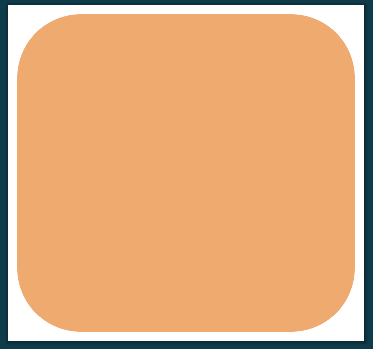
 Today’s design spec
My Crypto Cap View
Let’s begin by creating a new Composable under our composables/home package to keep things organized in our project.
Now, let’s write the root function of our new Composable.
| @Composable | |
| fun CTAMyCryptoCap() { | |
| } |
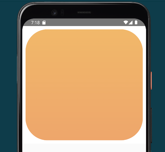
This new view looks quite similar to a native Card, so for now, let’s start with that and see if we can make it have the exact shape specified in the design.
| @Composable | |
| fun CTAMyCryptoCap(modifier: Modifier = Modifier) { | |
| Card( | |
| modifier = Modifier | |
| .background(color = FullWhite) | |
| .padding(10.dp) | |
| .fillMaxWidth() | |
| .height(350.dp), | |
| colors = CardDefaults.cardColors( | |
| containerColor = CryptoOrange | |
| ), | |
| shape = RoundedCornerShape(20) | |
| ) { | |
| } | |
| } |
The background seems to have a vertical gradient, so I grabbed the top and bottom color and created 2 new color entries. With them, I can create a new Brush that creates the gradient, and I add a Box filling all the available size in the Card with this Brush as a background (since this is not doable for the background of the card, it seems!).
| @Composable | |
| fun CTAMyCryptoCap(modifier: Modifier = Modifier) { | |
| val verticalOrangeGradient = Brush.verticalGradient( | |
| colors = listOf( | |
| CryptoOrange2, | |
| CryptoOrange3 | |
| ) | |
| ) | |
| Card( | |
| modifier = Modifier | |
| .background(color = FullWhite) | |
| .padding(10.dp) | |
| .fillMaxWidth() | |
| .height(350.dp), | |
| shape = RoundedCornerShape(20) | |
| ) { | |
| Box( | |
| modifier = Modifier | |
| .fillMaxSize() | |
| .background(verticalOrangeGradient) | |
| ) { | |
| } | |
| } | |
| } |
To continue developing the contents of our view, we need to bring in the data. We’ll define a new Data Class for it with the contents that will be required for now.
| data class MyCryptoCapUIData(val value: Float, val currency: String) |
We’ll use this data class to add a new parameter to our Composable and declare a “mockData” private value that will serve us as the default value to preview the Composable.
| //... | |
| private val mockData = MyCryptoCapUIData(38546.82f, "USD") | |
| @Composable | |
| fun CTAMyCryptoCap(modifier: Modifier = Modifier, data: MyCryptoCapUIData = mockData) { | |
| //... |
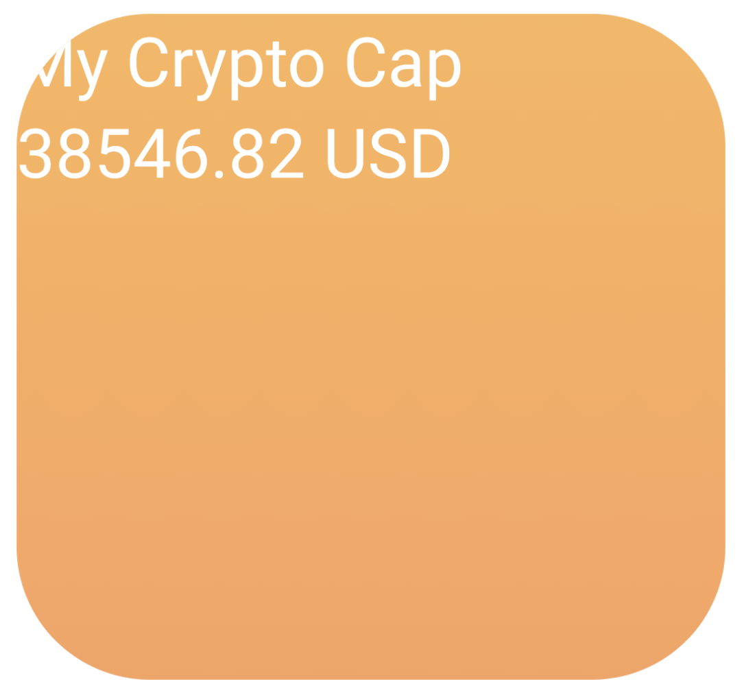
And finally, we’ll bring in 2 new Text composables inside a Column so that they are displayed on top of each other.
| //... | |
| Column { | |
| Text( | |
| text = "My Crypto Cap", | |
| color = Color.White, | |
| style = MaterialTheme.typography.displaySmall | |
| ) | |
| Text( | |
| text = "${data.value} ${data.currency}", | |
| color = Color.White, | |
| style = MaterialTheme.typography.displaySmall | |
| ) | |
| } | |
| //... |
 That’s not passing the first round of QA
And with some final styling tweaks, it’s already looking way closer to spec.
| //... | |
| Column(modifier = Modifier.padding(top = 50.dp, start = 30.dp)) { //<-- Adding padding | |
| Text( | |
| text = "My Crypto Cap", | |
| color = Color.White, | |
| style = MaterialTheme.typography.displaySmall, | |
| fontWeight = FontWeight.ExtraLight //<-- Updating font weight | |
| ) | |
| Text( | |
| text = "${data.value} ${data.currency}", | |
| color = Color.White, | |
| style = MaterialTheme.typography.displayMedium, //<-- Updating style | |
| fontWeight = FontWeight.ExtraBold //<-- Updating font weight | |
| ) | |
| } | |
| //... |
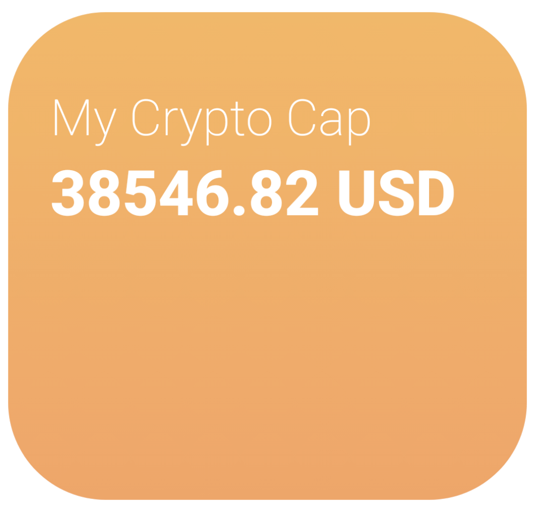 Already looking good
Now let’s focus for a second on that curvy shape in the background of the card. In a real-world scenario, this might be an asset that we request from the designer so that we can match the background for both iOS and Android (if we are writing native apps, of course). But given I don’t have a direct line with the designer in this case and that this is, after all, a Jetpack Compose tutorial, let’s add that line “The Compose Way,” which, by the way, is the lightest option anyway.

To achieve this curvy shape, we’ll use a combination of 2 tools Compose gives us:
- Using drawBehind(), we’ll update the Canvas behind our Card to draw the curve.
- With the help of quadraticBezierTo(), we’ll draw 2 Bézier curves.
Shoutout to Vikas for his awesome post on how to use them:
| //... | |
| Box( | |
| modifier = Modifier | |
| .fillMaxSize() | |
| .background(verticalOrangeGradient) | |
| .drawBehind { | |
| // Here we can access the DrawScope of our Box | |
| } | |
| //... |
OUR VIDEO RECOMMENDATION


Jobs
We’ll now move the initial pointer of the path to the top right of our drawing space to the point (x = 90% of the available width, y = 0% of the available height).
| //... | |
| val stroke = Path().apply { | |
| moveTo(size.width.times(.9f), size.height.times(0f)) | |
| //... |
We draw our 2 Bezier lines, update the Stroke color and size.
| val stroke = Path().apply { | |
| moveTo(size.width.times(.9f), size.height.times(0f)) | |
| quadraticBezierTo( | |
| size.width.times(.9f), size.height.times(.28f), | |
| size.width.times(.73f), size.height.times(.15f) | |
| ) | |
| quadraticBezierTo( | |
| size.width.times(.53f), size.height.times(0f), | |
| size.width.times(.55f), size.height.times(.25f) | |
| ) | |
| } | |
| drawPath( | |
| stroke, | |
| color = CryptoOrange4, | |
| style = Stroke( | |
| width = 50f, | |
| cap = StrokeCap.Round | |
| ) | |
| ) |

I’m not gonna lie; placing those Beziers correctly takes some trial and error plus some drawing on paper helps, but the result speaks for itself!
Let’s extract our curvy line to keep our Composable readable.
| private fun DrawScope.drawCurvyLine() { | |
| val stroke = Path().apply { | |
| moveTo(size.width.times(.9f), size.height.times(0f)) | |
| quadraticBezierTo( | |
| size.width.times(.9f), size.height.times(.28f), | |
| size.width.times(.73f), size.height.times(.15f) | |
| ) | |
| quadraticBezierTo( | |
| size.width.times(.53f), size.height.times(0f), | |
| size.width.times(.55f), size.height.times(.25f) | |
| ) | |
| } | |
| drawPath( | |
| stroke, | |
| color = CryptoOrange4, | |
| style = Stroke( | |
| width = 50f, | |
| cap = StrokeCap.Round | |
| ) | |
| ) | |
| } |
| //... | |
| Box( | |
| modifier = Modifier | |
| .fillMaxSize() | |
| .background(verticalOrangeGradient) | |
| .drawBehind { drawCurvyLine() } //<--- NEW | |
| ) { | |
| Column(modifier = Modifier.padding(top = 50.dp, start = 30.dp)) { | |
| //... |
That’s much better!
We need to turn our attention to the Bar Chart at the bottom of our widget now. This time let’s define the data that will fulfill it first, and then we can use that to build it.
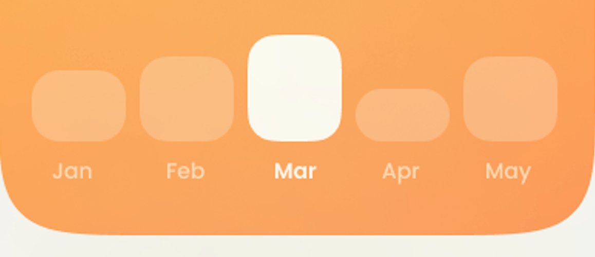
From a glance, we can tell that it displays the cap for 5 different months at the same time and displays highlighted the one with the biggest cap (could work differently, but we’ll take this assumption due to the lack of context surrounding its behaviour). Worth mentioning that this logic to highlight the highest cap is a perfect scenario to do TDD and add coverage for this functionality with a Compose Test 😉
Building High Quality Android UI
Let’s extend our existing data class to have this information too.
| data class MyCryptoCapUIData( | |
| val value: Float, | |
| val currency: String, | |
| val monthlyPreview: List<Pair<String, Float>> //<---- NEW | |
| ) | |
| private val mockData = | |
| MyCryptoCapUIData( | |
| 38546.82f, | |
| "USD", | |
| listOf( //<---- NEW | |
| Pair("Jan", 15000f), | |
| Pair("Feb", 20000f), | |
| Pair("Mar", 38000f), | |
| Pair("Apr", 8000f), | |
| Pair("May", 10000f) | |
| ) | |
| ) |
And let’s place a new Composable under our 2 Text elements inside the Column.
| Column(modifier = Modifier.padding(top = 50.dp, start = 30.dp)) { | |
| Text( | |
| text = "My Crypto Cap", | |
| color = Color.White, | |
| style = MaterialTheme.typography.displaySmall, | |
| fontWeight = FontWeight.ExtraLight | |
| ) | |
| Text( | |
| text = "${data.value} ${data.currency}", | |
| color = Color.White, | |
| style = MaterialTheme.typography.displayMedium, | |
| fontWeight = FontWeight.ExtraBold | |
| ) | |
| MonthlyCapPreview(data.monthlyPreview) //<--- HERE | |
| } |
| @Composable | |
| fun MonthlyCapPreview(monthlyPreview: List<Pair<String, Float>>) { | |
| TODO("Not yet implemented") | |
| } |
We’ll bring in a Row Composable so that we can iterate over the list of elements and draw Cards for each of them. To make it fully dynamic (or value-agnostic), we’ll determine the height of the Card based on the max value of the list and with it set a percentage-based size using the fillMaxHeight modifier.
| @Composable | |
| fun MonthlyCapPreview(monthlyPreview: List<Pair<String, Float>>) { | |
| val maxMonthValue = monthlyPreview.maxBy { it.second }.second //<-- We find the max Float value of our Pair List | |
| Row( | |
| modifier = Modifier.fillMaxSize(), | |
| verticalAlignment = Alignment.Bottom //<--- This is important to align them as required by spec | |
| ) { | |
| for (pairPreview in monthlyPreview) { | |
| val columnHeightWeight = pairPreview.second / maxMonthValue //<-- We use it to get a value between 0 and 1 | |
| Card( | |
| modifier = Modifier | |
| .weight(1f) | |
| .fillMaxHeight(columnHeightWeight) //<-- Pass it through the modifier to determine Its height | |
| .padding(5.dp) | |
| ) { | |
| Text(text = pairPreview.first) | |
| } | |
| } | |
| } | |
| } |
And to be able to display each month too, we’ll put a second Row for month names and bring it all together inside a Column.
| @Composable | |
| fun MonthlyCapPreview(monthlyPreview: List<Pair<String, Float>>) { | |
| Column(horizontalAlignment = Alignment.CenterHorizontally) { | |
| val maxMonthValue = monthlyPreview.maxBy { it.second }.second | |
| Row( | |
| modifier = Modifier.fillMaxHeight(.8f), | |
| verticalAlignment = Alignment.Bottom | |
| ) { | |
| for (pairPreview in monthlyPreview) { | |
| val columnHeightWeight = pairPreview.second / maxMonthValue | |
| Card( | |
| modifier = Modifier | |
| .weight(1f) | |
| .fillMaxHeight(columnHeightWeight) | |
| .padding(5.dp) | |
| ) { } | |
| } | |
| } | |
| Row( | |
| verticalAlignment = Alignment.CenterVertically | |
| ) { | |
| for (pairPreview in monthlyPreview) { | |
| Text( | |
| modifier = Modifier.weight(1f), | |
| text = pairPreview.first, | |
| textAlign = TextAlign.Center | |
| ) | |
| } | |
| } | |
| } | |
| } |
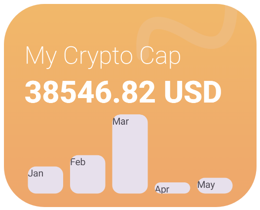
We are almost there, let’s add the final touches so we can match the Design. Add the functionality to highlight the highest month and update the text color of the text to white.
| @Composable | |
| fun MonthlyCapPreview(monthlyPreview: List<Pair<String, Float>>) { | |
| Column(horizontalAlignment = Alignment.CenterHorizontally) { | |
| val maxMonthValue = monthlyPreview.maxBy { it.second }.second | |
| Row( | |
| modifier = Modifier.fillMaxHeight(.8f), | |
| verticalAlignment = Alignment.Bottom | |
| ) { | |
| for (pairPreview in monthlyPreview) { | |
| val columnHeightWeight = pairPreview.second / maxMonthValue | |
| Card( | |
| modifier = Modifier | |
| .weight(1f) | |
| .fillMaxHeight(columnHeightWeight) | |
| .padding(5.dp), | |
| colors = CardDefaults.cardColors( | |
| containerColor = setHighlightColor( | |
| pairPreview, | |
| maxMonthValue | |
| ) | |
| ), | |
| shape = RoundedCornerShape(30) //<--- Adding some "extra roundiness" | |
| ) { } | |
| } | |
| } | |
| Row( | |
| verticalAlignment = Alignment.CenterVertically | |
| ) { | |
| for (pairPreview in monthlyPreview) { | |
| Text( | |
| modifier = Modifier.weight(1f), | |
| text = pairPreview.first, | |
| textAlign = TextAlign.Center, | |
| fontWeight = FontWeight.SemiBold, | |
| color = setHighlightColor(pairPreview, maxMonthValue) | |
| ) | |
| } | |
| } | |
| } | |
| } | |
| @Composable | |
| private fun setHighlightColor( //<--- Helper function to determine colour of Text and Bar | |
| pairPreview: Pair<String, Float>, | |
| maxMonthValue: Float | |
| ) = if (pairPreview.second == maxMonthValue) Color.White else Color.White.copy( | |
| alpha = 0.4f | |
| ) |
For the final touches, let’s update the background gradient to be radial instead of vertical, and let’s bring in a small loading animation so it’s a bit more alive.
| //... | |
| Box( | |
| modifier = Modifier | |
| .fillMaxSize() | |
| .background(verticalOrangeGradient) | |
| .drawBehind { drawCurvyLine() } //<--- NEW | |
| ) { | |
| Column(modifier = Modifier.padding(top = 50.dp, start = 30.dp)) { | |
| //... |
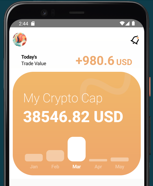
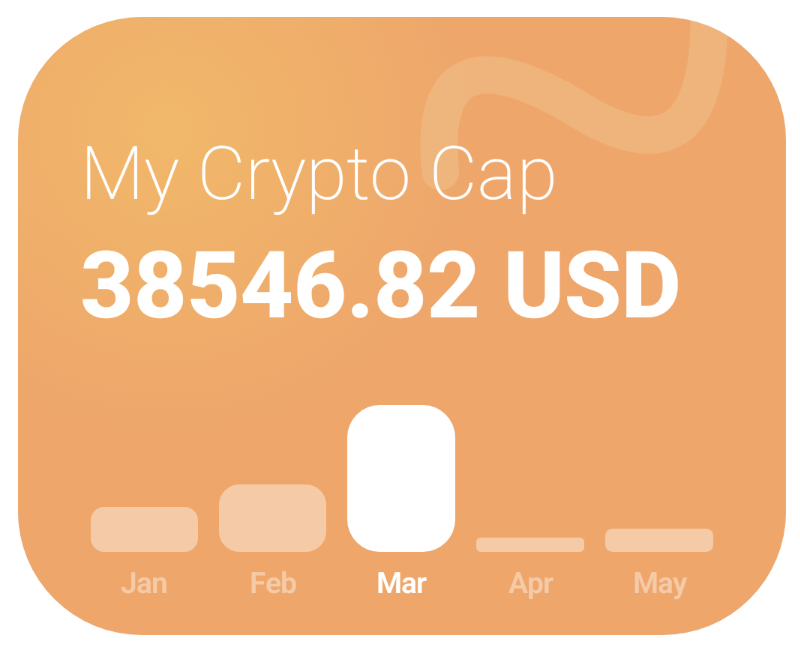 Our 100% Functional Compose made UI
The Original Design Spec
That was a lot of code, but it was worth the push. Our custom UI element is looking just as the designer wanted it to, and it will be easy to update. In an upcoming post, we’ll add the finishing touches to our Home Screen so we can call it complete and move on to the next part of our crypto App.
Have a nice day! 🧉
P.S.: In this tag you can find the working example we reviewed today:
This article was previously published on proandroiddev.com


