

 Jetpack Compose Logo by Google, Background generated with Midjourney and App Design by Roman L.
When it comes to incorporating charts into our UI, the most common approach is to either use an open-source chart library or invest in a paid one. However, in this tutorial, we will explore how to easily implement a line chart graph using solely Jetpack Compose while adhering to a design specification. Let’s dive right in.
Introduction
Our focus will be on enhancing Roman’s meticulously designed app, particularly the Performance View component that prominently features the Line Chart.
 Design by Roman L. https://www.behance.net/ozmoweb
Before we delve into the finer details of the user interface, we’ll guide you through the straightforward steps of incorporating this Line Chart using Jetpack Compose, along with a touch of fundamental mathematics. Let’s get started and elevate your app with visually captivating and informative Line Charts!

The Input
We’ll start by defining the data fields we can extract from the design specification to populate our Composable.
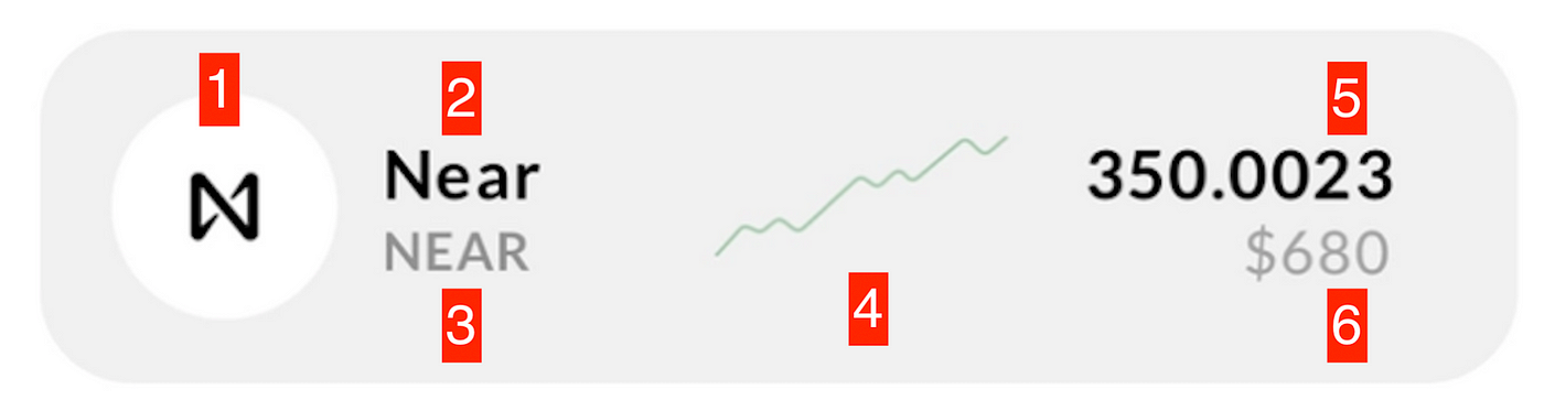
- Icon
- Asset Full Name
- Ticker Name
- Last Day Change
- Current Value
- Total Value
| data class AssetInfo( | |
| val iconDrawable: Int, | |
| val name: String, | |
| val tickerName: String, | |
| val lastDayChange: List<Float>, | |
| val currentValue: Float, | |
| val total: Float, | |
| ) |
We will use a List<Float> type for the lastDayChange to represent the latest values of our asset in a chart.
Implementation Time
As usual, we’ll divide our design into smaller components and implement them one by one. The root of our Composable will be a Card with a Row element inside it, where we’ll place our elements to match the design spec.
| @Composable | |
| fun AssetPerformanceCard( | |
| assetInfo: AssetInfo = mockAssetInfo | |
| ) { | |
| Card( | |
| modifier = Modifier | |
| .wrapContentHeight() | |
| .fillMaxWidth() | |
| .padding(start = 5.dp, end = 5.dp, bottom = 5.dp), | |
| colors = CardDefaults.cardColors(containerColor = CryptoWhite) | |
| ) { | |
| Row( | |
| horizontalArrangement = Arrangement.SpaceBetween, | |
| verticalAlignment = Alignment.CenterVertically, | |
| modifier = Modifier | |
| .padding(15.dp) | |
| .fillMaxWidth() | |
| ) { | |
| // TODO: Place here the other views of our Composable! | |
| } | |
| } | |
| } |
OUR VIDEO RECOMMENDATION


Jobs
Pro Tip: Create a mockAssetInfo constant to easily Preview your Composable.

With the foundation of our Composable in place, let’s implement each of its pieces and pass the required values to each. We’ll start with the simplest element, the asset icon.
This part of the UI can be achieved by placing a Canvas and an Icon inside a Box.
| @Composable | |
| private fun AssetIcon(iconDrawable: Int = R.drawable.apple) { | |
| Box(modifier = Modifier.size(50.dp), contentAlignment = Alignment.Center) { | |
| Canvas(modifier = Modifier, onDraw = { | |
| val radius = 65f | |
| drawCircle( | |
| color = Color.White, | |
| radius = radius | |
| ) | |
| }) | |
| Icon( | |
| painter = painterResource(id = iconDrawable), | |
| contentDescription = "Asset Icon", | |
| tint = Color.Black, | |
| modifier = Modifier | |
| .size(25.dp) | |
| .padding(bottom = 3.dp) | |
| ) | |
| } | |
| } |

Public Domain Apple Logo: https://en.m.wikipedia.org/wiki/File:Apple_logo_black.svg
Next, we need to display the name of the stock and its ticker name. To accomplish this, we’ll place two Text elements inside a Column and update their styling to match our spec.
| @Composable | |
| private fun TickerName(name: String = "Apple Inc.", tickerName: String = "AAPL") { | |
| Column( | |
| modifier = Modifier | |
| .padding(start = 10.dp, end = 5.dp) | |
| .width(80.dp) | |
| ) { | |
| Text( | |
| text = name, | |
| style = MaterialTheme.typography.labelMedium, | |
| fontWeight = FontWeight.Bold, | |
| color = Color.Black, | |
| overflow = TextOverflow.Ellipsis, | |
| maxLines = 2 | |
| ) | |
| Text(text = tickerName, style = MaterialTheme.typography.labelSmall, color = Color.Gray) | |
| } | |
| } |

Before we dive into our Chart component, let’s implement the rightmost part of the Composable; this section needs to display the most recent value of the stock and the total amount we have in our wallet, so we’ll call it the ValueView. Once again, by placing just two Text elements into a Column, we can achieve the desired effect.
| @Composable | |
| fun ValueView(currentValue: Float = 113.02211f, total: Float = 1356f) { | |
| Column( | |
| modifier = Modifier | |
| .padding(start = 10.dp), | |
| horizontalAlignment = Alignment.End | |
| ) { | |
| Text( | |
| text = currentValue.toString(), | |
| style = MaterialTheme.typography.labelMedium, | |
| fontWeight = FontWeight.Bold, | |
| color = Color.Black | |
| ) | |
| Text( | |
| text = "$${total.toInt()}", | |
| style = MaterialTheme.typography.labelSmall, | |
| color = Color.Gray | |
| ) | |
| } | |
| } |

Let’s put it all together in our core Row element to see how it’s looking so far.
 It’s almost there!
Chart Implementation Time 📈
Now, let’s get into the details of how we’ll implement this chart using Jetpack Compose. This is the icing on the cake of our Composable.
Our (made-up) requirements indicate that we need to support a dynamic list of values and that the chart needs to be green if the stock’s trend is going up and red otherwise.
The first step is to draw a line between a pair of values using a Canvas.
| Canvas( | |
| modifier = Modifier | |
| .fillMaxHeight() | |
| .weight(1f), | |
| onDraw = { | |
| val fromPoint = Offset(x = 0f, y = size.height) | |
| val toPoint = Offset(x = size.width, y = 0f) | |
| drawLine( | |
| color = lineColor, | |
| start = fromPoint, | |
| end = toPoint, | |
| strokeWidth = 3f | |
| ) | |
| }) |
 Line from coordinates (0, maxHeight) to (maxWidth, 0)
Now that we can draw lines, we need a list of pairs for each value and its next value so we can render all possible lines in our chart. Fortunately, Kotlin makes this straightforward.
| val zipList: List<Pair<Float, Float>> = list.zipWithNext() |
The idea behind this is that we receive something like this:
[value1, value2, value3, value4]
And we convert it to:
[(value1, value2), (value2, value3), (value3, value4)]
See zipWithNext() for more
With this step complete, we can run through our list of pairs and render a Canvas drawing a line from the first value of the Pair to the second, creating a Canvas for each of them.
| @Composable | |
| fun PerformanceChart(modifier: Modifier = Modifier, list: List<Float> = listOf(1f, 2f, 3f, 4f)) { | |
| val zipList: List<Pair<Float, Float>> = list.zipWithNext() | |
| Row(modifier = modifier) { | |
| val lineColor = Color.Black | |
| for (pair in zipList) { | |
| Canvas( | |
| modifier = Modifier | |
| .fillMaxHeight() | |
| .weight(1f), | |
| onDraw = { | |
| val fromPoint = Offset(x = 0f, y = size.height) | |
| val toPoint = Offset(x = size.width, y = 0f) | |
| drawLine( | |
| color = lineColor, | |
| start = fromPoint, | |
| end = toPoint, | |
| strokeWidth = 3f | |
| ) | |
| }) | |
| } | |
| } | |
| } |
The final and perhaps most important step is to determine the relative value of each point on the Canvas. To do this, we find the max and min values of our list and use them to determine the relative value of each coordinate in our zipped list.
| val max = list.max() | |
| val min = list.min() |
| private fun getValuePercentageForRange(value: Float, max: Float, min: Float) = | |
| (value - min) / (max - min) |
Our updated Composable:
| @Composable | |
| fun PerformanceChart(modifier: Modifier = Modifier, list: List<Float> = listOf(10f, 20f, 3f, 1f)) { | |
| val zipList: List<Pair<Float, Float>> = list.zipWithNext() | |
| Row(modifier = modifier) { | |
| val max = list.max() | |
| val min = list.min() | |
| val lineColor = | |
| if (list.last() > list.first()) LightOlive else LightCarmin // <-- Line color is Green if its going up and Red otherwise | |
| for (pair in zipList) { | |
| val fromValuePercentage = getValuePercentageForRange(pair.first, max, min) | |
| val toValuePercentage = getValuePercentageForRange(pair.second, max, min) | |
| Canvas( | |
| modifier = Modifier | |
| .fillMaxHeight() | |
| .weight(1f), | |
| onDraw = { | |
| val fromPoint = Offset(x = 0f, y = size.height.times(1 - fromValuePercentage)) // <-- Use times so it works for any available space | |
| val toPoint = | |
| Offset(x = size.width, y = size.height.times(1 - toValuePercentage)) // <-- Also here! | |
| drawLine( | |
| color = lineColor, | |
| start = fromPoint, | |
| end = toPoint, | |
| strokeWidth = 3f | |
| ) | |
| }) | |
| } | |
| } | |
| } |
Now, we have a 100% flexible Composable that not only supports any number of values but also adapts nicely to the available space.
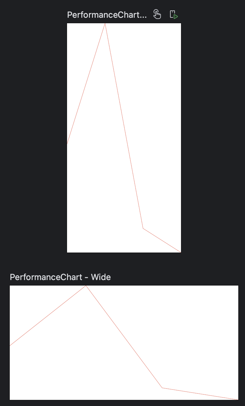

We draw one Canvas with one line in each Row of our composable
We simply add the Performance chart in the right place in our original row and we are done.


Looking sharp!
Final Thoughts
Thanks to the powerful combination of Kotlin and Jetpack Compose, we’ve achieved a highly dynamic and customized piece of UI that would have otherwise relied on third-party libraries to create a proper chart, which might not have fully met our requirements.
I hope this tutorial has deepened your knowledge of Compose. Thank you for reading this far, and have an awesome day! 🧉
P.S.: If you are interested all the implementation details and the full Finance UI Repo with this and more Finance Composables here:
This article was previously published on proandroiddev.com


