

In Material 2 Drawer navigation was part of Scaffold composable but from Material 3 it’s a stand alone component which we will explore in the story.
 Image from Article — Whats New in Navigation
It’s the first story in the series of Navigation Compose.
In this story we will explore and implement basic Drawer Navigation using Material3 and in the next story elaborates about Best Practices in Navigation Compose and how to implement them in a multi-module project. You can read the story from the link below
Prerequisite
You must have an understanding of basic Navigation in Jetpack Compose. Please see official documentation
Dependencies
We need to add Jetpack Compose Navigation dependency in our project. Below I am showing the Kotlin DSL but you have to see if you are using Groovy way to add dependency.
implementation("androidx.navigation:navigation-compose:2.7.0")
Sync your project after any changes in gradle files.
To use Drawer from Material3 in Compose, we have to include material3 dependency.
implementation("androidx.compose.material3:material3")
I am using Compose BOM, we should use BOM onward as its recommended way to include Jetpack Compose dependencies.
From Jetpack Compose BOM version 2023.05.01 it’s no longer an Experimental API.
Explaining Material3 APIs for Navigation Drawer
As mentioned before Material 3 provides explicit Apis for Drawer Navigation, first we will see in brief what those APIs are and later will implement them.
The main Composable provided by Material3 is ModelNavigationDrawer mentioned below.
Let’s see important parameters for ModelNavigationDrawer
drawerState— It keeps track of the DrawerOpen/Closedstate provided viaDrawerValueenum.gestureEnabled— It provides gesture capability to use swipe gesture fromleft -> rightto Open andright -> leftto Close drawer if it was opened before, we can also disable it as per our need.drawerContent— Its content of the slider/drawer itself, we will provide aDrawercomposable here.content— Its the actual page content showing composable screens to the user, we can addNavHostas content to manage different screens to show fromDrawer.
Material3 provides another composable ModelDrawerSheet which should be used to provide drawerContent as it sets all required values required for a Drawer.
Let’s see the ModelDrawerSheet composable below, later we will see how to use it while creating content for Drawer
| @Composable | |
| fun ModalDrawerSheet( | |
| modifier: Modifier = Modifier, | |
| drawerShape: Shape = DrawerDefaults.shape, | |
| drawerContainerColor: Color = MaterialTheme.colorScheme.surface, | |
| drawerContentColor: Color = contentColorFor(drawerContainerColor), | |
| drawerTonalElevation: Dp = DrawerDefaults.ModalDrawerElevation, | |
| windowInsets: WindowInsets = DrawerDefaults.windowInsets, | |
| content: @Composable ColumnScope.() -> Unit | |
| ) { | |
| } |
All of the parameters of ModelDrawerSheet are self-explanatory, we will look into content parameter, which is composable for Drawer using that we will provide Drawer composable.
ModelDrawerSheet works as a wrapper for Drawer content composable providing basic designs and colour schemes following Material 3 design guidelines.
Let’s get started with implementation!
Implementation
Let’s see the basic implementation of the Drawer in Material3.
Below code is showing Drawer in red and the content page in green, In the next example we will implement a real use-case with Drawer menus list and multiple screens.
As mentioned earlier ModelNavigationDrawer is the main composable to use providing drawerContent wrapping it inside ModelDrawerSheet which you can use to provide any design of your Drawer.
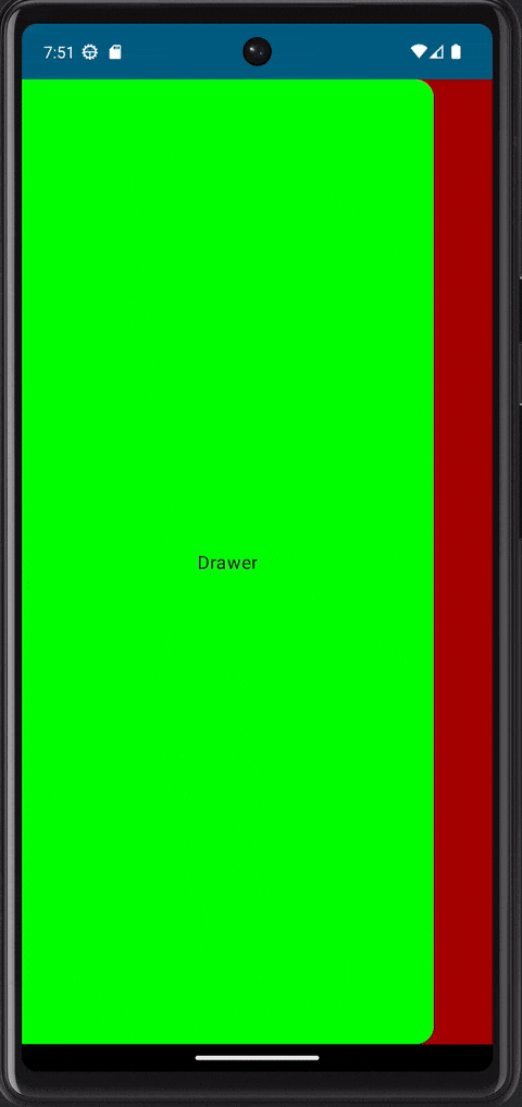
Above you can see gestures to slide in/out are working for Drawer automatically, it’s because the default value is set true for gestureEnabled parameter for ModelNavigationDrawer .
Real use-case implementation
Now Let’s implement an actual use-case where we want to show three screens: Articles, Settings and About Us using Drawer Navigation Component.
We will be using the Compose Navigation component. That’s a prerequisite for this story, If you want to read more about it you can read from official documentation here.
In order to use NavHost we have to provide routes for our composables and in our case we will have three routes each for each screen and to express them in code we will use MainRoute enum. Enum is enough for our case, we don’t need Sealed classes just for routes.
| enum class MainRoute(value: String) { | |
| Articles("articles"), | |
| About("about"), | |
| Settings("settings") | |
| } |
OUR VIDEO RECOMMENDATION


Jobs
Inside Navigation Drawer we want to show list of Menus having title and icon and when user taps on any menu we want to navigate to that screen using route
Material3 provides a built-in composable NavigationDrawerItem which has default settings and follows Material design guidelines, we will use NavigationDrawerItemto show menus inside Drawer.
Below is definition for NavigationDrawerItem composable.
NavigationDrawerItem is pretty self-explanatory.
In order to use NavigationDrawerItem we need to create a Data class which will hold information for individual Menu items that we want to show inside the Drawer. That data class will hold title , icon and route for the menu as stated below.
Below is the list of menus we will show.
I am passing
title for each menu as aString but in real Application in order to support multi languages, you want to pass title asresourceId and annotate it with@StringRes
At this point we have created everything for menus on Drawer but we still need a composable for Drawer content which will eventually contain a list of menus inside and some custom design for the top portion.
So Let’s create DrawerContent composable as below.
| @Composable | |
| private fun DrawerContent( | |
| menus: Array<DrawerMenu>, | |
| onMenuClick: (String) -> Unit | |
| ) { | |
| Column( | |
| modifier = Modifier.fillMaxSize() | |
| ) { | |
| Box( | |
| modifier = Modifier | |
| .fillMaxWidth() | |
| .height(200.dp), | |
| contentAlignment = Alignment.Center | |
| ) { | |
| Image( | |
| modifier = Modifier.size(150.dp), | |
| imageVector = Icons.Filled.AccountCircle, | |
| contentScale = ContentScale.Crop, | |
| contentDescription = null | |
| ) | |
| } | |
| Spacer(modifier = Modifier.height(12.dp)) | |
| menus.forEach { | |
| NavigationDrawerItem( | |
| label = { Text(text = it.title) }, | |
| icon = { Icon(imageVector = it.icon, contentDescription = null) }, | |
| selected = false, | |
| onClick = { | |
| onMenuClick(it.route) | |
| } | |
| ) | |
| } | |
| } | |
| } |
DrawerContent composable is taking a list of menus and providing a lambda which will be called when any menu will be clicked.
DrawerContent is internally creating a top Box for profile section to show profile image. ( I am showing this as an example: there is no real implementation for the user profile).
DrawerContent is also using NavigationDrawerItem built-in composable from material3 to show menus inside Drawer and onClick of each menu exposing a lambda onMenuClick passing in the route to navigate to in its parent composable .
Next we will see how to connect all of these pieces together, let’s see MainNavigation code below.
One thing to note is that I am passing drawerState reference in each Screen composable. It will be used to show Menu icon inside the AppBar if drawerState is provided. That’s because each screen is creating its own AppBar and passing drawerState will do the job of showing Menu icon and opening Drawer when the user taps on it.
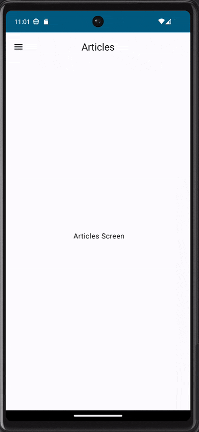
To see it in detail let’s take example of ArticlesScreen and CustomAppBar.
| @Composable | |
| fun ArticlesScreen(drawerState: DrawerState) { | |
| Scaffold( | |
| topBar = { CustomAppBar( | |
| drawerState = drawerState, | |
| title = "Articles" | |
| ) } | |
| ) { paddingValues -> | |
| Column( | |
| modifier = Modifier.fillMaxSize().padding(paddingValues), | |
| horizontalAlignment = Alignment.CenterHorizontally, | |
| verticalArrangement = Arrangement.Center | |
| ) { | |
| Text(text = " Articles Screen") | |
| } | |
| } | |
| } |
| @Composable | |
| fun CustomAppBar(drawerState: DrawerState?, title: String) { | |
| val coroutineScope = rememberCoroutineScope() | |
| CenterAlignedTopAppBar( | |
| navigationIcon = { | |
| if (drawerState != null) { | |
| IconButton(onClick = { | |
| coroutineScope.launch { | |
| drawerState.open() | |
| } | |
| }) { | |
| Icon(Icons.Filled.Menu, contentDescription = "") | |
| } | |
| } | |
| }, | |
| title = { Text(text = title) } | |
| ) | |
| } |
drawerState is being passed from Screen composable to the CustomAppBar composable and internally it shows menu icon if it exists and opens Drawer when the user taps on it.
This way each screen has to create its own AppBar. You can also create AppBar in main Navigation where NavHost is being created and don’t pass drawerState down to screen and further to AppBar but in that approach it will get complicated particularly if each particular screen has some custom actions to show in AppBar then one AppBar for all NavHost screens will get complicated.
Let’s see Pros and Cons of both cases.
Approach 1: Each NavHost screen destional creates its own AppBar
Pros
AppBarinformation liketitleetc will be encapsulated within the screen where its showing.MainNavigationwill not be responsible for individual title or other information inside AppBar which are specific to screen.- Adding custom actions per screen on
AppBarwill be easy and encapsulated because each screen will add its own custom actions
Cons
drawerStatereference to pass down to the screens.- Drawer opening/closing will be handled inside Custom
AppBar.
Approach 2: MainNavigation creates and manages AppBar for all screen destinations.
Pros
drawerStatewill not need to pass down to the individual screens composables- Drawer opening/closing will be handled inside
MainNavigation
Cons
- One
AppBarinstance will be created for all screens which will be hard to maintain for each screen. - Screen specific information like screen title etc will be exposed outside the individual module.
- If screens perform different actions via
AppBarthen managing those actions and icons per screen insideMainNavigationwill get complex.
Let’s look into final outcome.
That’s it for now, in next story I will elaborate best practices in Navigation Compose and will modularise the code per screen/feature.
Github
Remember to follow and 👏 if you liked it 🙂
— — — — — — — — — — —
This article was previously published on proandroiddev.com


