

The article aims to show how to create a shimmer & shadow loading effect animation with native Jetpack Compose for light and dark modes in Android applications. For any concerns about the article, contact me here. 🤝
The story has a GitHub project: https://github.com/canerkaseler/jetpack-compose-shimmer-loading-animation 📂
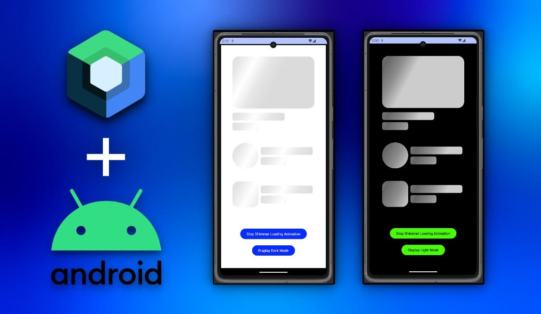
I will create a basic Android application with only Jetpack Compose in this article. This app will include some general placeholders for some general use cases such as a news image, title, subtitle, user image, etc.
In addition, the app will include two buttons. The first one is to start or stop the shimmer animation. Another one is to show dark mode shimmer loading animation.
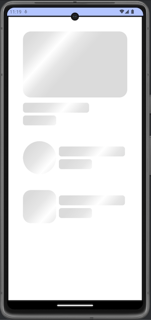
Basically, the final output will be this:
The full version of the Shimmer Loading Effect Animation.
If you would like to jump into a specific topic, this is the table of contents:
- Design of the Application
- Creating Shimmer Loading Effect Animation for Light and Dark Modes
- Manage Shimmer Loading Effect Animation and Display Modes
1) Design of the Application
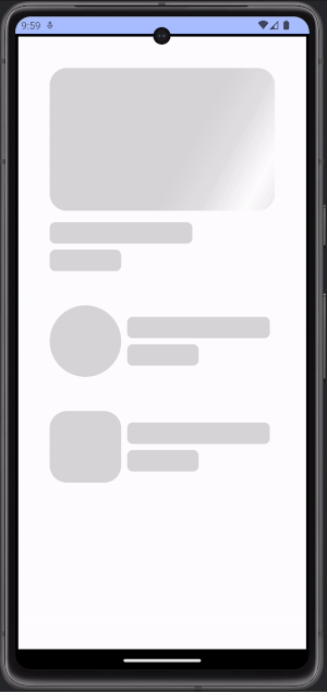
In this section, I do not want to focus too much on design. Generally, we need some placeholders for UI components. That is why I created three major placeholders. For example:
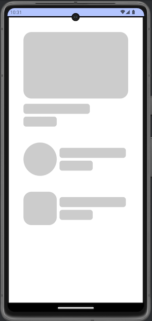
Three example placeholder components.
The target is having image + title + subtitle, placeholder groups. On the code side, I would like to separate them from each other. I created a new Kotlin file as HomeScreen.kt and I am calling it from MainActivity.kt:
// File: MainActivity.kt

import android.os.Bundle
import androidx.activity.ComponentActivity
import androidx.activity.compose.setContent
import androidx.compose.runtime.Composable

class MainActivity : ComponentActivity() {
    override fun onCreate(savedInstanceState: Bundle?) {
        super.onCreate(savedInstanceState)
        setContent {
            ShimmerLoadingAnimationTheme {
                HomeScreen()
            }
        }
    }
}
Let’s see HomeScreen.kt:
// File: HomeScreen.kt

import androidx.compose.foundation.BorderStroke
import androidx.compose.foundation.background
import androidx.compose.foundation.border
import androidx.compose.foundation.layout.Box
import androidx.compose.foundation.layout.Column
import androidx.compose.foundation.layout.Row
import androidx.compose.foundation.layout.Spacer
import androidx.compose.foundation.layout.fillMaxSize
import androidx.compose.foundation.layout.fillMaxWidth
import androidx.compose.foundation.layout.height
import androidx.compose.foundation.layout.padding
import androidx.compose.foundation.layout.size
import androidx.compose.foundation.shape.CircleShape
import androidx.compose.foundation.shape.RoundedCornerShape
import androidx.compose.material3.Button
import androidx.compose.material3.ButtonDefaults
import androidx.compose.material3.Text
import androidx.compose.runtime.Composable
import androidx.compose.runtime.getValue
import androidx.compose.runtime.mutableStateOf
import androidx.compose.runtime.remember
import androidx.compose.runtime.setValue
import androidx.compose.ui.Alignment
import androidx.compose.ui.Modifier
import androidx.compose.ui.draw.clip
import androidx.compose.ui.graphics.Color
import androidx.compose.ui.tooling.preview.Preview
import androidx.compose.ui.unit.dp

@Composable
fun HomeScreen() {
    Box(
        modifier = Modifier
            .fillMaxSize()
            .background(Color.White)
            .border(border = BorderStroke(width = 4.dp, color = Color.Black))
            .padding(48.dp)
    ) {
        Column(
            modifier = Modifier.align(alignment = Alignment.TopCenter)
        ) {

            Column {
                ComponentRectangle()
                Spacer(modifier = Modifier.padding(8.dp))
                ComponentRectangleLineLong()
                Spacer(modifier = Modifier.padding(4.dp))
                ComponentRectangleLineShort()
            }

            Spacer(modifier = Modifier.padding(24.dp))

            Row {
                ComponentCircle()
                Spacer(modifier = Modifier.padding(4.dp))
                Column {
                    Spacer(modifier = Modifier.padding(8.dp))
                    ComponentRectangleLineLong()
                    Spacer(modifier = Modifier.padding(4.dp))
                    ComponentRectangleLineShort()
                }
            }
            Spacer(modifier = Modifier.padding(24.dp))

            Row {
                ComponentSquare()
                Spacer(modifier = Modifier.padding(4.dp))
                Column {
                    Spacer(modifier = Modifier.padding(8.dp))
                    ComponentRectangleLineLong()
                    Spacer(modifier = Modifier.padding(4.dp))
                    ComponentRectangleLineShort()
                }
            }
        }
    }
}

@Composable
fun ComponentCircle() {
    Box(
        modifier = Modifier
            .background(color = Color.LightGray, shape = CircleShape)
            .size(100.dp)
    )
}

@Composable
fun ComponentSquare() {
    Box(
        modifier = Modifier
            .clip(shape = RoundedCornerShape(24.dp))
            .background(color = Color.LightGray)
            .size(100.dp)
    )
}

@Composable
fun ComponentRectangle() {
    Box(
        modifier = Modifier
            .clip(shape = RoundedCornerShape(24.dp))
            .background(color = Color.LightGray)
            .height(200.dp)
            .fillMaxWidth()
    )
}

@Composable
fun ComponentRectangleLineLong() {
    Box(
        modifier = Modifier
            .clip(shape = RoundedCornerShape(8.dp))
            .background(color = Color.LightGray)
            .size(height = 30.dp, width = 200.dp)
    )
}

@Composable
fun ComponentRectangleLineShort() {
    Box(
        modifier = Modifier
            .clip(shape = RoundedCornerShape(8.dp))
            .background(color = Color.LightGray)
            .size(height = 30.dp, width = 100.dp)
    )
}
You can see that I used Spacer() for paddings. It is just my preference for this demo project. Also, I used static height and width values. Of course, you can change all of them according to your needs.
Perfect! Now, we can start to implement shimmer loading effect animation into this design 🚀
2) Creating Shimmer Loading Effect Animation for Light and Dark Modes
I would like to handle topics step by step for this part. Let’s start with creating the first shimmer-loading effect animation. I assume that you already know extension functions, for instance:
// Example String extension function.

fun main() {
    println("I am Caner.".addHelloKeywordAtStart())
}

fun String.addHelloKeywordAtStart(): String {
    return "Hello, $this"
}

// Output:
// Hello, I am Caner.
You can copy the above code and press into https://play.kotlinlang.org then can see the result. Like this, we can create extension functions for Modifier. This is the key point to manipulate jetpack components.
// File: AnimationShimmerLoading.kt

import androidx.compose.foundation.background
import androidx.compose.ui.Modifier
import androidx.compose.ui.composed
import androidx.compose.ui.geometry.Offset
import androidx.compose.ui.graphics.Brush
import androidx.compose.ui.graphics.Color

fun Modifier.shimmerLoadingAnimation(): Modifier {
    return composed {

        val shimmerColors = listOf(
            Color.White.copy(alpha = 0.3f),
            Color.White.copy(alpha = 0.5f),
            Color.White.copy(alpha = 1.0f),
            Color.White.copy(alpha = 0.5f),
            Color.White.copy(alpha = 0.3f),
        )

        this.background(
            brush = Brush.linearGradient(
                colors = shimmerColors,
                start = Offset(x = 100f, y = 0.0f),
                end = Offset(x = 400f, y = 270f),
            ),
        )
    }
}
When you look at the above code, you can understand that it creates a linear brush gradient. It has a colour list to achieve a shimmer line. Also, 270f is an angle of axis Y.
Let’s see how we call it into our Home screen design. You can see it at the latest extension function of Modifiers:
OUR VIDEO RECOMMENDATION


Jobs
// File: HomeScreen.kt

import androidx.compose.foundation.BorderStroke
import androidx.compose.foundation.background
import androidx.compose.foundation.border
import androidx.compose.foundation.layout.Box
import androidx.compose.foundation.layout.Column
import androidx.compose.foundation.layout.Row
import androidx.compose.foundation.layout.Spacer
import androidx.compose.foundation.layout.fillMaxSize
import androidx.compose.foundation.layout.fillMaxWidth
import androidx.compose.foundation.layout.height
import androidx.compose.foundation.layout.padding
import androidx.compose.foundation.layout.size
import androidx.compose.foundation.shape.CircleShape
import androidx.compose.foundation.shape.RoundedCornerShape
import androidx.compose.material3.Button
import androidx.compose.material3.ButtonDefaults
import androidx.compose.material3.Text
import androidx.compose.runtime.Composable
import androidx.compose.runtime.getValue
import androidx.compose.runtime.mutableStateOf
import androidx.compose.runtime.remember
import androidx.compose.runtime.setValue
import androidx.compose.ui.Alignment
import androidx.compose.ui.Modifier
import androidx.compose.ui.draw.clip
import androidx.compose.ui.graphics.Color
import androidx.compose.ui.tooling.preview.Preview
import androidx.compose.ui.unit.dp

@Composable
fun HomeScreen() {
    Box(
        modifier = Modifier
            .fillMaxSize()
            .background(Color.White)
            .border(border = BorderStroke(width = 4.dp, color = Color.Black))
            .padding(48.dp)
    ) {
        Column(
            modifier = Modifier.align(alignment = Alignment.TopCenter)
        ) {

            Column {
                ComponentRectangle()
                Spacer(modifier = Modifier.padding(8.dp))
                ComponentRectangleLineLong()
                Spacer(modifier = Modifier.padding(4.dp))
                ComponentRectangleLineShort()
            }

            Spacer(modifier = Modifier.padding(24.dp))

            Row {
                ComponentCircle()
                Spacer(modifier = Modifier.padding(4.dp))
                Column {
                    Spacer(modifier = Modifier.padding(8.dp))
                    ComponentRectangleLineLong()
                    Spacer(modifier = Modifier.padding(4.dp))
                    ComponentRectangleLineShort()
                }
            }
            Spacer(modifier = Modifier.padding(24.dp))

            Row {
                ComponentSquare()
                Spacer(modifier = Modifier.padding(4.dp))
                Column {
                    Spacer(modifier = Modifier.padding(8.dp))
                    ComponentRectangleLineLong()
                    Spacer(modifier = Modifier.padding(4.dp))
                    ComponentRectangleLineShort()
                }
            }
        }
    }
}

@Composable
fun ComponentCircle() {
    Box(
        modifier = Modifier
            .background(color = Color.LightGray, shape = CircleShape)
            .size(100.dp)
            .shimmerLoadingAnimation() // <--- Here.
    )
}

@Composable
fun ComponentSquare() {
    Box(
        modifier = Modifier
            .clip(shape = RoundedCornerShape(24.dp))
            .background(color = Color.LightGray)
            .size(100.dp)
            .shimmerLoadingAnimation() // <--- Here.
    )
}

@Composable
fun ComponentRectangle() {
    Box(
        modifier = Modifier
            .clip(shape = RoundedCornerShape(24.dp))
            .background(color = Color.LightGray)
            .height(200.dp)
            .fillMaxWidth()
            .shimmerLoadingAnimation() // <--- Here.
    )
}

@Composable
fun ComponentRectangleLineLong() {
    Box(
        modifier = Modifier
            .clip(shape = RoundedCornerShape(8.dp))
            .background(color = Color.LightGray)
            .size(height = 30.dp, width = 200.dp)
            .shimmerLoadingAnimation() // <--- Here.
    )
}

@Composable
fun ComponentRectangleLineShort() {
    Box(
        modifier = Modifier
            .clip(shape = RoundedCornerShape(8.dp))
            .background(color = Color.LightGray)
            .size(height = 30.dp, width = 100.dp)
            .shimmerLoadingAnimation() // <--- Here.
    )
}
Now, when you run the code, you should see the below screenshot and it is normal totally.
The shimmer effect is displayed as constant.
However, we would like to animate this effect. To achieve this target, we need to use an animation library. I mentioned and used it in the Threads Invitation Card with Jetpack Compose article. You can check it if you would like to see a more complex example.
Adding animation into “.shimmerLoadingAnimation()” extension function:
import androidx.compose.animation.core.LinearEasing
import androidx.compose.animation.core.RepeatMode
import androidx.compose.animation.core.animateFloat
import androidx.compose.animation.core.infiniteRepeatable
import androidx.compose.animation.core.rememberInfiniteTransition
import androidx.compose.animation.core.tween
import androidx.compose.foundation.background
import androidx.compose.ui.Modifier
import androidx.compose.ui.composed
import androidx.compose.ui.geometry.Offset
import androidx.compose.ui.graphics.Brush
import androidx.compose.ui.graphics.Color

fun Modifier.shimmerLoadingAnimation(
    widthOfShadowBrush: Int = 500,
    angleOfAxisY: Float = 270f,
    durationMillis: Int = 1000,
): Modifier {
    return composed {

        val shimmerColors = listOf(
            Color.White.copy(alpha = 0.3f),
            Color.White.copy(alpha = 0.5f),
            Color.White.copy(alpha = 1.0f),
            Color.White.copy(alpha = 0.5f),
            Color.White.copy(alpha = 0.3f),
        )

        val transition = rememberInfiniteTransition(label = "")

        val translateAnimation = transition.animateFloat(
            initialValue = 0f,
            targetValue = (durationMillis + widthOfShadowBrush).toFloat(),
            animationSpec = infiniteRepeatable(
                animation = tween(
                    durationMillis = durationMillis,
                    easing = LinearEasing,
                ),
                repeatMode = RepeatMode.Restart,
            ),
            label = "Shimmer loading animation",
        )

        this.background(
            brush = Brush.linearGradient(
                colors = shimmerColors,
                start = Offset(x = translateAnimation.value - widthOfShadowBrush, y = 0.0f),
                end = Offset(x = translateAnimation.value, y = angleOfAxisY),
            ),
        )
    }
}
Let’s describe what they are:
widthOfShadowBrush: Width of our brush line. It can be bold or thin according to your value. I set it as 500. When you decrease it, you need to update angleOfAxisY because drawing bold and thin lines are not the same, do not forget.durationMillis: This duration of your shimmer loading animation. You can edit it as slow or fast.transition: I would like to create infinite animation so I defined it as an infinite transition.translateAnimation: It is our real animation.initialValueoftranslateAnimation: It is the start point.targetValueoftranslateAnimation: We need to sum duration and widthOfShadowBrush. Otherwise, the shimmer animation disappears without completing the expected behaviour.
Now, we can see the moving shimmer loading effect animation:
Basic shimmer loading effect animation.
It seems good but how we can create for dark mode? Or how can we create a shadow shimmer loading effect? The answer is updating colours.
Firstly, please update the background of HomeScreen.kt:
@Composable
fun HomeScreen() {
    Box(
        modifier = Modifier
            .fillMaxSize()
            .background(Color.Black) // <-- Here.
...
}
Secondly, change the colours of “.shimmerLoadingAnimation()” extension function:
val shimmerColors = listOf(
    Color.Black.copy(alpha = 0.0f),
    Color.Black.copy(alpha = 0.3f),
    Color.Black.copy(alpha = 0.5f),
    Color.Black.copy(alpha = 0.3f),
    Color.Black.copy(alpha = 0.0f),
)
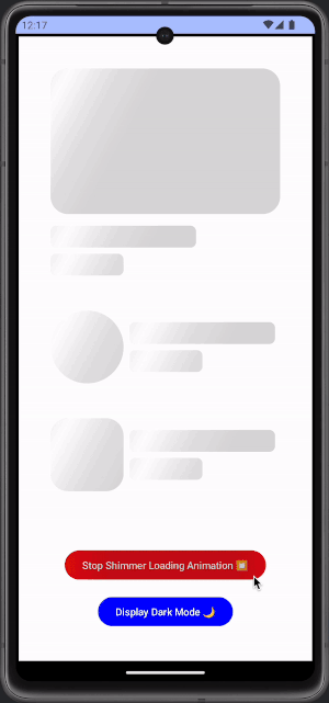
Now, you can observe dark mode shadow shimmer loading effect animation:
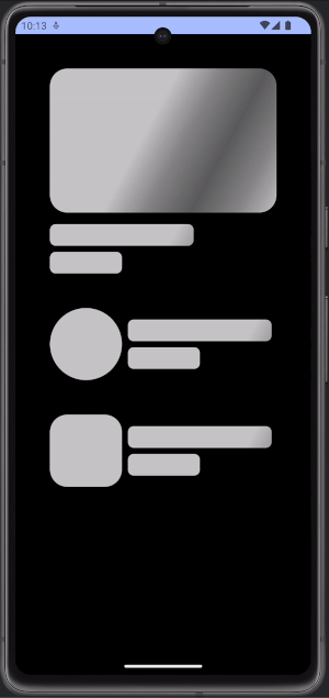
Basic shadow shimmer loading effect animation.
Well done! You learned to create the shimmer loading effect with Jetpack Compose animation for two popular design modes! In addition, you can modify it according to the requirements of your project. 👏
3) Manage Shimmer Loading Effect Animation and Display Modes
In this bonus part, we can manage our shimmer loading effect animation according to our actions. I will add two buttons for:
- Start/Stop shimmer animation
- Display light/dark modes
First of all, I would like to start with updating our “.shimmerLoadingAnimation()” extension function. We need to have two parameters; one is for start/stop, another is for light/dark modes:
import androidx.compose.animation.core.LinearEasing
import androidx.compose.animation.core.RepeatMode
import androidx.compose.animation.core.animateFloat
import androidx.compose.animation.core.infiniteRepeatable
import androidx.compose.animation.core.rememberInfiniteTransition
import androidx.compose.animation.core.tween
import androidx.compose.foundation.background
import androidx.compose.ui.Modifier
import androidx.compose.ui.composed
import androidx.compose.ui.geometry.Offset
import androidx.compose.ui.graphics.Brush
import androidx.compose.ui.graphics.Color

fun Modifier.shimmerLoadingAnimation(
    isLoadingCompleted: Boolean = true, // <-- New parameter for start/stop.
    isLightModeActive: Boolean = true, // <-- New parameter for display modes.
    widthOfShadowBrush: Int = 500,
    angleOfAxisY: Float = 270f,
    durationMillis: Int = 1000,
): Modifier {
    if (isLoadingCompleted) { // <-- Step 1.
        return this
    }
    else {
        return composed {

            // Step 2.
            val shimmerColors = ShimmerAnimationData(isLightMode = isLightModeActive).getColours()

            val transition = rememberInfiniteTransition(label = "")

            val translateAnimation = transition.animateFloat(
                initialValue = 0f,
                targetValue = (durationMillis + widthOfShadowBrush).toFloat(),
                animationSpec = infiniteRepeatable(
                    animation = tween(
                        durationMillis = durationMillis,
                        easing = LinearEasing,
                    ),
                    repeatMode = RepeatMode.Restart,
                ),
                label = "Shimmer loading animation",
            )

            this.background(
                brush = Brush.linearGradient(
                    colors = shimmerColors,
                    start = Offset(x = translateAnimation.value - widthOfShadowBrush, y = 0.0f),
                    end = Offset(x = translateAnimation.value, y = angleOfAxisY),
                ),
            )
        }
    }
}

data class ShimmerAnimationData(
    private val isLightMode: Boolean
) {
    fun getColours(): List<Color> {
        return if (isLightMode) {
            val color = Color.White

            listOf(
                color.copy(alpha = 0.3f),
                color.copy(alpha = 0.5f),
                color.copy(alpha = 1.0f),
                color.copy(alpha = 0.5f),
                color.copy(alpha = 0.3f),
            )
        } else {
            val color = Color.Black

            listOf(
                color.copy(alpha = 0.0f),
                color.copy(alpha = 0.3f),
                color.copy(alpha = 0.5f),
                color.copy(alpha = 0.3f),
                color.copy(alpha = 0.0f),
            )
        }
    }
}
As you can see, the new version of our function includes two new parameters:
isLoadingCompleted: To manage start/stop for animation. If it is false, it returns just itself of Modifier. So, we have if(isLoadingCompleted) { return this } else { … } — Step 1.isLightModeActive: To manage display mode for animation. Basically, I would like to change the colour list according to it’s value; ShimmerAnimationData(isLightMode = isLightModeActive).getColours() — Step 2.
Now, we can focus on HomeScreen.kt file. Firstly, we need to handle the state of animation status and display mode. So, let’s create two variables in HomeScreen function:
@Composable
fun HomeScreen() {

    var isLoadingCompleted by remember { mutableStateOf(true) } // <-- Here.
    var isLightModeActive by remember { mutableStateOf(true) } // <-- Here.

    Box(
        modifier = Modifier
            .fillMaxSize()
            // Do not forget to update backgroud according to display mode!
            .background(color = if (isLightModeActive) Color.White else Color.Black)
            .border(border = BorderStroke(width = 4.dp, color = Color.Black))
            .padding(48.dp)
    ) {
...
}
As you know, we need to use remember delegation. Otherwise, recomposition will reset our variables with the initial value. That means isLoadingCompleted and isLightModeActive will always be true.
In addition, do not forget to update the background according to the display mode. Otherwise, it always has a white background.
Now, we can pass them into our components:
@Composable
fun HomeScreen() {

    var isLoadingCompleted by remember { mutableStateOf(true) }
    var isLightModeActive by remember { mutableStateOf(true) }

    Box(
        modifier = Modifier
            .fillMaxSize()
            .background(color = if (isLightModeActive) Color.White else Color.Black)
            .border(border = BorderStroke(width = 4.dp, color = Color.Black))
            .padding(48.dp)
    ) {
        Column(
            modifier = Modifier.align(alignment = Alignment.TopCenter)
        ) {

            Column {
                ComponentRectangle(isLoadingCompleted, isLightModeActive)
                Spacer(modifier = Modifier.padding(8.dp))
                ComponentRectangleLineLong(isLoadingCompleted, isLightModeActive)
                Spacer(modifier = Modifier.padding(4.dp))
                ComponentRectangleLineShort(isLoadingCompleted, isLightModeActive)
            }

            Spacer(modifier = Modifier.padding(24.dp))

            Row {
                ComponentCircle(isLoadingCompleted, isLightModeActive)
                Spacer(modifier = Modifier.padding(4.dp))
                Column {
                    Spacer(modifier = Modifier.padding(8.dp))
                    ComponentRectangleLineLong(isLoadingCompleted, isLightModeActive)
                    Spacer(modifier = Modifier.padding(4.dp))
                    ComponentRectangleLineShort(isLoadingCompleted, isLightModeActive)
                }
            }
            Spacer(modifier = Modifier.padding(24.dp))

            Row {
                ComponentSquare(isLoadingCompleted, isLightModeActive)
                Spacer(modifier = Modifier.padding(4.dp))
                Column {
                    Spacer(modifier = Modifier.padding(8.dp))
                    ComponentRectangleLineLong(isLoadingCompleted, isLightModeActive)
                    Spacer(modifier = Modifier.padding(4.dp))
                    ComponentRectangleLineShort(isLoadingCompleted, isLightModeActive,)
                }
            }
        }
    }
}

@Composable
fun ComponentCircle(
    isLoadingCompleted: Boolean,
    isLightModeActive: Boolean,
) {
    Box(
        modifier = Modifier
            .background(color = Color.LightGray, shape = CircleShape)
            .size(100.dp)
            .shimmerLoadingAnimation(isLoadingCompleted, isLightModeActive)
    )
}

@Composable
fun ComponentSquare(
    isLoadingCompleted: Boolean,
    isLightModeActive: Boolean,
) {
    Box(
        modifier = Modifier
            .clip(shape = RoundedCornerShape(24.dp))
            .background(color = Color.LightGray)
            .size(100.dp)
            .shimmerLoadingAnimation(isLoadingCompleted, isLightModeActive)
    )
}

@Composable
fun ComponentRectangle(
    isLoadingCompleted: Boolean,
    isLightModeActive: Boolean,
) {
    Box(
        modifier = Modifier
            .clip(shape = RoundedCornerShape(24.dp))
            .background(color = Color.LightGray)
            .height(200.dp)
            .fillMaxWidth()
            .shimmerLoadingAnimation(isLoadingCompleted, isLightModeActive)
    )
}

@Composable
fun ComponentRectangleLineLong(
    isLoadingCompleted: Boolean,
    isLightModeActive: Boolean,
) {
    Box(
        modifier = Modifier
            .clip(shape = RoundedCornerShape(8.dp))
            .background(color = Color.LightGray)
            .size(height = 30.dp, width = 200.dp)
            .shimmerLoadingAnimation(isLoadingCompleted, isLightModeActive)
    )
}

@Composable
fun ComponentRectangleLineShort(
    isLoadingCompleted: Boolean,
    isLightModeActive: Boolean,
) {
    Box(
        modifier = Modifier
            .clip(shape = RoundedCornerShape(8.dp))
            .background(color = Color.LightGray)
            .size(height = 30.dp, width = 100.dp)
            .shimmerLoadingAnimation(isLoadingCompleted, isLightModeActive)
    )
}
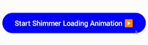
At this moment, only one part is missing which are buttons to start/stop animation and change display mode. Let’s create these buttons. First is start/stop animation button:
@Composable
fun ContentLoadingButton(
    modifier: Modifier,
    onClick: () -> Unit, // <-- Here.
    isLoadingCompleted: Boolean,
    isLightMode: Boolean,
) {
    var isStartMode by remember { mutableStateOf(true) }

    Button(
        modifier = modifier,
        onClick = {
            isStartMode = !isStartMode
            onClick() // <-- Here.
        },
        colors = ButtonDefaults.buttonColors(
            containerColor =
            if (isLightMode) {
                if (isStartMode) Color.Blue else Color.Red
            } else {
                if (isStartMode) Color.Green else Color.Red
            }
        )
    ) {
        Text(
            text = if (isLoadingCompleted) {
                "Start Shimmer Loading Animation ▶\uFE0F"
            } else {
                "Stop Shimmer Loading Animation ⏹\uFE0F"
            },
            color = if (isLightMode) {
                Color.White
            } else {
                if (isStartMode) Color.Black else Color.White
            }
        )
    }
}
When you click the button, onClick() function parameter will run. We did not define it yet. Otherwise, it has just isStartMode as a local state to manage its own UI parts such as text and colour.
Start/Stop shimmer loading effect animation button.
Secondly, we can create a display mode button:
@Composable
fun ContentModeButton(
    modifier: Modifier,
    onClick: () -> Unit, // <-- Here.
    isLightMode: Boolean,
) {
    Button(
        modifier = modifier,
        onClick = {
          onClick() // <-- Here.
        },
        colors = ButtonDefaults.buttonColors(
            containerColor = if (isLightMode) Color.Blue else Color.Green
        )
    ) {
        Text(
            text = if (isLightMode) {
                "Display Dark Mode \uD83C\uDF19"
            } else {
                "Display Light Mode ☀\uFE0F"
            },
            color = if (isLightMode) Color.White else Color.Black
        )
    }
}
It has a similar logic as the start/stop button, for instance:
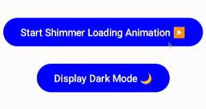
Display mode button and its effects.
Now, we can move to use them in our HomeScreen function:
@Composable
fun HomeScreen() {

    var isLoadingCompleted by remember { mutableStateOf(true) }
    var isLightModeActive by remember { mutableStateOf(true) }

    Box(
        modifier = Modifier
            .fillMaxSize()
            .background(color = if (isLightModeActive) Color.White else Color.Black)
            .border(border = BorderStroke(width = 4.dp, color = Color.Black))
            .padding(48.dp)
    ) {
        Column(
            modifier = Modifier.align(alignment = Alignment.TopCenter)
        ) {

            Column {
                ComponentRectangle(isLoadingCompleted, isLightModeActive)
                Spacer(modifier = Modifier.padding(8.dp))
                ComponentRectangleLineLong(isLoadingCompleted, isLightModeActive)
                Spacer(modifier = Modifier.padding(4.dp))
                ComponentRectangleLineShort(isLoadingCompleted, isLightModeActive)
            }

            Spacer(modifier = Modifier.padding(24.dp))

            Row {
                ComponentCircle(isLoadingCompleted, isLightModeActive)
                Spacer(modifier = Modifier.padding(4.dp))
                Column {
                    Spacer(modifier = Modifier.padding(8.dp))
                    ComponentRectangleLineLong(isLoadingCompleted, isLightModeActive)
                    Spacer(modifier = Modifier.padding(4.dp))
                    ComponentRectangleLineShort(isLoadingCompleted, isLightModeActive)
                }
            }
            Spacer(modifier = Modifier.padding(24.dp))

            Row {
                ComponentSquare(isLoadingCompleted, isLightModeActive)
                Spacer(modifier = Modifier.padding(4.dp))
                Column {
                    Spacer(modifier = Modifier.padding(8.dp))
                    ComponentRectangleLineLong(isLoadingCompleted, isLightModeActive)
                    Spacer(modifier = Modifier.padding(4.dp))
                    ComponentRectangleLineShort(isLoadingCompleted, isLightModeActive,)
                }
            }
        }

        // New part starts for two buttons.
        Column(
            modifier = Modifier.align(alignment = Alignment.BottomCenter),
        ) {

            ContentLoadingButton(
                modifier = Modifier.align(alignment = Alignment.CenterHorizontally),
                isLightMode = isLightModeActive,
                isLoadingCompleted = isLoadingCompleted,
                onClick = {
                    isLoadingCompleted = !isLoadingCompleted
                }
            )

            Spacer(modifier = Modifier.padding(8.dp))

            ContentModeButton(
                modifier = Modifier.align(alignment = Alignment.CenterHorizontally),
                onClick = {
                    isLightModeActive = !isLightModeActive
                },
                isLightMode = isLightModeActive
            )
        }
        // New part ends for two buttons.
    }
}
By adding a code block between “New part starts for two buttons” and “New part ends for two buttons”, you will be able to see the two buttons and manage all logic, like below:
Full functionality of the project.
Congratulations! You completed: Shimmer Loading Effect Animation with Jetpack Compose 👏

You can reach me on social media and other platforms, stay tuned: https://linktr.ee/canerkaseler 🤝
Thanks! ☕️
This article was previously published on proandroiddev.com


