

Motivation
I like cool animations inside the different apps, but there often isn’t much time to work on them unless someone requests it. One of my favorites is the Glovo animation on the main screen, where you can drag items inside the circle and play around for a while before you order something. That’s why I want to recreate this animation by myself.
It won’t be an identical implementation, just a similar idea that will be implemented in an easy way using Jetpack Compose.
Also, I won’t explain the principles of sine and cosine; from my point of view, they’re just something you need to remember without deep knowledge, especially at the start. But I added a useful link in the second part where you can get more knowledge about this topic.
There are many details in the code comments, so please pay attention.
En avante!
Simple circles
Let’s start with a simple part — creating a Composable for our animation. We need the main item (that will be in the center of a component), secondary items with text and path (that will be around main item), circle radius for whole component and radius for our small circles inside, text style for title, onClick callback and modifier.
| data class GlovoItem( | |
| val title: String, | |
| val path: Path | |
| ) | |
| @Composable | |
| fun GoalsComponent( | |
| modifier: Modifier = Modifier, | |
| goals: List<Goal> = emptyList(), | |
| mainCircleRadius: Dp = 130.dp, | |
| innerCircleRadius: Dp = 60.dp, | |
| textStyle: TextStyle = MaterialTheme.typography.body2, | |
| onGoalClick: (Goal) -> Unit, | |
| ) |
Next we will draw circles to see something on our screen. For this we need Canvas on which we will draw. It’s easy to draw one circle in the middle using the drawCircle function. One thing to mention, canvas working with pixels, not with Dp (density-independent pixels).
| Canvas(modifier = modifier) { | |
| drawCircle( | |
| color = Color.White, | |
| radius = innerCircleRadius.toPx(), | |
| center = center | |
| ) | |
| } |
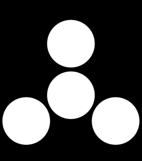
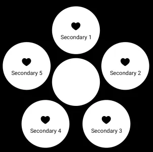
Next step is to add secondary circles. It’s a little bit harder, because we need to count distances and draw them appropriately around the main circle.
| // Draw secondary items | |
| items.forEachIndexed { i, item -> | |
| // Firstly count the angle on which we | |
| // should position secondary item in degrees | |
| // -90 will help to position degrees in | |
| // the right appropriately (you can play around with that) | |
| val angleInDegrees = (i * distance - 90) | |
| // Convert angle to radians | |
| val angleInRad = angleInDegrees * (PI / 180).toFloat() | |
| // In essence, this function helps | |
| // find the coordinates of a point on a circle based | |
| // on its radius (mainCircleRadius), | |
| // center (circleCenter), and the angle (angleInRad) | |
| // at which you want to find the point. | |
| val currentOffset = Offset( | |
| x = mainCircleRadius.toPx() * cos(angleInRad) + circleCenter.x, | |
| y = mainCircleRadius.toPx() * sin(angleInRad) + circleCenter.y | |
| ) | |
| drawCircle( | |
| color = Color.White, | |
| radius = innerCircleRadius.toPx(), | |
| center = currentOffset | |
| ) | |
| } |
Generally, we calculate the equal distance in degrees between each circle. Then calculate the points on our main circle. These points will be the center for secondary items. Then, we draw them using the same function as before for the main circle.
Path icon
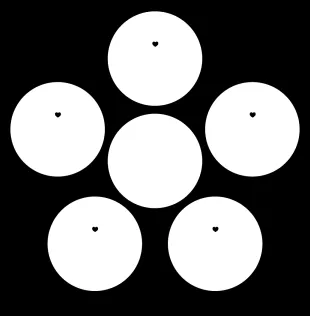
Now it looks better. But let’s add some individuality to each of these plain circles. In our case it would be title and icon. As an icon I would use a path. Path is the route or trajectory you want your drawing tool to follow. It’s like giving directions to a pen or brush on where to go on the canvas to create shapes or lines.
We will start with the icon. You can draw Path by yourself or download icons as svg and then save the internals of this file in res/values/strings.xml. I’ve chosen the second option. It should look something like this:
<string name="default_path">M2 9.1371C2 14 6.01943 16.5914 8.96173 18.9109C10 19.7294 11 20.5 12 20.5C13 20.5 14 19.7294 15.0383 18.9109C17.9806 16.5914 22 14 22 9.1371C22 4.27416 16.4998 0.825464 12 5.50063C7.50016 0.825464 2 4.27416 2 9.1371Z</string>
To convert the path-string to a Path object we will use PathParser. I will use only one icon for simplicity, but it wouldn’t be a problem to use another one.
| val defaultPath = PathParser().parsePathString(getString(R.string.default_path)) | |
| .toPath() | |
| GlovoLikeAnimation( | |
| onGoalClick = {}, | |
| mainItem = GlovoItem("Main", defaultPath), | |
| items = listOf( | |
| GlovoItem("Secondary 1", defaultPath), | |
| GlovoItem("Secondary 2", defaultPath), | |
| GlovoItem("Secondary 3", defaultPath), | |
| GlovoItem("Secondary 4", defaultPath), | |
| GlovoItem("Secondary 5", defaultPath), | |
| ) | |
| ) |
We have our path, but there is a small problem, we need to position it in the center of our circle. If we don’t do that, it will be drawn somewhere in the top left corner. Hopefully, compose gives us this possibility with translation extension.
| // Get the path bounds to translate | |
| // path exactly to the center of the circle | |
| val pathBounds = item.path.getBounds() | |
| // Move our path to the new position | |
| translate( | |
| left = currentOffset.x - pathBounds.right / 2, | |
| top = currentOffset.y - 15.dp.toPx() - pathBounds.bottom | |
| ) { | |
| drawPath( | |
| path = item.path, | |
| color = Color.Black | |
| ) | |
| } |
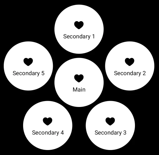
With a few simple calculations, we positioned our icon in the middle. Also, I added a small space on the bottom. Because we also need to draw titles. But here is another problem — the path is too small. Let’s make it big and “powerful”. In this mission, composition will help us with another extension function — scale. First, add a scale factor to the Composable.
// Scale factor for icon
   iconScale: Float = 3f
And now we used this scale to our translate and scale functions.
| // Move our path to the new position | |
| translate( | |
| left = currentOffset.x - (pathBounds.right * iconScale) / 2, | |
| top = currentOffset.y - 15.dp.toPx() - pathBounds.bottom | |
| ) { | |
| // Increase path in 3 times | |
| scale(scale = iconScale, pivot = pathBounds.topLeft) { | |
| drawPath( | |
| path = item.path, | |
| color = Color.Black | |
| ) | |
| } | |
| } |
OUR VIDEO RECOMMENDATION


Jobs
This is how it was, and look at it now!
Text
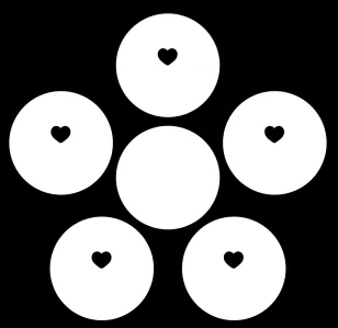
Moving on to the last aspect of individuality: text. Firstly, add the TextMeasurer. In simpler terms, the Text Measurer helps you plan and design your user interface by giving you information about the size of text elements before they’re displayed.
| // Object that will help us to measure and customize text | |
| val textMeasurer = rememberTextMeasurer() | |
| // Calculate all needed info for text drawing | |
| val measurementResult = textMeasurer.measure( | |
| item.title, | |
| constraints = Constraints( | |
| // Set constraints to prevent overflow | |
| maxWidth = (innerCircleRadius.toPx() * 2 - 16.dp.toPx()).toInt() | |
| ), | |
| // Set style for the text | |
| style = textStyle.copy( | |
| textAlign = TextAlign.Center, | |
| fontSize = textStyle.fontSize | |
| ) | |
| ) | |
| drawText( | |
| textLayoutResult = measurementResult, | |
| // For text we need to set top left corner from which drawing will be started | |
| // in this case I set text in the middle | |
| topLeft = Offset( | |
| x = currentOffset.x - measurementResult.size.width / 2, | |
| y = currentOffset.y + pathBounds.height | |
| ) | |
| ) |
After some manipulations with the text measurer and Offset, we set text in the middle of a circle above the path icon.
I added all this code to an extension function to reuse it for the main circle and add some simplicity to code.
| fun DrawScope.drawCircleInfo( | |
| item: GlovoItem, | |
| innerCircleRadius: Dp, | |
| iconScale: Float, | |
| textStyle: TextStyle, | |
| textMeasurer: TextMeasurer, | |
| animationValue: Float, | |
| currentOffset: Offset | |
| ) { | |
| // Draw secondary items with counted offset | |
| drawCircle( | |
| color = Color.White, | |
| radius = innerCircleRadius.toPx() * animationValue, | |
| center = currentOffset | |
| ) | |
| // Get the path bounds to translate path exactly to the center of the circle | |
| val pathBounds = item.path.getBounds() | |
| // Move our path to the new position | |
| translate( | |
| left = currentOffset.x - (pathBounds.right * iconScale) / 2, | |
| top = currentOffset.y - 15.dp.toPx() - pathBounds.bottom | |
| ) { | |
| // Increase path in 3 times | |
| scale(scale = iconScale * animationValue, pivot = pathBounds.topLeft) { | |
| drawPath( | |
| path = item.path, | |
| color = Color.Black | |
| ) | |
| } | |
| } | |
| // Calculate all needed info for text drawing | |
| val measurementResult = textMeasurer.measure( | |
| item.title, | |
| constraints = Constraints( | |
| // Set constraints to prevent overflow | |
| maxWidth = (innerCircleRadius.toPx() * 2 - 16.dp.toPx()).toInt() | |
| ), | |
| // Set style for the text | |
| style = textStyle.copy( | |
| textAlign = TextAlign.Center, | |
| fontSize = textStyle.fontSize * animationValue | |
| ) | |
| ) | |
| drawText( | |
| textLayoutResult = measurementResult, | |
| // For text we need to set top left corner from which drawing will be started | |
| // in this case I set text in the middle | |
| topLeft = Offset( | |
| x = currentOffset.x - measurementResult.size.width / 2, | |
| y = currentOffset.y + pathBounds.height | |
| ) | |
| ) | |
| } | |
Change the main circle drawing function to this.
| val mainCircleOffset = Offset(x = circleCenter.x, y = circleCenter.y) | |
| // Draw main circle in the center | |
| drawCircleInfo( | |
| item = mainItem, | |
| innerCircleRadius = innerCircleRadius, | |
| iconScale = iconScale, | |
| textStyle = textStyle, | |
| textMeasurer = textMeasurer, | |
| animationValue = animateFloat.value, | |
| currentOffset = mainCircleOffset | |
| ) |
And this is what we get in the end!
Conclusion
In the first part of the article, we took our first steps with Canvas, Path, and text drawing. Also, we used a few calculations that can be useful when you work with Canvas. If you want to see the whole implementation, you can find it in the link below.
In the second part we will discuss how to add draggability and appearance animation.
https://github.com/AndreVero/GlovoLikeAnimation?source=post_page—–90c7f50a6230——————————–
This article is previously published on proandroiddev.com


