

Featured in Android Weekly Issue #614, Kotlin Weekly Issue #398, and jetc.dev Issue #205
Jetpack Compose is awesome. I’m probably preaching to the choir in saying that it gave native Android development the “shot in the arm” it sorely needed after ~10 years of XML and Views. It claims to be modern and intuitive, and it is—it’s easy to rave about the Kotlin-only APIs, the reduced lines of code for both simple and complex UIs, how it’s designed for unidirectional data flow (UDF), the growing tooling/community support… However, a quote from the official Why adopt Compose documentation sums it up quite nicely:
“There are fewer steps between the thing you want to make and actually making it.”
I’d wager that this is the “north star” of Compose (and any UI toolkit for that matter): making it easier to implement what your product team—whether that’s you as an indie developer or an entire team of designers—has envisioned. Compose is very good at doing this in most cases but, in my opinion, it could be better in one particular, important area: design systems.
Why are design systems important in the context of Compose?
Before we dive in: If you need an introduction to or a refresher on design systems, Figma has conveniently started publishing a series on the topic starting with Design systems 101: What is a design system? I also recommend checking out designsystems.com (also by Figma) and reading Design That Scales by
.
Design systems are the “secret sauce” (of truth) for UIs at scale. Just as Compose seems to be the UI-toolkit-shaped silver bullet for Android development (and possibly other platforms), design systems have the same sleek, shiny casing in the world of product design, and they’re here to stay.
Your aforementioned product team is very likely using a design system to manage tokens, themes/styles, components, patterns, screens, flows, and more. They’re also very likely using Figma, the current industry standard product design tool, which is built to support (and encourages!) design systems. There’s no hiding from them, even as a developer.
If your product team is using a design system as the digital “building blocks” for your product’s representation in Figma (or any other design tool for that matter), then it follows that these building blocks should be translated to code for said product’s representation as… A codebase (in this case, a Compose one). There are different ways of going about this, but ideally, you’d have a standalone package/module/library within your codebase that purely represents your design system, depended on and used by features, to ensure visual and behavioral consistency, reduce code repetition, allow for catalog apps and screenshot testing, etc.
Side note: You might have recently noticed an uptick in “design engineering” positions in tech i.e. dedicated teams and individuals whose job it is to liaise directly with product teams to ensure that their design systems are represented and maintained accurately in code, thus alleviating this responsibility from those that use the design system to build features and experiments. Check out these positions from Square, Airbnb, CVS Health, Wolt, and SumUp (some might be expired, sorry). Again, there’s no hiding from design systems!
As it turns out, Compose includes a design system out of the box: Material Design. It’s been Google and Android’s design system since 2014, has seen 3 major versions, and includes a mature suite of styles and components that make up the overall spec. It’s also the default look and feel for Compose. Material is represented in code for Compose in two official Google libraries: Compose Material (represents Material 2) and Compose Material 3 (preferred, represents Material 3 a.k.a Material You). Material 1 predates Compose so there’s no library for that. Regardless of which version you’re dealing with, they occupy the outermost position of the Jetpack Compose architectural layering:
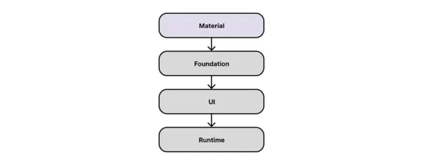
Compose Material libraries are primarily built using APIs in the layers below them, Foundation, and UI, which include lower-level building blocks like Row, Column, graphics/ text rendering, gesture recognition handlers, and more. The layering guide claims that Foundation is “design system agnostic” (true) and that “you might consider building upon the foundation layer to create your own design system.” I suppose you could, but is it realistic to think that all custom design systems built in Compose should implement their own Button, CheckBox, or TextField from scratch? Probably not. Thus most developers would likely use Material as the starting point for their design system implementations, hoping to benefit from code reuse, under-the-hood accessibility (a11y) support, and a baseline set of themes/styles and components that they can customize to meet their product team’s expectations…
So, back to that “north star”: does Material make it easier to implement a design system in Compose? As always, it depends… In some ways, yes, but in more ways, in my opinion, unfortunately not.
How is Compose not great for implementing design systems?
In my experience the biggest issues with Compose, when it comes to implementing custom design systems, are summarized as follows:
- Material Design is an opinionated, not general, design system. Intentional decisions and restrictions form part of this overall opinion e.g. no support for gradients or blurs, elevation represented by shadows in Material 2 vs. tonal color overlays in Material 3, very particular color roles (which can be influenced by wallpaper colors), etc…
- … This opinion directly influences the shape of the Compose Material APIs (and some APIs in other layers, too). Unfortunately, this has led to a large amount of variance in the flexibility of these APIs, with most of them leaning more towards being inflexible…
- … These inflexible APIs make it difficult to build custom design systems on top of them…
- … In these cases, the general guidance for developers is to either try to extend/replace Material, copy the source code into their codebases and adjust as needed, or implement things entirely from scratch…
- … This ultimately leads to time wasted in trying to “massage” Material into a custom design system and/or maintaining more code than is desirable (both of which can lead to headaches when Material decides to change something.)
You shouldn’t just take my word for it, though. Here are some quotes from notable developers in the Android/Compose community working at large-scale companies (yes, I did get their permission!):
“Not sure if it’s a feature request or just a complaint, but I find it tricky to square “if the first-party component doesn’t suit your needs, just copy it and modify it!” with the fact that they almost exclusively use private abstraction APIs that are impossible to reuse without copying out the entire system. I get why they’re not public, but I also feel like there’s not actually a story for tweaking components. Material feels either all-in or all-out.” —
, Slack
“Our design system uses basically nothing from the [Material] API. Slider is such a good example of how this can be done without the issues.” —
, Hinge
“This is probably an artifact of Compose still being pretty immature, still, the few times we have wrapped Material components instead of full re-implementations, we have historically always ended up dearly regretting it and having to reimplement them anyway. Typically because a Compose (hence Material) update subtly changes how these widgets behave (intentionally or not), and this ends up creating bugs on our end.” —
, Instacart
“I think Google needs to clarify who Material is designed for. Is it only intended to be used by Google’s own apps? Then the restrictions are understandable but the components should probably not be public. Is it intended to be used as an implementation detail for other companies’ design systems? Then it should be a lot more flexible. Or is it only intended for hobby apps?” —
, Block
Still not convinced? To illustrate these issues, let’s take a look at what should be a fairly simple example: custom buttons.
I mocked up three different buttons in Figma — the standard Material 3 button, the Duolingo button, and the Tinder button (named “language app button” and “dating app button” from here on). I chose the second two as they’re distinctly different from the Material 3 button and incorporate interesting design choices like zero blur drop shadows and gradients:

Note 1: These Figma mockups are quick approximations and shouldn’t be considered exact replicas!
Note 2: The code examples that follow are highly simplified and only explore basic visual adjustments. They don’t cover handling light/dark theme, enabled/disabled states, interaction sources, etc.
Material 3 button
Let’s start with the standard Material 3 Button, which (surprise, surprise) requires the least amount of code:
@Composable
fun Material3Button(
    onClick: () -> Unit,
    modifier: Modifier = Modifier,
    enabled: Boolean = true,
    content: @Composable RowScope.() -> Unit,
) {
    Button(
        onClick = onClick,
        modifier = modifier,
        enabled = enabled,
        content = content,
    )
}

@Composable
@Preview
fun Material3ButtonPreview() {
    MaterialTheme {
        Material3Button(onClick = {}) {
            Text(text = "Button")
        }
    }
}

Nice and easy!
Language app button
Next, let’s try that language app button. First, we need to do some theming setup. By inspecting the Material 3 button source code (i.e. lots of cmd-clicking in Android Studio) and working our way through layers of defaults and tokens, we can eventually determine that Button uses MaterialTheme.colorScheme.primary for its background, MaterialTheme.colorScheme.onPrimary for its content, and MaterialTheme.typography.labelLarge for its label. It uses a non-theme-mapped token called ShapeKeyTokens.CornerFull for its background shape, so we’ll need to use MaterialTheme.shapes.small here instead. We also need a color role for the drop shadow, so let’s use MaterialTheme.colorScheme.secondary (not taking into account how this may affect other Material components). The theming code looks as follows:
@Composable
fun LanguageAppTheme(
    content: @Composable () -> Unit,
) {
    MaterialTheme(
        colorScheme = languageAppLightColorScheme,
        typography = languageAppTypography,
        shapes = languageAppShapes,
        content = content,
    )
}

val languageAppLightColorScheme = lightColorScheme(
    // Used for button background
    primary = Color(0xFF58CC02),
    // Used for button content
    onPrimary = Color.White,
    // Used for button shadow
    secondary = Color(0xFF6CA530),
)

val languageAppFontFamily = FontFamily(
    Font(R.font.din_alternate, FontWeight.Normal),
)

val languageAppTypography = Typography(
    // Used for button label
    labelLarge = TextStyle(
        fontFamily = languageAppFontFamily,
        fontSize = 16.sp,
        letterSpacing = 1.5.sp,
    )
)

val languageAppShapes = Shapes(
    // Used for button background
    small = RoundedCornerShape(size = 12.dp),
)
We can now implement the language app button itself. We’ll try and use the approach of “wrapping” the Material component. The biggest challenge here is the drop shadow without a blur. While this was easy to do in Figma, we’ll slowly find that this isn’t the case when using a Compose Button. The elevation parameter? Using Modifier.shadow? Unfortunately, neither of these supports a zero blur radius or 5dp y-offset. To be clear, this isn’t all Compose Material’s fault — shadow rendering primarily lives in Compose UI. Nevertheless, we can resort to solutions such as Modifier.drawBehind. The button code looks as follows:
@Composable
fun LanguageAppButton(
    onClick: () -> Unit,
    modifier: Modifier = Modifier,
    enabled: Boolean = true,
    content: @Composable RowScope.() -> Unit,
) {
    LanguageAppTheme {
        val buttonHeight = 48.dp
        val shadowColor = MaterialTheme.colorScheme.secondary
        val shadowCornerRadius = 12.dp
        val shadowOffset = 5.dp
        Box(
            modifier = Modifier
                .heightIn(min = buttonHeight + shadowOffset)
                .drawBehind {
                    drawRoundRect(
                        color = shadowColor,
                        cornerRadius = CornerRadius(shadowCornerRadius.toPx()),
                    )
                }
        ) {
            Button(
                onClick = onClick,
                modifier = modifier.heightIn(min = buttonHeight),
                enabled = enabled,
                shape = MaterialTheme.shapes.small,
                content = content,
            )
        }
    }
}

@Composable
@Preview
fun LanguageAppButtonPreview() {
    LanguageAppTheme {
        LanguageAppButton(onClick = {}) {
            Text(text = "BUTTON")
        }
    }
}

While we may not have needed a large amount of code, it felt as though we were “massaging” Material and working our way around Compose to implement our desired design, using solutions that either felt a bit hacky or overly complex.
Dating app button
Lastly, let’s try that dating app button. Our theming code is a bit lighter than before because our button is a pill, like the standard Material 3 button, and thus we can leave out overriding the shapes parameter (yay!):
@Composable
fun DatingAppTheme(
    content: @Composable () -> Unit,
) {
    MaterialTheme(
        colorScheme = datingAppLightColorScheme,
        typography = datingAppTypography,
        content = content,
    )
}

val datingAppLightColorScheme = lightColorScheme(
    // Used for button background gradient (color 1)
    primary = Color(0xFFFD286E),
    // Used for button content
    onPrimary = Color.White,
    // Used for button background gradient (color 2)
    secondary = Color(0xFFFF7356),
)

val datingAppFontFamily = FontFamily(
    Font(R.font.arial_rounded_mt_bold, FontWeight.Bold),
)

val datingAppTypography = Typography(
    // Used for button label
    labelLarge = TextStyle(
        fontFamily = datingAppFontFamily,
        fontSize = 14.sp,
        letterSpacing = 0.sp,
    )
)
When it comes to implementing the button itself, we can skip ahead here and note that there isn’t a reasonable way to incorporate gradients with Material components, so we’re going to need to copy the source code and adapt accordingly. In doing so we’ll find that some of the source code depends on internal classes/functions, so in the end, the implementation will be more or less from scratch. The button code looks as follows:
@Composable
fun DatingAppButton(
    onClick: () -> Unit,
    modifier: Modifier = Modifier,
    enabled: Boolean = true,
    content: @Composable RowScope.() -> Unit,
) {
    val primaryColor = MaterialTheme.colorScheme.primary
    val secondaryColor = MaterialTheme.colorScheme.secondary
    Box(
        modifier = modifier
            .background(
                brush = Brush.linearGradient(
                    colors = listOf(primaryColor, secondaryColor),
                ),
                shape = CircleShape,
            )
            .semantics { role = Role.Button }
            .clickable(
                interactionSource = remember { MutableInteractionSource() },
                indication = rememberRipple(),
                onClick = onClick,
                enabled = enabled,
            ),
    ) {
        CompositionLocalProvider(
            LocalContentColor provides MaterialTheme.colorScheme.onPrimary
        ) {
            ProvideTextStyle(
                MaterialTheme.typography.labelLarge
            ) {
                Row(
                    Modifier
                        .defaultMinSize(
                            minWidth = ButtonDefaults.MinWidth,
                            minHeight = ButtonDefaults.MinHeight
                        )
                        .padding(ButtonDefaults.ContentPadding),
                    horizontalArrangement = Arrangement.Center,
                    verticalAlignment = Alignment.CenterVertically,
                    content = content
                )
            }
        }
    }
}

@Composable
@Preview
fun DatingAppButtonPreview() {
    DatingAppTheme {
        DatingAppButton(onClick = {}) {
            Text(text = "BUTTON")
        }
    }
}

Again, we didn’t need to adapt that much source code, but there’s still a fair bit going on and we’re kinda setting ourselves up for tech debt from the start — if the Button API changes (as most APIs do), then we’ll need to manually track those changes and merge them in with our changes over time.
These issues are tricky to overcome for seasoned Compose developers, let alone beginners. Unfortunately, they aren’t exclusive to buttons — they affect, to varying degrees, most of Compose Material’s 20+ components as well as other parts of the API. The developer experience of customizing Material for custom design systems feels difficult, which is a shame given that Compose in general has a fantastic developer experience.
Wait, doesn’t Material Design make Android apps “feel at home”?
So, Compose Material might be difficult to use and customize sometimes, but maybe it’s not that big of an issue because that’s what we should be using on Android? There’s an old adage that says that incorporating Material Design into Android apps makes them “feel at home” on the OS and among other apps. Why We Recommend Material Components for Android made a strong case (albeit before Compose). Does the general idea still hold up? In theory, where most devices out there are Google Pixels running the latest version of AOSP- or Pixel-flavored Android, probably. In reality, given the sheer complexity of the Android ecosystem, probably not.
Android is well known for having a long “tail” of devices running versions lower than the latest — take a look at the Android Distribution Chart on composables.com. Material Design evolved over these Android versions too, going from version 1, to 2, to 3 and thus the Android system UI (i.e. the look and feel of the OS) evolved to align with it. To be specific, Android versions 5 to 8 look like Material 1, versions 9 to 11 look like Material 2, and versions 12 onwards look like Material 3.
OUR VIDEO RECOMMENDATION


Jobs
The problem with this in Compose is that you need to either use Compose Material or Compose Material 3 in your apps — these libraries are unbundled, independent of one another, and pinned to versions 2 and 3 of Material, respectively. They can both technically run on any device running Android 5 or later. What that boils down to is that you could have a Material 3 app running on a Material 1 or 2 Android OS, or a Material 2 app running on a Material 3 Android OS, etc.
Up to now, we’ve only been talking about AOSP- or Pixel-flavored Android. The problem compounds further when you consider the varying levels of OEM OS customizations, particularly to the system UI. There are lots of device manufacturers and Google (Pixel) occupies less than 1% of the overall market share! Thus the majority of your app’s users have devices from alternative OEMs. Many of the top manufacturers customize AOSP Android to fit their brand. There’s nothing wrong with that, but it’s not clear if Samsung One UI or Xiaomi MIUI are still considered Material Design (neither of them mentions it on their landing pages).
Outside of the Android OS, the apps in the ecosystem can vary quite a lot in terms of their look and feel too. This can be attributed to the ever-increasing need to differentiate by brand identity and craft, use of various cross-platform frameworks, etc. Importantly, most of these apps use their own custom design systems!
All in all, the old adage of “feeling at home” doesn’t really hold true, mostly thanks to one of Android’s biggest strengths — choice.
The Compose Multiplatform conundrum
Compose started as the new UI toolkit for Android, and Material Design has historically been viewed as the primary design system for Android. Despite the issues mentioned above, it does kinda make sense that they’re closely linked. However, as of fairly recently, Compose is now also able to run on iOS, desktop, and web via Compose Multiplatform. This joint effort between Google and JetBrains is really exciting, but it further complicates the picture of Compose’s default look and feel. Quite frankly, Material Design doesn’t feel “at home” in any way on iOS and probably isn’t the first choice for the other platforms either.
When Compose Multiplatform launched in alpha, there was a paragraph in the announcement blog post which read:
Of course, a key question for a cross-platform UI framework is to which degree elements should mimic the look and feel of its target platforms. At the current stage, the JetBrains team has not yet made any decisions about providing native or common-looking UI elements. Since this is a key part of the Compose Multiplatform user experience, we don’t want to make decisions on this without first gathering feedback from the development community…”
I’m honestly not sure what the latest on this is, but it seems to me that JetBrains has also been thinking about this issue.
A side effect (pun intended, IYKYK) of this has been a rise in third-party Compose libraries that implement native design systems for the other platforms — mainly Apple’s Human Interface Guidelines (HIG). Take a look at Compose Cupertino by Alexander Zhirkevich and Calf — Compose Adaptive Look & Feel by
. These libraries are awesome, seem to be very well maintained, and address a clear need given that Compose can now run on other platforms. Are they scalable, long-term solutions, though? I’m not entirely sure but, in my opinion, we need something more… Fundamental.
What might improved design systems support in Compose look like?
I know, I know, that was a lot of opinionated complaining with virtually no suggestions of what could be done to improve things. Hear me out!
Let’s take it all the way back to the Compose architectural layering. The title of this post gave it away, so I’ll skip straight to it and say that I believe: there should be a Compose Design System layer in between Foundation and Material:
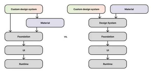
The features of this layer would be as follows:
- Have a basic set of commonly used components that implement more function than form (i.e. general layout, support for various input methods, a11y, Compose best practices, multiplatform support, responsive design, etc.)
- Have a flexible theming mechanism, enabled by
CompositionLocal, that can handle any value type (not just Material’s color, typography, and shape) - Have a baseline look and feel that feels unopinionated (but not ugly, it should still feel ✨ by default)
- Focus primarily on flexibility. All visual and behavioral elements of all components should be publicly exposed and changeable, ideally via slot APIs. Internal or private implementations should be limited.
- Adhere to design systems best practices, such as Atomic Design proposed by
(who also proposed a Global Design System, by the way…)
- Naturally, adhere to the Compose API guidelines
- Be as good as possible at integrating with design tokens and tools like Figma and Style Dictionary, to make design-to-dev handoff easier and support design-to-code use cases (e.g. Material 3 has a public design kit, which is great)
Both Compose Material and custom design systems could build upon this layer by incorporating their own opinionated look and feel while benefitting from the common, unopinionated bits. For custom design systems, there wouldn’t be a need to wrestle with the Compose Material APIs, unless you want to. For Compose Material, there wouldn’t be a need to try and support both its opinionated look and feel while somehow also being very flexible. Win-win?
In terms of layering, some might say this is harking back to the days of AppCompat vs. Design Support Library / Material Components in Views/XML. It kinda is! I honestly found some aspects of custom theming easier in those days, despite the many other improvements introduced by Compose.
In some ways, this separation of concerns is already happening in a few places in the lower layers of Compose. For example, BasicTextField2 is a “basic text composable that provides an interactive box that accepts text input through software or hardware keyboard, but provides no decorations like hint or placeholder.” Both of the Material 3 text field composables — TextField and OutlinedTextField — build upon this basic component by adding their own opinionated design elements (actually they’re based on the older BasicTextField at the time of writing, but you get the picture). The same can be said of BasicText vs. Text, Dialog vs. BasicAlertDialog, BasicTooltipBox vs. TooltipBox, etc. There’s perhaps a point to be made that design system APIs could just live in these lower layers, but Compose Foundation and UI have a lot of responsibility between them — layouts, text rendering, gesture handling, graphics, geometry, and more. Should they be taking on design systems as well? I personally believe a separate layer is preferable.
With the above in mind, let’s once again go back, but this time to the example of custom buttons. What could a (theoretical) basic button API look like and does it make it easier to implement the example buttons from before?
Here’s a rough attempt at a “design system” button that supports a variety of button-related parameters related to size, clickable, background, and content. It mostly makes use of a Box, modifiers, and composition locals. It only uses LocalContentColor and LocalTextStyle from Compose Material 3, but those could theoretically be reimplemented/refactored. The button code looks as follows:
@Composable
fun DesignSystemButton(
    modifier: Modifier = Modifier,
    // Size parameters
    minWidth: Dp = 80.dp,
    minHeight: Dp = 48.dp,
    // Clickable parameters
    interactionSource: MutableInteractionSource = remember { MutableInteractionSource() },
    indication: Indication? = LocalIndication.current,
    enabled: Boolean = true,
    onClickLabel: String? = null,
    onClick: () -> Unit,
    // Background parameters
    backgroundColor: Color = Color.DarkGray,
    backgroundShape: Shape = RoundedCornerShape(size = 16.dp),
    backgroundPaddingValues: PaddingValues = PaddingValues(all = 0.dp),
    // Content parameters
    contentColor: Color = Color.White,
    contentTextStyle: TextStyle = TextStyle.Default,
    contentAlignment: Alignment = Alignment.Center,
    contentPaddingValues: PaddingValues = PaddingValues(horizontal = 24.dp, vertical = 8.dp),
    content: @Composable BoxScope.() -> Unit,
) {
    CompositionLocalProvider(
        LocalContentColor provides contentColor,
        LocalTextStyle provides contentTextStyle,
    ) {
        Box(
            modifier = modifier
                .defaultMinSize(
                    minWidth = minWidth,
                    minHeight = minHeight,
                )
                .padding(paddingValues = backgroundPaddingValues)
                .background(
                    color = backgroundColor,
                    shape = backgroundShape,
                )
                .clip(shape = backgroundShape)
                .clickable(
                    interactionSource = interactionSource,
                    indication = indication,
                    enabled = enabled,
                    onClickLabel = onClickLabel,
                    role = Role.Button,
                    onClick = onClick
                )
                .padding(paddingValues = contentPaddingValues),
            contentAlignment = contentAlignment,
            content = content,
        )
    }
}

@Composable
@Preview
fun DesignSystemButtonPreview() {
    DesignSystemButton(onClick = {}) {
        Text(text = "Button")
    }
}

Let’s use this to implement both the Material 3 button and the language app button…
Material 3 button
@Composable
fun DesignSystemMaterial3Button(
    onClick: () -> Unit,
    modifier: Modifier = Modifier,
    enabled: Boolean = true,
    content: @Composable BoxScope.() -> Unit,
) {
    DesignSystemButton(
        modifier = modifier,
        // Size parameters
        minWidth = ButtonDefaults.MinWidth,
        minHeight = ButtonDefaults.MinHeight,
        // Clickable parameters
        indication = rememberRipple(),
        enabled = enabled,
        onClick = onClick,
        // Background parameters
        backgroundColor = MaterialTheme.colorScheme.primary,
        backgroundShape = ButtonDefaults.shape,
        // Content parameters
        contentColor = MaterialTheme.colorScheme.onPrimary,
        contentTextStyle = MaterialTheme.typography.labelLarge,
        contentPaddingValues = ButtonDefaults.ContentPadding,
        content = content,
    )
}

@Composable
@Preview
fun DesignSystemMaterial3ButtonPreview() {
    MaterialTheme {
        DesignSystemMaterial3Button(onClick = {}) {
            Text(text = "Button")
        }
    }
}

Language app button
@Composable
fun DesignSystemLanguageAppButton(
    onClick: () -> Unit,
    modifier: Modifier = Modifier,
    enabled: Boolean = true,
    content: @Composable BoxScope.() -> Unit,
) {
    val cornerRadius = 12.dp
    val shadowHeight = 5.dp
    DesignSystemButton(
        // Custom "drop shadow" via modifier
        modifier = modifier.drawBehind {
            drawRoundRect(
                color = Color(0xFF6CA530),
                cornerRadius = CornerRadius(cornerRadius.toPx()),
            )
        },
        // Size parameters
        minHeight = 48.dp + shadowHeight,
        // Clickable parameters
        enabled = enabled,
        onClick = onClick,
        // Background parameters
        backgroundColor = Color(0xFF58CC02),
        backgroundShape = RoundedCornerShape(size = cornerRadius),
        backgroundPaddingValues = PaddingValues(bottom = shadowHeight),
        // Content parameters
        contentTextStyle = TextStyle(
            fontFamily = languageAppFontFamily,
            fontSize = 16.sp,
            letterSpacing = 1.5.sp,
        ),
        content = content,
    )
}

@Composable
@Preview
fun DesignSystemLanguageAppButtonPreview() {
    DesignSystemLanguageAppButton(onClick = {}) {
        Text(text = "BUTTON")
    }
}

Dating app button
For us to implement the dating app button, we’ll need to add a DesignSystemButton overload that aligns with an overload of Modifier.background, allowing for complex backgrounds via Brush:
@Composable
fun DesignSystemButton(
    modifier: Modifier = Modifier,
    // Size parameters
    minWidth: Dp = 80.dp,
    minHeight: Dp = 48.dp,
    // Clickable parameters
    interactionSource: MutableInteractionSource = remember { MutableInteractionSource() },
    indication: Indication? = LocalIndication.current,
    enabled: Boolean = true,
    onClickLabel: String? = null,
    onClick: () -> Unit,
    // Background parameters
    backgroundBrush: Brush = Brush.linearGradient(
        colors = listOf(Color.DarkGray, Color.Green)
    ),
    backgroundShape: Shape = RoundedCornerShape(size = 16.dp),
    @FloatRange(from = 0.0, to = 1.0)
    backgroundAlpha: Float = 1.0f,
    backgroundPaddingValues: PaddingValues = PaddingValues(all = 0.dp),
    // Content parameters
    contentColor: Color = Color.White,
    contentTextStyle: TextStyle = TextStyle.Default,
    contentAlignment: Alignment = Alignment.Center,
    contentPaddingValues: PaddingValues = PaddingValues(horizontal = 24.dp, vertical = 8.dp),
    content: @Composable BoxScope.() -> Unit,
) {
    CompositionLocalProvider(
        LocalContentColor provides contentColor,
        LocalTextStyle provides contentTextStyle,
    ) {
        Box(
            modifier = modifier
                .defaultMinSize(
                    minWidth = minWidth,
                    minHeight = minHeight,
                )
                .padding(paddingValues = backgroundPaddingValues)
                .background(
                    brush = backgroundBrush,
                    shape = backgroundShape,
                    alpha = backgroundAlpha,
                )
                .clip(shape = backgroundShape)
                .clickable(
                    interactionSource = interactionSource,
                    indication = indication,
                    enabled = enabled,
                    onClickLabel = onClickLabel,
                    role = Role.Button,
                    onClick = onClick
                )
                .padding(paddingValues = contentPaddingValues),
            contentAlignment = contentAlignment,
            content = content,
        )
    }
}
We can now implement the dating app button:
@Composable
fun DesignSystemDatingAppButton(
    onClick: () -> Unit,
    modifier: Modifier = Modifier,
    enabled: Boolean = true,
    content: @Composable BoxScope.() -> Unit,
) {
    DesignSystemButton(
        modifier = modifier,
        // Size parameters
        minHeight = 40.dp,
        // Clickable parameters
        enabled = enabled,
        onClick = onClick,
        // Background parameters
        backgroundBrush = Brush.linearGradient(
            colors = listOf(Color(0xFFFD286E), Color(0xFFFF7356)),
        ),
        backgroundShape = CircleShape,
        // Content parameters
        contentTextStyle = TextStyle(
            fontFamily = datingAppFontFamily,
            fontSize = 14.sp,
            letterSpacing = 0.sp,
        ),
        content = content,
    )
}

@Composable
@Preview
fun DesignSystemDatingAppButtonPreview() {
    DesignSystemDatingAppButton(onClick = {}) {
        Text(text = "BUTTON")
    }
}

These layering and API proposals are only scratching the surface (😉) and probably need a lot more thought from folks who know a lot more than I do. That being said, this rough implementation still feels a little easier than what we currently have, at least in my opinion.
How does this tie in with design tooling and design-to-code automation?
The gap between design and dev appears to be getting shorter and shorter. What has typically been a somewhat manual handoff process from designer to developer has become increasingly automated, partly thanks to AI, and we’re at a point where designs can be (partially) converted directly to code by design tools. The current effectiveness and accuracy of design-to-code is perhaps up for debate, but given how fast most things are progressing at the moment it probably won’t be long until entire design systems in Figma can be converted into codebases of varying platforms/languages/toolkits in a single click.
What kind of tools currently exist? Figma recently announced Dev Mode, described as “a new space in Figma for developers with features that help you translate designs into code, faster.” It supports copying code snippets in Compose. Google has been working on Relay for a while, which aims to let you “design UI components in Figma and use them directly in Jetpack Compose projects.” It integrates with both Figma and Android Studio, via plugins. In fact, these two tools work together (somewhat)! There are bound to be limitations, but these are exciting times.
So, if you agree with me in thinking that Compose is not as good as it could be for implementing design systems, then where does it leave it amid all this excitement? I think Compose will always be supported by these tools (as it already is) given that it’s Android’s newest and most “official” UI toolkit. However, I also think that platforms/languages/toolkits that are the easiest to integrate with design tools will be preferred for new features and long-term maintenance (not to mention the marketing benefits). Overall I believe that optimal design tool integration should be one of Compose’s priorities going forward, and supporting design system engineering is a key part of that.
Is there a way forward?
If all this moaning/theorizing had a practical way forward, what might that look like?
In my opinion, the ideal outcome would be for Google to consider this in some shape or form (pun once again intended). As the primary maintainer of Compose in general, I think this makes the most sense. Collaborating with JetBrains would probably be required too, given the inevitable impact on Compose Multiplatform.
In the absence of this, I can imagine a third-party “Compose Design System” library maintained by the Android/Kotlin/Compose developer community. This community already does an incredible job of maintaining other relevant libraries like Shot, Showkase, Coil, Telephoto, and many others.
If you have a preference or an alternative idea, please feel free to leave a comment!
Why should you consider my opinion?
I left this section for last as I don’t want it to seem like I’m “tooting my own horn” and would rather let the content of the post be the main thing. That being said, this is still an opinion piece and my opinions stem from relevant experience that I think is worth mentioning.
I’ve worked professionally as a software engineer and part-time product designer for ~10 years (at the time of writing). My current focus areas are Android, Jetpack Compose, and Kotlin Multiplatform with a particular niche in design systems. I’m also a Google Developer Expert (GDE) for Android.
I’ve been privileged to fulfill a hybrid design/dev role in 5 different companies to date, including at Google where I worked as an Android Developer Relations (DevRel) Engineer on the Material Design team. It was my job to advocate for Material Design on Android, initially in Views/XML and then mostly in Compose. I enjoyed my time there and got to experience the inner workings of Compose Material while also engaging with third-party developers using it at their companies and in their codebases. I was involved in quite a few projects, including the current Design systems in Compose documentation. Nowadays, folks like
and
do a far better job than I ever did.
Anyways, that’s quite enough of that. My opinions might be based on my experience but I certainly don’t know everything — alternative views/insights, differences of opinion, and even outright disagreement are all genuinely welcome!
Wrap-up
Android is awesome. Jetpack Compose is awesome. Design systems are awesome. Material Design is also awesome! Clearly, I think there are some improvements to be made, but that shouldn’t detract from the products, libraries, tools, and community already at our disposal.
While a lot of this post has been about highlighting issues and proposing solutions, I also see this as an opportunity for Compose to pave the way for UI toolkits in terms of making it easy and even enjoyable to implement design systems and integrate with design tools. I believe design systems are going to become increasingly prevalent in product design and development, so I don’t see a downside in evolving to stay ahead of the curve.
I hope this has provided some food for thought. I’d really like to start a conversation around this topic, so if you have any thoughts or comments then I’d love to hear from you!
Find me on ricknout.dev and as @ricknout on LinkedIn, X, and Mastodon.
This article is previously published on proandroiddev.com


