


Introduction
Jetpack Compose’s declarative nature and rich set of features have been well-received, but there’s more to it than meets the eye. Beyond the commonly used tools lies a range of advanced and lesser-known modifiers that offer untapped potential for enhancing UI design.
This article aims to venture beyond the surface level, exploring those modifiers in Jetpack Compose that aren’t typically in the spotlight. We will be focusing on tools that, while not always in the mainstream discussion, hold the key to unlocking deeper functionalities and design possibilities in your applications. These modifiers range from those offering intricate control over layouts that provide subtle yet impactful improvements to the user interface.
The exploration is not just theoretical. Alongside a detailed look at each modifier’s capabilities and applications, we will have practical, interactive demonstrations. These demos are designed to give you a real feel for how these modifiers operate, allowing you to see the effects in action and apply them in your own work. It’s about bridging the gap between concept and practice, providing a platform for you to experiment and learn.
Whether you’re well-versed in Jetpack Compose or are just beginning your journey, this article is intended to broaden your toolkit and inspire new ways of thinking about UI design.
1. Modifier.graphicsLayer
Overview
Modifier.graphicsLayer allows developers to apply advanced graphical transformations to UI elements. This modifier provides control over properties such as rotation, scaling, opacity, and shadow, enabling the creation of sophisticated visual effects.
Use Cases
- 3D Effects — Implementing rotational effects on the X and Y and even Z axes to create a sense of depth, making elements appear three-dimensional.
- Animation Enhancements — Enhancing animations by adding shadows and altering opacity during transitions for a more dynamic presentation.
- Performance Optimization — Reducing the rendering load by modifying only the layer properties instead of redrawing the entire composable.
Example
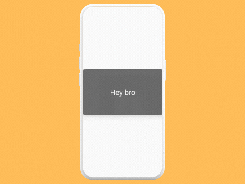
The FlipCardDemo composable demonstrates how to use Modifier.graphicsLayer to create a flip animation on a Card. This example showcases a combination of rotation, shadow elevation, and alpha changes to create an interactive, 3D flipping card effect.
@Composable
fun FlipCardDemo() {
    var flipped by remember { mutableStateOf(false) }
    val rotationZ by animateFloatAsState(targetValue = if (flipped) 180f else 0f, label = "")

    Box(modifier = Modifier.fillMaxSize(), contentAlignment = Alignment.Center) {
        Card(
            modifier = Modifier
                .graphicsLayer {
                    this.rotationX = rotationZ
                    cameraDistance = 12f * density
                    shadowElevation = if (flipped) 0f else 30f
                    alpha = if (flipped) 0.3f else 0.8f
                }
                .clickable { flipped = !flipped }
                .width(350.dp)
                .height(200.dp),
            colors = CardDefaults.cardColors(
                containerColor = Color.DarkGray,
            )
        ) {
            Box(modifier = Modifier.fillMaxSize(), contentAlignment = Alignment.Center) {
                Text("Hey bro", color = Color.White, fontSize = 32.sp)
            }
        }
    }
}
Performance Considerations
- It’s important to use it judiciously, particularly with complex animations or in scenarios where multiple elements are animated simultaneously. Sometimes using simpler modifiers would be a better alternative and depends on the use case you want to use this for.
- Animations should be used wisely to avoid performance overhead, especially in lists or grids.
2. Modifier.drawWithCache
Overview
Modifier.drawWithCache is a specialized modifier in Jetpack Compose that enhances performance for complex drawing operations. This modifier is particularly useful when you have custom drawing logic that involves calculations or operations that don’t change often. It allows you to cache certain parts of the drawing, reducing the need to recalculate or redraw them every time the composable is recomposed.
Use Cases
- Complex Custom Drawings — Ideal for composables with intricate drawing logic, such as custom shapes, patterns, or visual effects that are computationally expensive to generate.
- Dynamic Yet Static Elements — Useful when parts of the drawing change dynamically based on user interaction or state changes, while other parts remain static.
- Optimizing Redraws — Reduces overhead in scenarios where recomposition occurs frequently, but the actual drawing changes are minimal.
How It Works
drawWithCacheprovides a canvas that you can draw onto, caching the result.- The drawing inside
drawWithCacheis only recomposed if the parameters you use within it change. - You can combine dynamic and static elements effectively, caching static parts while allowing dynamic parts to change and redraw as needed.
Example
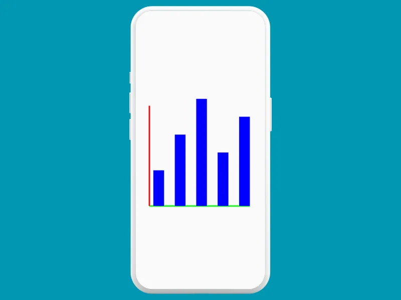
Creating a basic bar chart to demonstrate data visualization. The bar chart will display static elements (like the axes of the chart) and dynamic elements (like the bars representing data points) that can change based on user interaction or data updates.
@Composable
fun BarChartExample(dataPoints: List<Float>) {
    Box(modifier = Modifier.fillMaxSize(), contentAlignment = Alignment.Center) {
      Box(modifier = Modifier
          .size(300.dp)
          .drawWithCache {
              onDrawWithContent {
                  drawContent()

                  // Draw axes
                  drawLine(
                      start = Offset(50f, size.height),
                      end = Offset(size.width, size.height),
                      color = Color.Green,
                      strokeWidth = 10f
                  )
                  drawLine(
                      start = Offset(50f, 50f),
                      end = Offset(50f, size.height),
                      color = Color.Red,
                      strokeWidth = 10f
                  )

                  // Draw bars for each data point
                  val barWidth = size.width / (dataPoints.size * 2)
                  dataPoints.forEachIndexed { index, value ->
                      val left = barWidth * (index * 2 + 1)
                      val top = size.height - (value / dataPoints.max() * size.height)
                      val right = left + barWidth
                      val bottom = size.height
                      drawRect(
                          Color.Blue,
                          topLeft = Offset(left, top),
                          size = Size(right - left, bottom - top)
                      )
                  }
              }
          }
        )
    }
}
Explanation
- The axes of the bar chart are considered static and are drawn once.
- The bars representing the data points are dynamic. They change based on the
dataPointsprovided to the composable. drawWithCacheis used to optimize the drawing of these elements, especially beneficial if the chart needs to update frequently or contains many data points.
Performance Considerations
- While
drawWithCacheimproves efficiency for complex drawings, it should be used wisely. Overuse can lead to unnecessary caching and increased memory usage. - It’s most effective when the cost of calculating the drawing is high compared to the frequency of recomposition.
Potential Applications
- Data Visualization — Highly effective for charts or graphs where part of the graphic (like the grid) remains constant, but data points may change.
- Game Development — Useful for rendering static backgrounds or elements in a game interface that require complex drawings.
- Interactive UI Elements — Enhancing user interfaces with custom, intricate designs that need to be efficient in redrawing.
3. Modifier.onSizeChanged
Overview
Modifier.onSizeChanged is used for responding to size changes of a composable. This modifier can be particularly useful in scenarios where you need to perform actions or adjust the layout based on the size of a component, which might not be known until runtime.
Use Cases
- Responsive UI — Adapting the UI based on the size of a component, useful in creating layouts that need to work across different screen sizes and orientations.
- Dynamic Content Adjustment — Adjusting the content or its arrangement based on the available space, such as resizing images or changing the layout of text and buttons.
- Animations Based on Size — Triggering animations or transitions when a component reaches a certain size.
How It Works
- The
onSizeChangedmodifier provides a callback with the new size of the composable whenever it changes. - This size information can be used to make decisions or trigger actions in your UI.
Example
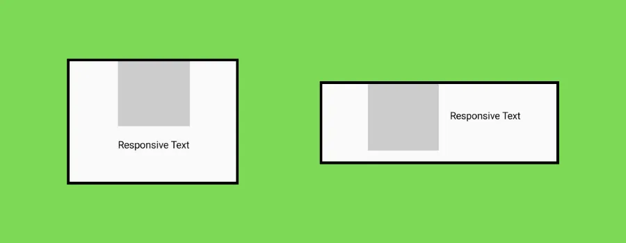
- A UI component that contains an image and a text block.
- For wider screens (more than 400dp in width), the image and text will be displayed side by side (horizontal layout).
- For narrower screens (less than or equal to 400dp in width), the image will be above the text (vertical layout).
@Composable
fun ResponsiveImageTextLayout() {
    var containerWidth by remember { mutableStateOf(0.dp) }

    Box(
        modifier = Modifier
            .fillMaxWidth()
            .onSizeChanged { newSize ->
                containerWidth = newSize.width.dp
            },
    ) {
        if (containerWidth < 600.dp) {
            Row(
                modifier = Modifier.fillMaxWidth(),
                verticalAlignment = Alignment.CenterVertically,
                horizontalArrangement = Arrangement.Center
            ) {
                PlaceHolderComponent()
                TextComponent()
            }
        } else {
            Column(
                modifier = Modifier.fillMaxWidth(),
                verticalArrangement = Arrangement.Center,
                horizontalAlignment = Alignment.CenterHorizontally
            ) {
                PlaceHolderComponent()
                TextComponent()
            }
        }
    }
}

@Composable
fun PlaceHolderComponent() {
    Box(
        modifier = Modifier
            .size(100.dp)
            .background(Color.LightGray)
    )
}

@Composable
fun TextComponent() {
    Text(
        text = "Responsive Text",
        modifier = Modifier.padding(16.dp)
    )
}
Explanation
- The
Boxcomposable listens for size changes usingModifier.onSizeChanged. - Based on the width of the
Box, it switches between aRowand aColumnlayout.
Performance Considerations
- Be mindful of causing too many recompositions in the
onSizeChangedlambda. Excessive use can lead to performance issues, especially if the UI is complex. - It’s generally a good practice to keep the logic inside the
onSizeChangedcallback minimal and efficient.
Potential Applications
- Collapsible Menus — Adjusting the layout of menus or navigation bars based on the available space.
- Adaptive Grids — Changing the number of columns in a grid layout based on the container size.
- Interactive Charts — Resizing or changing the presentation of data visualizations in response to size changes.
4. Modifier.onPlaced
Overview
Modifier.onPlaced is a useful modifier that allows you to get information about the placement of a composable within its parent. This can be particularly handy when you need to know the exact position of a component on the screen, which might be necessary for creating custom layouts or interactions that depend on the component’s position.
Use Cases
- Custom Layout Behaviors: Determining the position of a composable to create custom layout arrangements or animations based on those positions.
- Interaction Feedback: Providing feedback or interactions based on where an element is placed, such as showing a tooltip or a contextual menu.
- Dynamic Positioning: Adjusting the positions of floating UI elements (like popups or overlays) relative to other components.
How It Works
- The
onPlacedmodifier provides aLayoutCoordinatesobject in the callback, which contains information about the size and position of the composable. - You can use this information to understand where the composable is placed in relation to its parent or the entire screen.
Example
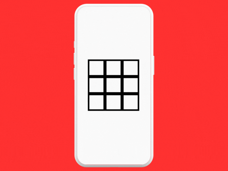
- An interactive grid where each cell can be tapped to reveal an annotation or a tooltip.
Modifier.onPlacedis used to determine the precise position of each cell within the grid, allowing the annotation to be displayed above the cell clicked on.
@Composable
fun InteractiveGridDemo() {
    val cellSize = 90.dp
    val numRows = 3
    val numColumns = 3
    val gridState = remember { mutableStateOf(Array(numRows * numColumns) { Offset.Zero }) }
    val selectedCell = remember { mutableStateOf(-1) }

    Column(
        modifier = Modifier.fillMaxSize(),
        verticalArrangement = Arrangement.Center,
        horizontalAlignment = Alignment.CenterHorizontally
    ) {
        for (row in 0 until numRows) {
            Row {
                for (column in 0 until numColumns) {
                    val cellIndex = row * numColumns + column
                    Box(
                        modifier = Modifier
                            .size(cellSize)
                            .onPlaced { layoutCoordinates ->
                                gridState.value[cellIndex] = layoutCoordinates.positionInRoot()
                            }
                            .clickable { selectedCell.value = cellIndex }
                            .border(8.dp, Color.Black)
                    )
                }
            }
        }
    }


    if (selectedCell.value >= 0) {
        val position = gridState.value[selectedCell.value]
        Box(
            modifier = Modifier
                .offset {
                    IntOffset(
                        position.x.roundToInt() - 35.dp
                            .toPx()
                            .toInt(),
                        position.y.roundToInt() - 80.dp
                            .toPx()
                            .toInt()
                    )
                }
                .size(width = 150.dp, height = 60.dp)
                .background(Color.DarkGray.copy(alpha = 0.9f)),
            contentAlignment = Alignment.Center
        ) {
            Text(
                text = "Cell Clicked: ${selectedCell.value}",
                color = Color.Red,
                fontSize = 20.sp,
                fontWeight = FontWeight.Bold,
                textAlign = TextAlign.Center
            )
        }
    }
}
Explanation
- We create a 3×3 grid of boxes, each box representing a cell.
- The
onPlacedmodifier captures the position of each cell usinglayoutCoordinates.positionInRoot()within the grid and updatesgridState. - When a cell is clicked,
selectedCellis updated, and the annotation box is displayed above the selected cell.
Potential Applications
- Drag and Drop Interfaces — Understanding where an element is dropped in relation to other components.
- Dynamic Overlays — Positioning overlays or floating elements based on the position of other UI elements.
- Interactive Charts or Maps — Providing detailed information about specific parts of a chart or map based on where the user interacts.
Performance Considerations
- Be cautious about triggering too many state changes or recompositions in the
onPlacedcallback, as this can affect performance. - It’s best to use this modifier for scenarios where the position information is crucial and cannot be obtained through other simpler means.
What about using onGloballyPositioned instead?

a) Relative vs Global Positioning —
onPlacedis about relative positioning within a parent.onGloballyPositionedis about absolute positioning within the entire screen or root layout.
b) Use Cases
- Use
onPlacedfor internal layout adjustments and relative positioning. - Use
onGloballyPositionedfor global overlays, popups, and positioning in the larger UI context.
c) Performance Considerations
- Both modifiers should be used judiciously to avoid performance overhead.
- The choice depends on the need for relative or global positioning information.
Jobs
5. Modifier.zIndex()
Overview
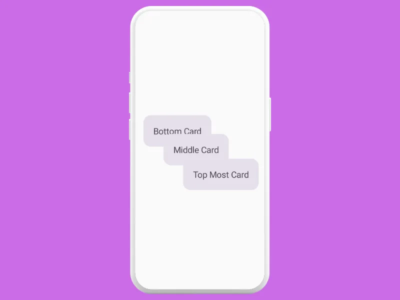
Modifier.zIndex() in Jetpack Compose is a modifier that controls the drawing order of composables within the same parent layout. It essentially changes the Z-order of elements, determining which composable appears on top when they overlap. This is particularly useful in creating depth and layering effects in your UI.
Use Cases
- Overlapping Elements — Useful in designs where elements overlap, such as cards, images, or any UI elements that need to appear above or below others.
- Drag-and-Drop Interfaces — In drag-and-drop interactions, the dragged element can be set to a higher z-index to ensure it appears above other elements.
- Creating Depth in UI — Helpful in adding depth to the UI by layering elements, which can enhance the visual hierarchy and aesthetics.
How It Works
Modifier.zIndex()accepts a float value. Higher values will cause the composable to be drawn above siblings with lower values.- It only affects the drawing order within the same parent. Composables in different parents are unaffected by each other’s z-index.
Example
@Composable
fun LayeredCardsExample() {
    Box(modifier = Modifier.fillMaxSize(), contentAlignment = Alignment.Center) {
        Card(
            modifier = Modifier
                .offset(x = 20.dp, y = 20.dp)
                .zIndex(1f)
        ) {
            Text("Top Most Card", modifier = Modifier.padding(16.dp))
        }
        Card(
            modifier = Modifier
                .offset(x = (-20).dp, y = (-20).dp)
                .zIndex(0.5f)
        ) {
            Text("Middle Card", modifier = Modifier.padding(16.dp))
        }
        Card(
            modifier = Modifier
                .offset(x = (-50).dp, y = (-50).dp)
                .zIndex(0f)
        ) {
            Text("Bottom Card", modifier = Modifier.padding(16.dp))
        }
    }
}
Performance Considerations
- Use
zIndexjudiciously as excessive overlapping elements can complicate the UI and affect performance. - It’s best used for specific cases where the visual design necessitates layers or when dealing with dynamic elements like in drag-and-drop interactions.
Potential Applications
- Interactive Card UIs — In card-based interfaces, where selected cards need to come to the forefront.
- Game Development — For creating layered effects in game interfaces.
- Dynamic Content Presentation — In scenarios where content needs to dynamically overlap, such as in a gallery or a slideshow.
6. Modifier.onKeyEvent
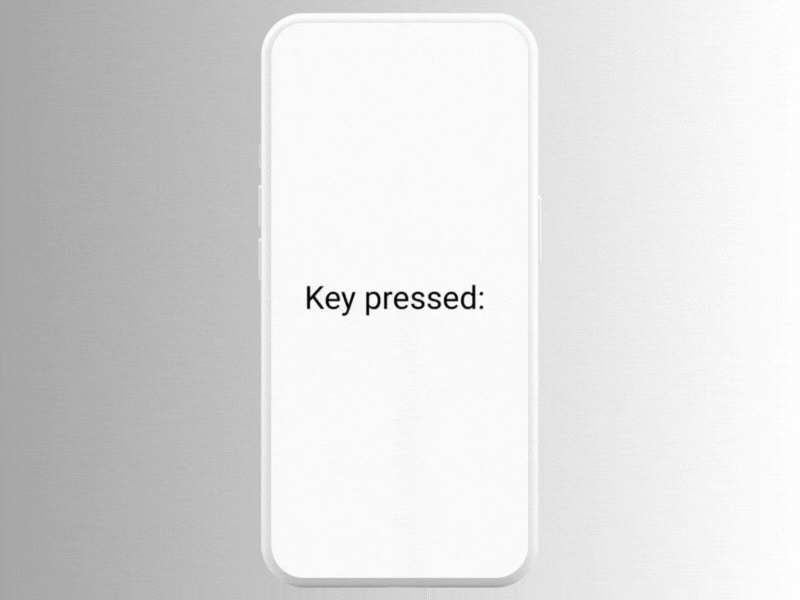
Overview
Modifier.onKeyEvent is used for handling key events on hardware keyboards. It allows you to define custom responses to key presses, making it particularly useful for applications that require keyboard input or navigation.
Use Cases
- Keyboard Shortcuts — Implementing keyboard shortcuts to enhance user experience and efficiency in apps.
- Form Navigation and Submission — Handling key events like ‘Enter’ for form submission or navigation between input fields.
- Game Controls — Assigning actions to specific keys in games or interactive applications.
How It Works
- The
onKeyEventmodifier listens for key events and triggers a callback when a key event occurs. - You can check the type of key event (key down, key up) and which key was pressed to define specific responses.
Example
@Composable
fun KeyEventExample() {
    var text by remember { mutableStateOf("Press any key") }

    Box(modifier = Modifier
        .fillMaxSize()
        .focusable() // Required to receive key input
        .onKeyEvent { keyEvent ->
            if (keyEvent.type == KeyEventType.KeyUp) {
                text = "Key pressed: ${keyEvent.nativeKeyEvent.displayLabel}"
                true // Indicate that the event was consumed
            } else {
                false // Event not handled here
            }
        }
    ) {
        Text(text, modifier = Modifier.align(Alignment.Center), fontSize = 32.sp)
    }
}
Performance Considerations
- Be cautious with complex logic inside the key event handler to avoid performance issues.
- Ensure that the composable is focusable to receive key events.
Potential Applications
- Accessibility Features — Enhancing accessibility by providing keyboard navigation and shortcuts.
- Rich Text Editors — Handling key combinations for text formatting or command execution.
- Custom Components — Creating custom components that respond to specific key inputs.
7. Modifier.clipToBounds()
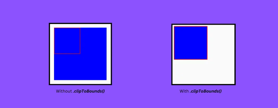
Overview
Modifier.clipToBounds() controls whether a composable’s content is clipped to its bounding box. This modifier is particularly useful for managing the visibility of content that extends beyond the bounds of its parent composable.
Use Cases
- Controlling Overflow — Preventing child composables from drawing outside the bounds of their parent. This is crucial in UIs where clean, confined layouts are needed.
- Creating Mask Effects — Useful in scenarios where part of a UI element should be hidden, creating effects like masking or partial visibility.
How It Works
- When applied to a composable,
clipToBounds()ensures that all the drawing done by the composable or its children is confined within the boundaries of the composable. - This means any part of the content that exceeds the boundaries will not be visible.
Example
Note — In Jetpack Compose, the default behavior of some composables is indeed to clip their children to their bounds. This is often the case with layout containers like Box, Column, and Row. If you need to allow contents to overflow their bounds, you’ll have to work around this default behavior. That’s why we will be using a composable called NonClippingLayout to demonstrate the use of clipToBounds().
@Composable
fun CanvasClippingExample() {
    NonClippingLayout {
        Canvas(
            modifier = Modifier.size(50.dp)
                .border(width = 2.dp, color = Color.Black)
                .clipToBounds()
        ) {
            drawRect(
                color = Color.Blue,
                size = Size(150.dp.toPx(), 150.dp.toPx())
            )
        }
    }
}

@Composable
fun NonClippingLayout(
    modifier: Modifier = Modifier,
    content: @Composable () -> Unit
) {
    Layout(
        content = content,
        modifier = modifier
    ) { measurables, constraints ->
        val placeables = measurables.map { measurable ->
            measurable.measure(constraints)
        }

        layout(constraints.maxWidth, constraints.maxHeight) {
            placeables.forEach { placeable ->
                placeable.placeRelative(0, 0)
            }
        }
    }
}
Performance Considerations
- Clipping can be performance-intensive, especially if applied to a large number of composables or complex layouts.
- In some cases, avoiding unnecessary clipping can help in rendering the UI more efficiently.
Potential Applications
- Custom Shapes and Graphics — Creating UI elements with custom shapes where parts of the element should not be visible outside the shape.
- Overflow Handling — In UI designs where dynamic content might exceed container bounds, clipping ensures a consistent and clean appearance.
- Image Galleries and Carousel — Ensuring that partial or off-screen images in scrollable galleries are clipped for a polished look.
8. Modifier.paddingFromBaseline()
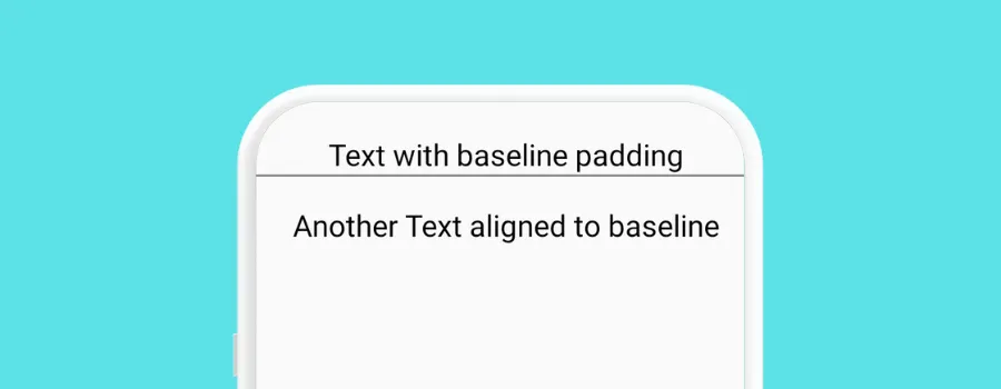
Overview
Modifier.paddingFromBaseline() is used primarily for aligning text relative to its baseline. This modifier is particularly useful in typographic layouts where precise vertical alignment of text is required, especially in relation to other composables.
Use Cases
- Text Alignment in UIs — Ensuring text in different composables aligns correctly along their baselines, which is crucial in designs with multiple text elements.
- Material Design Compliance — Adhering to Material Design guidelines which often specify text alignment in terms of baselines.
- Consistent Visual Rhythm — Creating a consistent visual rhythm in UIs with multiple text components.
How It Works
paddingFromBaselineadds padding above the text baseline. This is different from regular padding which is applied from the edge of the composable.- It’s mostly used with
Textcomposables to align text in a visually consistent manner across your UI.
Example
@Composable
fun BaselinePaddingExample() {
    Column(modifier = Modifier.fillMaxWidth()) {
        Text(
            "Text with baseline padding",
            modifier = Modifier
                .fillMaxWidth()
                .paddingFromBaseline(top = 32.dp),
            fontSize = 16.sp,
            textAlign = TextAlign.Center
        )
        Divider(color = Color.Gray, thickness = 1.dp)
        Text(
            "Another Text aligned to baseline",
            modifier = Modifier
                .fillMaxWidth()
                .paddingFromBaseline(top = 32.dp),
            fontSize = 16.sp,
            textAlign = TextAlign.Center
        )
    }
}
Performance Considerations
- This modifier is relatively straightforward in terms of performance. However, as with any padding, excessive use might impact layout calculations, especially in complex layouts.
Potential Applications
- Form Layouts — Aligning labels in forms for a clean and organized look.
- List Items — Ensuring text in list items is aligned, particularly when list items have varying font sizes or styles.
- Header and Content Alignment — Aligning headers and content text in articles or cards, adhering to design guidelines.
How is it different from .padding()?
Modifier.padding()— Applies padding from the edges of the composable. It affects the space around the outside of the composable, regardless of the content type.Modifier.paddingFromBaseline()— Specifically for text, this modifier applies padding from the text baseline, which is the line upon which most letters sit. This type of padding adjusts the space above the baseline where the text starts.
9. Interaction Source

Overview
InteractionSource (not a modifier) is used to track and respond to different interaction states of a composable. It’s particularly useful for customizing the user interaction feedback, such as visual responses to touches, drags, or clicks.
Use Cases
- Custom Interaction Feedback — Customizing how a UI element visually responds to user interactions like press, drag, or focus.
- Stateful UI Components — Creating components that change appearance based on their interaction state, enhancing user experience.
- Accessibility Enhancements — Providing additional feedback for accessibility purposes, like visual cues for focus or selection.
How It Works
- You create a
MutableInteractionSourceand pass it to components that support interaction tracking. InteractionSourcekeeps track of different interaction states which can be collected and used to drive UI changes.
Example
@Composable
fun InteractiveButtonExample() {
    val interactionSource = remember { MutableInteractionSource() }
    val isPressed by interactionSource.collectIsPressedAsState()

    Box(
        modifier = Modifier.fillMaxSize(),
        contentAlignment = Alignment.Center
    ) {
        Button(
            onClick = { },
            interactionSource = interactionSource,
            colors = ButtonDefaults.buttonColors(
                containerColor = if (isPressed) Color.Gray else Color.Blue
            )
        ) {
            Text("Press Me")
        }
    }
}
Performance Considerations
- It’s important to manage the
InteractionSourceefficiently. Avoid complex or heavy computations directly within the state collection lambdas. - Use the interaction states for lightweight UI changes to ensure a responsive and performant user experience.
Potential Applications
- Interactive Components — Customizing the behavior and appearance of components like buttons, cards, or form fields based on user interaction.
- Visual Feedback for Gestures — Implementing visual feedback for complex gestures in more interactive applications like games or drawing tools.
- Accessibility Enhancements — Providing clear visual cues in response to focus or selection, which can be particularly helpful for users with accessibility needs.
10. Modifier.absoluteOffset()
Overview
Modifier.absoluteOffset() allows you to position a composable at an exact offset relative to its original position. Unlike other offset modifiers that might be affected by the layout direction (like LTR or RTL), absoluteOffset positions the composable with absolute x and y coordinates, ignoring layout direction.
Use Cases
- Precise Positioning — Positioning elements at an exact location, regardless of the layout direction, which is crucial for certain design requirements.
- Overlay and Floating Elements — Creating overlay components like tool-tips or custom drop-downs that need to be positioned at specific coordinates.
- Custom Animations and Transitions — Implementing custom animations where components move to specific points on the screen.
How It Works
absoluteOffsettakes x and y parameters (asDpor lambda expressions returningDp) to set the offset of the composable.- The offset is applied relative to the composable’s original position in the layout.
Example
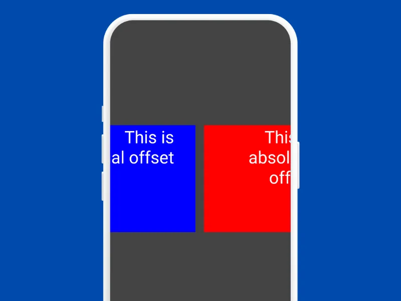
In this example, both Box composables are moved horizontally by 20.dp. However, due to the RTL layout —
- The blue box with
offsetwill move to the left. - The red box with
absoluteOffsetwill move to the right, ignoring the RTL layout direction. offsetis typically used in scenarios where you want the UI to respect the layout direction, which is important for supporting multiple languages and cultural layouts.absoluteOffsetis used when you need a fixed, direction-agnostic position, such as for specific animations, overlapping items, or custom layouts where relative position to layout direction is not a concern.
@Composable
fun AbsoluteOffsetExample() {
    Row(
        modifier = Modifier
            .fillMaxSize()
            .padding(5.dp)
            .background(Color.DarkGray),
        horizontalArrangement = Arrangement.Center,
        verticalAlignment = Alignment.CenterVertically
    ) {
        CompositionLocalProvider(LocalLayoutDirection provides LayoutDirection.Rtl) {
            Box(
                modifier = Modifier
                    .size(200.dp)
                    .background(Color.Blue)
                    .offset(x = 40.dp) // This will move right in LTR, left in RTL
            ) {
                Text("This is normal offset", color = Color.White, fontSize = 32.sp)
            }

            Spacer(modifier = Modifier.width(16.dp))

            Box(
                modifier = Modifier
                    .size(200.dp)
                    .background(Color.Red)
                    .absoluteOffset(x = 20.dp) // This will always move right
            ) {
                Text("This is absolute offset", color = Color.White, fontSize = 32.sp)
            }
        }
    }
}
Performance Considerations
- While
absoluteOffsetis effective for positioning, overuse, especially with dynamic values, can lead to performance overhead due to layout recalculations. - It’s best used when static positioning is required, or if dynamic offsets are used, they should be managed efficiently.
Potential Applications
- Custom Layout Designs — Positioning elements in a custom layout where the traditional layout constructs don’t suffice.
- Interactive UI Elements — Placing elements like badges, icons, or custom markers on other components.
- Adaptive UIs — Adjusting the position of elements dynamically in response to user interactions or application state.
11. Modifier.weight()
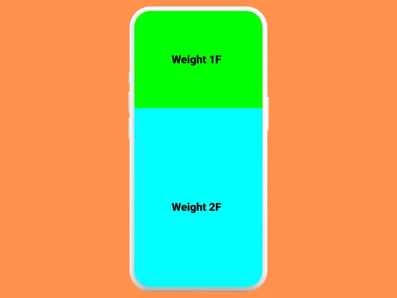
Overview
Combining Modifier.weight() with fillMaxWidth() or fillMaxHeight() is a common pattern in Jetpack Compose, especially when working within a Row or Column. This combination allows for flexible layouts where composables can proportionally occupy available space.
Use Cases
- Proportional Sizing — Distributing space among composables in a
RoworColumnbased on a specified weight ratio. - Responsive Layouts — Creating UIs that adapt to different screen sizes or orientations by dynamically adjusting the size of composables.
- Balancing Content — Ensuring that certain elements (like images, text, buttons) are given appropriate space relative to each other.
How It Works
Modifier.weight()is used withinRoworColumnto allocate a proportion of the available space to the composable it’s applied to. The space is divided among siblings based on their respective weights.fillMaxWidth()orfillMaxHeight()ensures that the composable fills the maximum width or height in its parentRoworColumn.
Example
@Composable
fun WeightedRowExample() {
    Column(modifier = Modifier.fillMaxHeight()) {
        Box(
            modifier = Modifier
                .weight(1f)
                .fillMaxSize()
                .background(Color.Green)
                .padding(16.dp),
            contentAlignment = Alignment.Center
        ) {
            Text("Weight 1F", fontSize = 48.sp, fontWeight = FontWeight.ExtraBold)
        }
        Box(
            modifier = Modifier
                .weight(2f)
                .fillMaxSize()
                .background(Color.Cyan)
                .padding(16.dp),
            contentAlignment = Alignment.Center
        ) {
            Text("Weight 2F", fontSize = 48.sp, fontWeight = FontWeight.ExtraBold)
        }
    }
}
Performance Considerations
- While using
weightis effective for responsive designs, overusing it in deeply nested layouts can lead to complex layout calculations and performance issues. - Ensure that the combined use of
weightandfillMaxWidth/fillMaxHeightis appropriate for the layout requirements and doesn’t lead to unnecessary layout overhead.
Potential Applications
- Flexible UI Panels — In applications with sidebars, headers, or footers where you need flexible sizing based on content or screen size.
- List Items — In custom list items where different elements should occupy specific portions of the space.
- Dashboard Layouts — For dashboards or data display interfaces where you need proportional allocation of space for charts, graphs, or data panels.
12. Modifier.focusRequester()
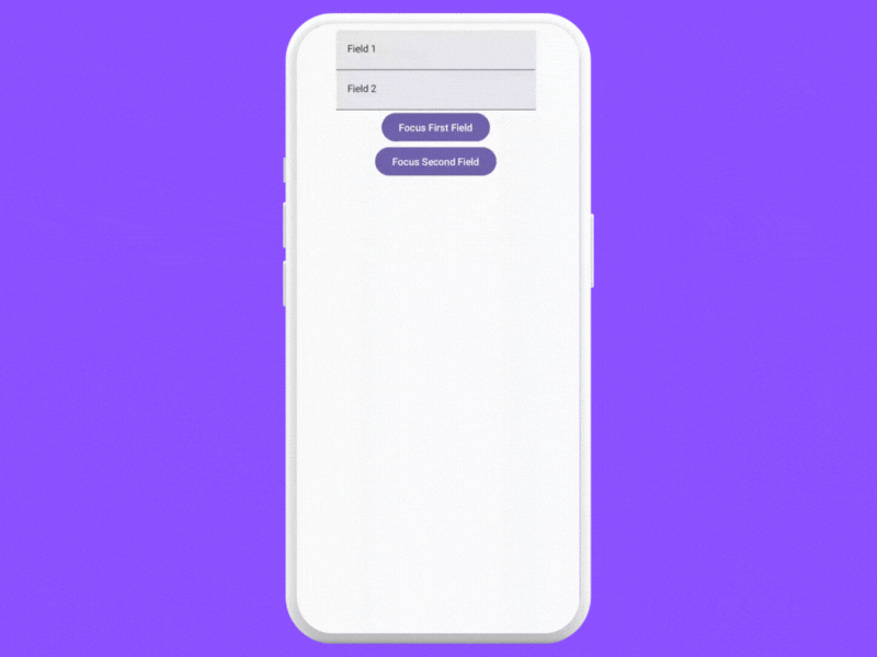
Overview
FocusRequester allows you to programmatically request focus for composables. It’s especially useful in managing focus behavior in more complex UIs where the default focus order may not be sufficient, or when specific focus control is required due to user interactions or application logic.
Use Cases
- Programmatic Focus Control — Directly setting focus on specific composables in response to events, such as moving focus to a text field when a screen is displayed.
- Custom Keyboard Navigation — Managing keyboard navigation in a non-linear order or in response to specific user actions.
- Accessibility Improvements — Enhancing accessibility by ensuring focus is directed to important elements in a context-sensitive manner.
How It Works
- A
FocusRequesteris created and attached to a composable. It can then be used to request focus for that composable programmatically. - You can create multiple
FocusRequesterinstances to manage focus among several composables.
Example
@OptIn(ExperimentalMaterial3Api::class)
@Composable
fun FocusRequesterExample() {
    val focusRequester = FocusRequester()
    val focusRequester2 = FocusRequester()

    Column(
        modifier = Modifier.fillMaxSize(),
        horizontalAlignment = Alignment.CenterHorizontally,
        verticalArrangement = Arrangement.Top
    ) {
        TextField(
            value = "Field 1",
            onValueChange = {},
            modifier = Modifier
                .focusRequester(focusRequester)
        )
        TextField(
            value = "Field 2",
            onValueChange = {},
            modifier = Modifier
                .focusRequester(focusRequester2)
        )
        Button(onClick = { focusRequester.requestFocus() }) {
            Text("Focus First Field")
        }
        Button(onClick = { focusRequester2.requestFocus() }) {
            Text("Focus Second Field")
        }
    }
}
Performance Considerations
- While
FocusRequesteris a powerful tool for focus control, use it wisely to keep the UI intuitive and accessible. - Avoid unnecessary complexity in focus management, as it can lead to confusing navigation for users.
Potential Applications
- Forms and Input Fields — Automatically setting focus to the first input field in a form, or managing focus transition between fields based on user input.
- Dynamic UIs and Dialogs — Shifting focus to relevant components in dynamically changing interfaces or modal dialogs.
- Game UIs and Interactive Elements — Managing focus in game interfaces or other interactive elements where focus needs to be controlled programmatically for enhanced user experience.
13. Modifier.nestedScroll()
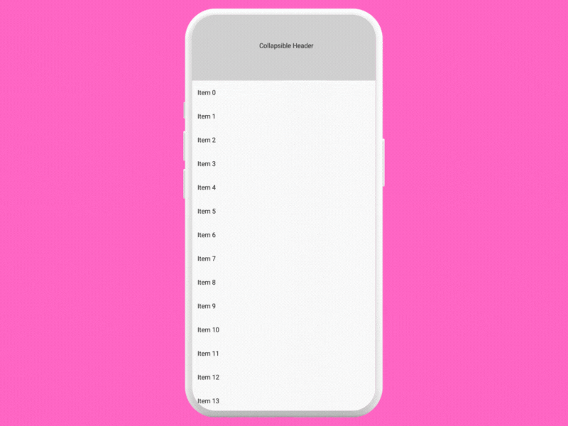
Overview
Modifier.nestedScroll() is a Jetpack Compose modifier that enables nested scrolling behavior within your UI. It’s particularly useful in complex layouts where scrollable components are nested within others, such as a scrollable list inside a vertically scrollable page.
Use Cases
- Nested Scrollable Layouts — Managing scrolling behavior in UIs where scrollable components are nested, like a LazyColumn inside a vertically scrollable Column.
- Coordinated Scrolling — Creating effects where multiple scrollable areas are coordinated, such as a header that collapses as you scroll through a list.
- Custom Scroll Behaviors — Implementing custom scroll-related interactions that depend on the scroll position or state of nested scrollable components.
How It Works
nestedScrollconnects nested scrollable components, allowing them to communicate their scroll state and coordinate their behavior.- It’s used in conjunction with
NestedScrollConnection, which defines how nested scrollable components interact with each other.
Example
@Composable
fun NestedScrollWithCollapsibleHeader() {
    // header height
    val headerHeight = remember { mutableStateOf(150.dp) }
    // adjust the header size based on scroll
    val nestedScrollConnection = remember {
        object : NestedScrollConnection {
            override fun onPreScroll(available: Offset, source: NestedScrollSource): Offset {
                val delta = available.y
                val newHeight = headerHeight.value + delta.dp
                headerHeight.value = newHeight.coerceIn(50.dp, 150.dp)
                return Offset.Zero // Consuming no scroll
            }
        }
    }

    Box(modifier = Modifier
        .fillMaxSize()
        .nestedScroll(nestedScrollConnection)) {
        Column {
            Box(
                modifier = Modifier
                    .height(headerHeight.value)
                    .fillMaxWidth()
                    .background(Color.LightGray)
            ) {
                Text("Collapsible Header", Modifier.align(Alignment.Center))
            }
            LazyColumn {
                items(100) { index ->
                    Text("Item $index", modifier = Modifier.padding(16.dp))
                }
            }
        }
    }
}
Explanation
- We have a
Boxthat serves as a collapsible header. Its height is controlled by theheaderHeightstate. NestedScrollConnectionis used to modify theheaderHeightbased on the scroll events from theLazyColumn. As you scroll down, the header collapses (its height decreases).- The
LazyColumncontains a list of items. When scrolled, it triggers theonPreScrollin theNestedScrollConnection, affecting the header’s height. - The key aspect here is how the scrolling of the
LazyColumninfluences another component’s (the header’s) size. This interconnected behavior is what defines nested scrolling in this context.
Performance Considerations
- Nested scrolling can be complex and may impact performance, especially with large or deeply nested scrollable areas.
- Ensure that the nested scroll logic is optimized and does not result in unnecessary layout recalculations or janky scrolling.
Potential Applications
- Complex UI Structures — In applications with sophisticated UI structures where different parts of the screen need to scroll in a coordinated manner.
- Collapsible Toolbars — Implementing UI patterns like collapsible toolbars or headers that react to scroll events.
- Interactive Dashboards — Creating dashboards where different sections scroll but are interconnected, such as syncing scroll positions.
Looking Ahead

The journey through advanced modifiers doesn’t end here. As the toolkit continues to evolve, so too will the opportunities for creating even more innovative and user-friendly interfaces. I believe I haven’t even scratched the surface with this article seeing the vast number of options available to create beautiful experiences.
Let’s continue to experiment, learn, and share our experiences with these advanced tools, pushing the boundaries of what’s possible in UI development. Whether you’re building a simple app or a complex interactive experience, the knowledge of these advanced modifiers will undoubtedly prove to be a valuable asset in your developer toolkit.
Closing Remarks
If you liked what you read, please feel free to leave your valuable feedback or appreciation. I am always looking to learn, collaborate and grow with fellow developers.
If you have any questions feel free to message me!
Follow me on Medium for more articles — Medium Profile
Connect with me on LinkedInand Twitter for collaboration.
Happy Composing!
This article was previously published on proandroiddev.com


