

Enhancing Consistency, Collaboration, and Efficiency Across Enterprise, Business, and Consumer-Facing Apps
Introduction
In the dynamic and fast-paced landscape of modern app development, maintaining design consistency across diverse teams and applications remains a formidable challenge. Whether building for enterprises, businesses, or the common consumer, the quest for design consistency and efficient development is a shared pursuit. This article delves into the significance of creating a pattern library, especially in the context of companies adopting Jetpack Compose. It sheds light on the far-reaching benefits of a pattern library in Jetpack Compose, extending its advantages beyond enterprise needs to also cater to businesses and consumer-facing applications. As we explore the challenges of design consistency and delve into the pivotal role of pattern libraries, this guide unveils an approach to crafting basic/advanced, reusable UI components. These components not only meet the diverse demands of different app scenarios but also address the overarching need for an elevated user experience.
Unveiling the Difference — Design Systems and Pattern Libraries
Design System — The Blueprint of Creativity
A design system encompasses a wide spectrum of guidelines, principles, and visual assets that define the overall aesthetics and interactions of an application. It’s the blueprint for creating harmonious and user-centric experiences. This expansive concept includes typography, color palettes, spacing rules, iconography, motion guidelines, and more. The design system unifies the visual and interactive elements, guiding designers and developers in maintaining consistency across the application.
Pattern Library — The Practical Toolkit
On the other hand, a pattern library narrows its focus to the practical implementation of UI components. It’s a collection of pre-designed components like buttons, cards, input fields, and more. These components adhere to the design principles set by the design system, ensuring a consistent and cohesive look and feel throughout the app. Pattern libraries serve as a toolkit, offering developers ready-made solutions for common design patterns.
The Role of Pattern Libraries
A pattern library acts as a resource for UI design and development. It comprises reusable UI components and custom styles that ensure a cohesive user experience. Pattern libraries offer several key benefits —
 Sourced from Dribbble
1. Consistency Across User Experience
Regardless of the app’s target audience, maintaining a consistent and polished user experience is crucial. A pattern library helps achieve this by ensuring that UI components, styles, and behaviors remain uniform throughout the application.
2. Efficiency in Development
Large-scale applications, regardless of their intended audience, often require a significant amount of development effort. A pattern library saves time by offering a set of pre-designed and tested app specific components that developers can easily integrate, reducing the need to reinvent the wheel.
3. Collaboration Between Teams
Collaboration between designers and developers is key. A pattern library provides a common ground for both teams to work together effectively, as designers define components and guidelines, and developers implement them.
4. Scalability and Maintenance
As an application grows, maintaining a consistent design becomes more challenging. A pattern library ensures scalability by providing a structured way to manage design elements. When updates are required, they can be made in a centralized manner, reflecting across the app.
5. Accelerating Onboarding
Large-scale applications often involve multiple teams and developers coming on board at different stages. A pattern library serves as a valuable resource for new team members to quickly grasp guidelines and existing UI components.
6. Customization and Branding
While pattern libraries provide a consistent base, they are flexible enough to allow customization. Whether it’s aligning with a business’s branding or tailoring components for specific consumer-facing interactions, a well-designed pattern library can accommodate various use cases.
7. Enhanced User Experience
Irrespective of the app’s target users, an organized and consistent UI contributes to a better user experience. By streamlining design and interactions through a pattern library, users can navigate the application more easily and intuitively.
Aren’t there existing ones? Then Why? 💡
One fact is that developers often find themselves at a crossroads between utilizing existing libraries or crafting their own. Here’s a lighthearted exploration of why this decision can be challenging —
Job Offers
OUR VIDEO RECOMMENDATION


Jobs
Photo by Bozhin Karaivanov on Unsplash
1. “Swiss Army Knife” Effect —
Existing UI libraries can often be extensive and versatile — like a Swiss Army knife with numerous tools. While they offer a wide array of components and features, developers might find themselves overwhelmed by options. Crafting a custom pattern library allows them to extract and refine only the components they need, leading to a more focused and streamlined toolkit.
2. Tailored to Needs —
Just like you wouldn’t use every tool on a Swiss Army knife for a single task, not every component in a big UI library might fit your specific use case. Building a custom library ensures that each component is tailor-made to match your app’s precise requirements.
3. The “Kitchen Sink” Syndrome —
Large UI libraries often accumulate various features and components over time. This can lead to a phenomenon called the “kitchen sink” syndrome, where everything (including the kitchen sink) is thrown in. This bloat might not align with your project’s goals or aesthetics.
4. Performance Precision —
Custom-built components can be fine-tuned for performance and efficiency. While big libraries strive for generality, they may not always provide the level of optimization required for a specific app. A custom pattern library allows developers to focus on performance-critical aspects.
5. The “Swimming Pool vs. Bathtub” Analogy —
Imagine needing a small container of water — a bathtub would be an overkill. Similarly, big libraries might provide a plethora of components that overshadow the precise set you need. Building your own library is akin to designing a perfect-sized bathtub for your needs.
So, the decision to build a custom pattern library, whether from scratch or as a wrapper on top of existing libraries, is based on business needs. While established libraries offer convenience, a bespoke solution ensures alignment with your project’s unique goals, design, and performance needs. It’s all about finding the right balance between what’s readily available and what’s perfectly tailored to your app’s personality.
Creating a Jetpack Compose Pattern Library — A Step-by-Step Approach
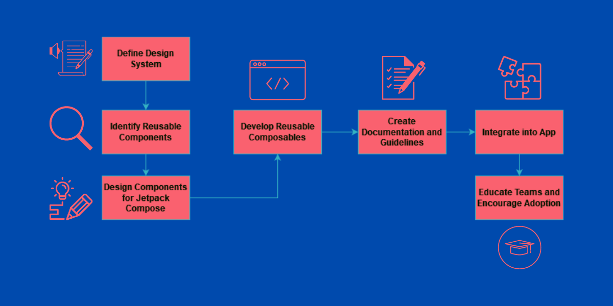 Steps to Create a Pattern Library
1. Audit Existing Design
Evaluate your current system and identify reusable components, styles, and guidelines that can be adapted to Jetpack Compose based on the design system you currently use in your app (ex. material)
2. Design for Compose
Modify existing designs or create new ones that align with principles of Compose. Consider customization options, theming, and accessibility.
3. Develop Reusable Components
Implement Jetpack Compose components that encapsulate your design elements. Create a library of composables for buttons, cards, navigation, and other complex UI elements with them extending a current design system like material or similar as in most cases we may not want to reinvent that wheel!
4. Document Guidelines
Provide thorough documentation that guides developers and designers on how to effectively use the pattern library. Include examples and best practices to ensure proper adoption.
5. Integration and Adoption
Integrate the pattern library into your app’s architecture. Educate teams about its benefits and usage to encourage adoption.
Providing Examples and Usage Guidelines
Showcasing Practicality
Include illustrative examples in your pattern library’s documentation. Detail how each component should be utilized in different parts of the app. By showcasing real-world usage scenarios, you simplify the integration process for developers.
@Composable
fun AppScreen() {
    Column(
        modifier = Modifier.fillMaxSize(),
        verticalArrangement = Arrangement.Center,
        horizontalAlignment = Alignment.CenterHorizontally
    ) {
        PatternLibraryButton(text = "Click Me") {
            // Handle button click
        }
    }
}
Some Examples of Reusable UI Components
Example 1 — Expandable Card
Design an expandable card with customizable content. Create an ExpandableCard component that toggles between collapsed and expanded states when interacted with.
 Expandable Card — Sourced from Pinterest
Example 2 — Multi-Step Form
Develop a multi-step form with transitions between steps. Craft a MultiStepForm component that handles multiple steps, animations, and validation.
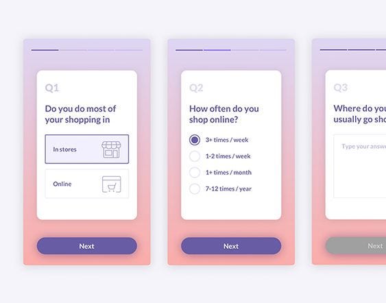 Multi Step Form — Sourced from Pinterest
Example 3 — Customizable Themes
Design a theming system that allows customization. Build a ThemedCard component that adapts to different themes while maintaining design consistency.
Customizable Themes — Sourced from Dribbble
Example 4 — Custom Charts
Construct a custom chart with interactive elements. Create a CustomChart component that supports different chart types and interactive data points.
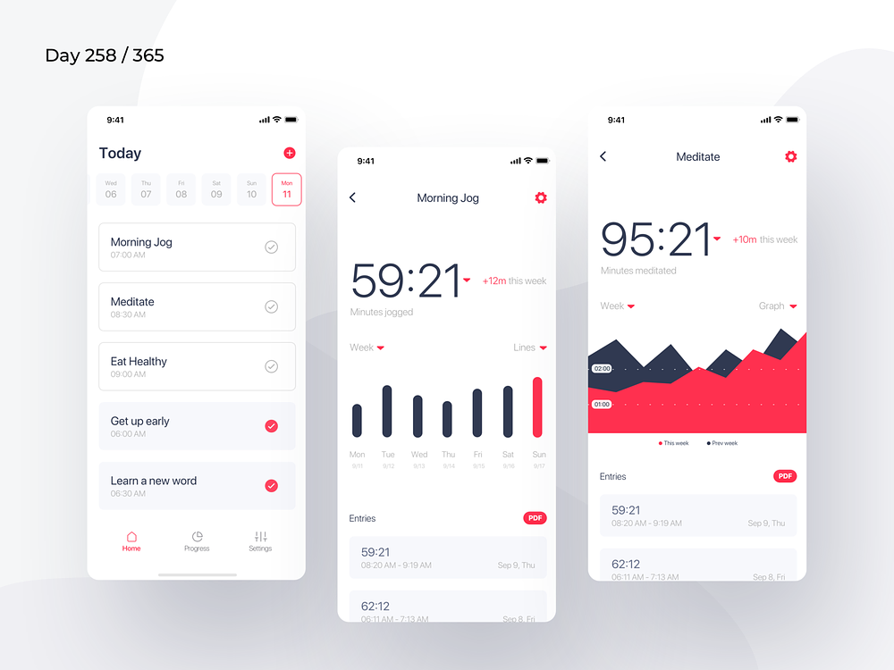 Custom Charts — Sourced from Dribbble
Example 5 — Animated Carousel
Develop an animated carousel with swipe gestures. Build an AnimatedCarousel component that displays a swipe-able carousel of items.
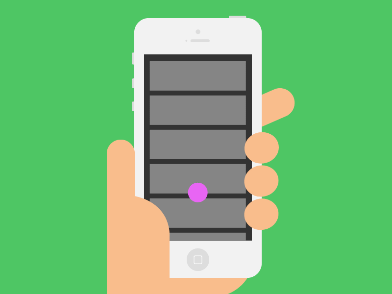
Animated Carousel — Sourced from Pinterest
Conclusion
Integrating a pattern library into Jetpack Compose projects is not just convenient; it’s a strategic decision that ensures design consistency, accelerates development, and fosters collaboration. As companies embrace the potential of Jetpack Compose, they have a unique chance to re-imagine not just their design system but also thinking all the way till atomic elements in their app, creating a foundation that supports innovation, scalability, and an exceptional user experience. By investing in a comprehensive pattern library, companies can build well-designed, consistent, and scalable apps that meet the evolving needs of their users.
Closing Remarks
If you liked what you read, please feel free to leave your valuable feedback or appreciation. I am always looking to learn, collaborate and grow with fellow developers.
If you have any questions feel free to message me on LinkedIn!
Follow me on Medium for more articles — Medium Profile
Connect with me on LinkedIn for collaboration — LinkedIn Profile
Happy Composing!


