

There’s so many exciting things happening in the Android world. It’s always hard to keep up. But when I do play around with things, I find them really exciting to work with.
Especially when they’re related to design and interaction.
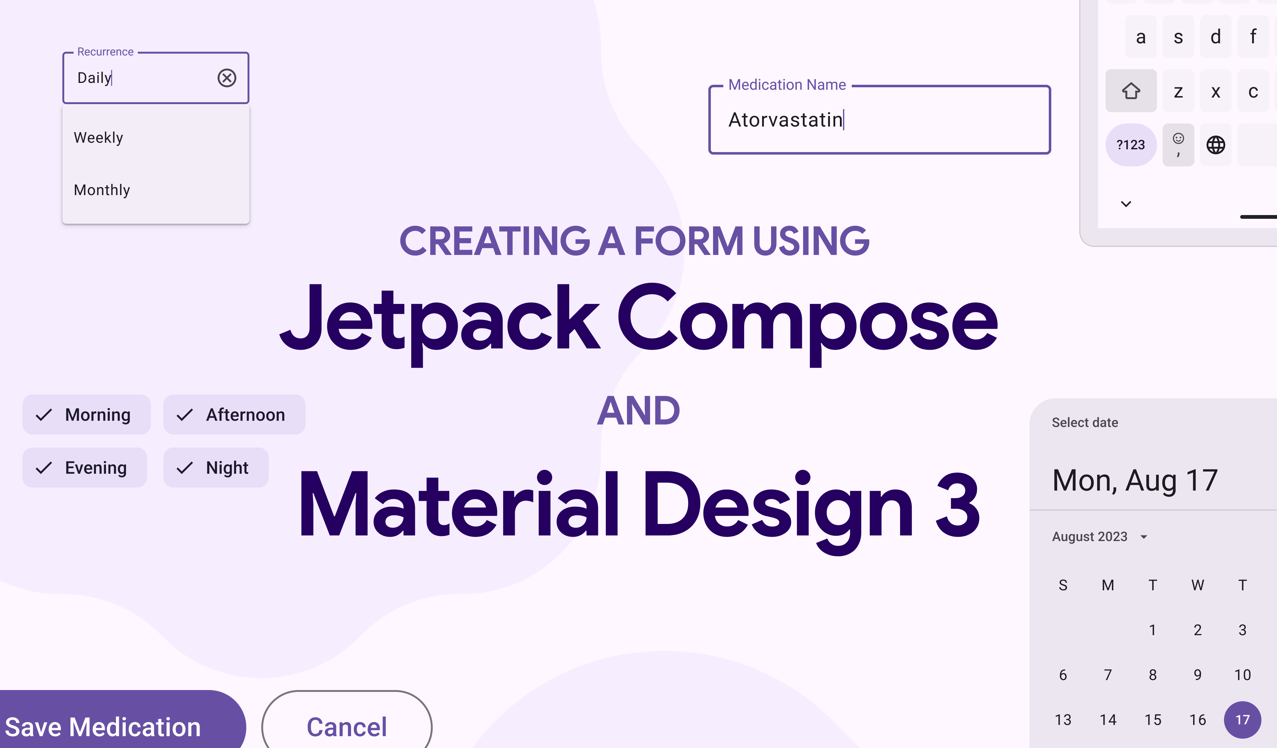
I’ve long been wanting to work on a side project where I can play around with Compose and Material Design 3. So I started my side project called Dose, a reminder app for people to take their medications on time:
GitHub – waseefakhtar/dose-android: 💊⏰ Dose is a work-in-progress Android app that reminds you…
Although there are so many things going on in the project, I happen to gather some exciting things that I learnt along the way, that I want to share with you.
So in this blog post, I want to share what I learnt about:
- Building a form sheet using Compose and Material Design 3 with various elements like TextField, DropDownMenu, and FilterChip.
- Maintaining element states to retain user input values.
- Validating inputs to ensure mandatory fields are filled, numbers are within limits, and text length is respected.
In case you’re not fond of reading blog posts, I’ve also turned this blog post into a 17-minute speed code video with some laid back music for you to watch and relax to, as well.
In case that’s your cup of tea, here you go:
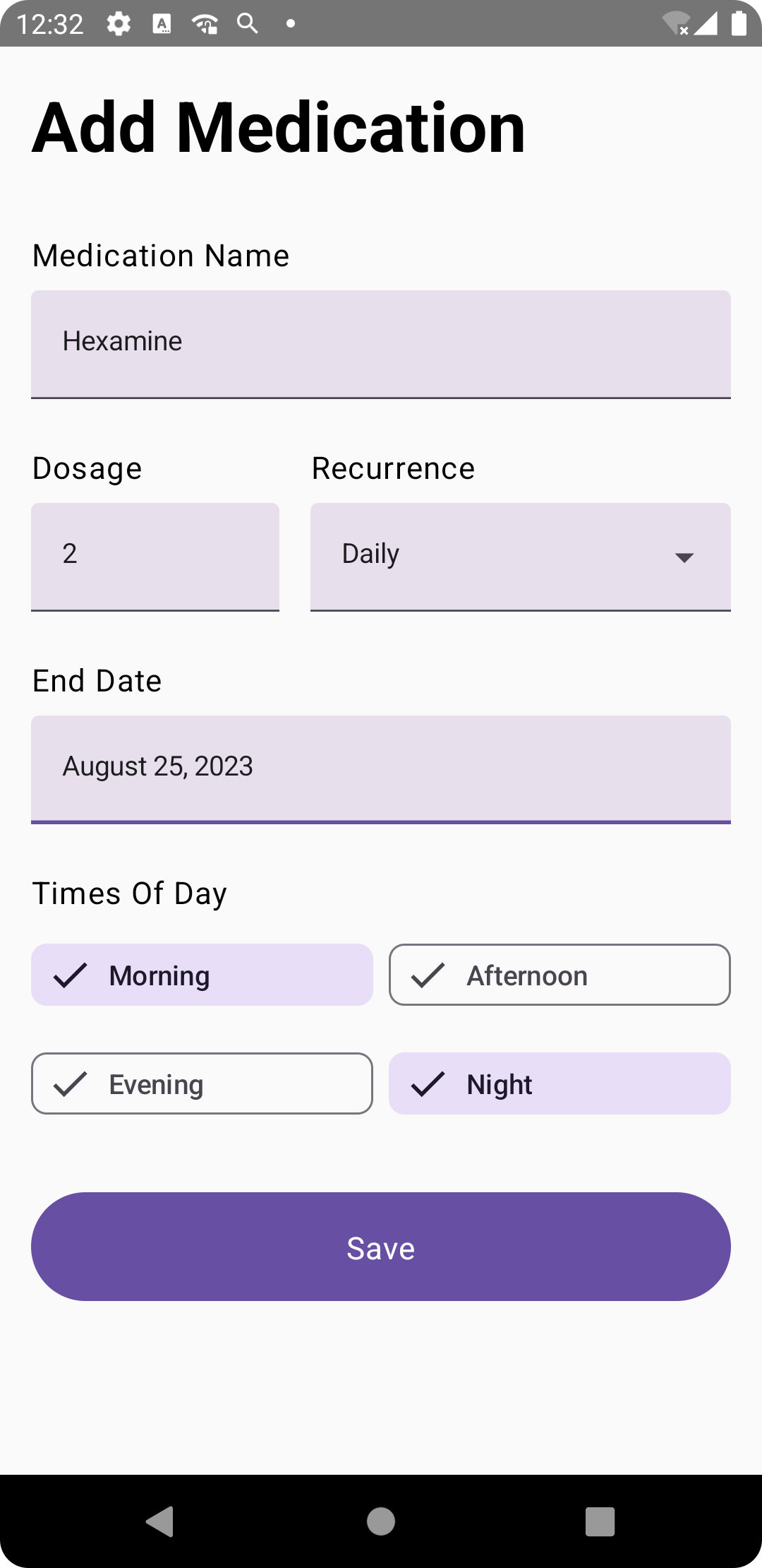
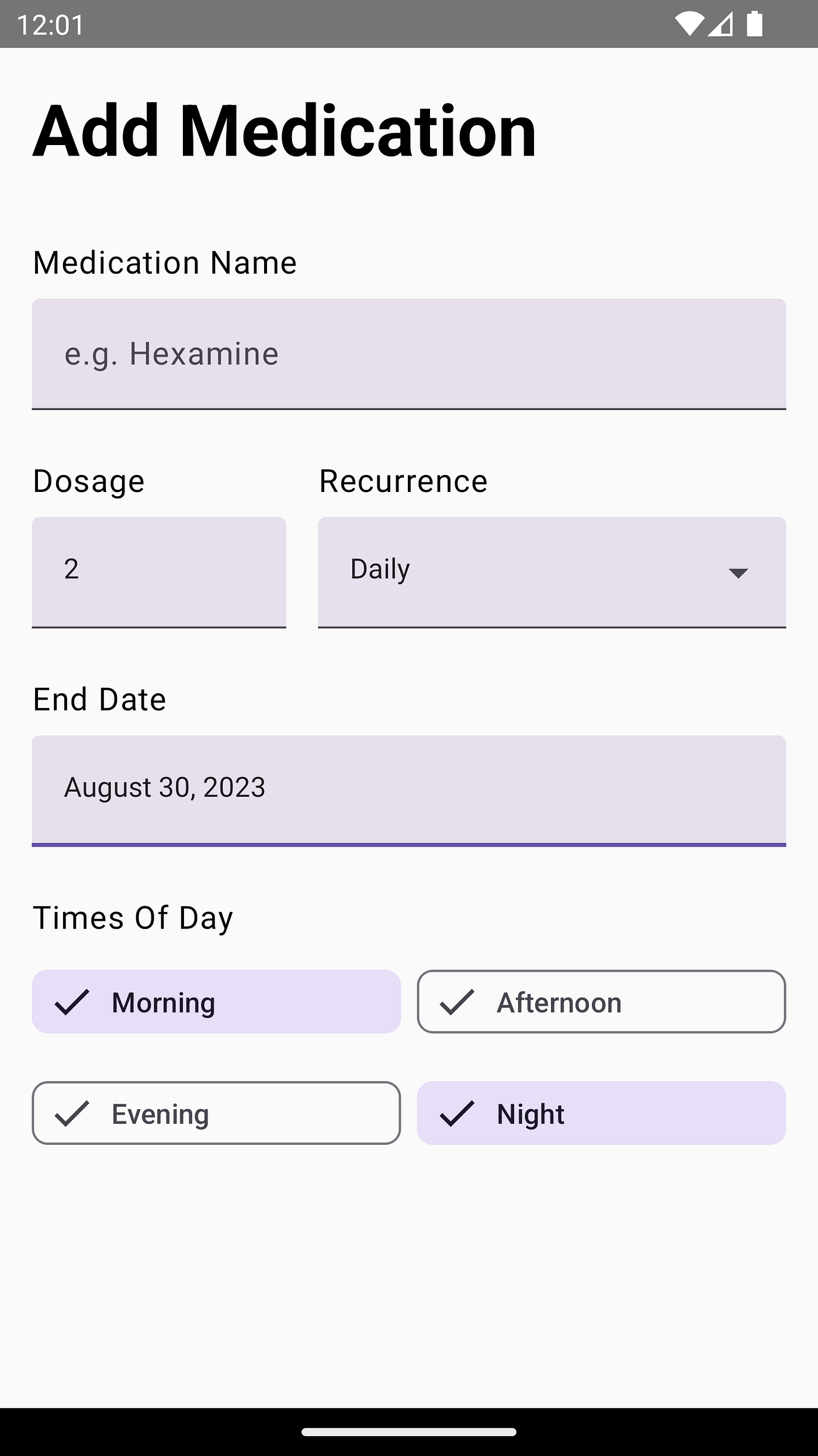
Here’s how your form should look by the end of this blog post:
So without further ado, let’s get started.
Prerequisite ☝️
First things first. As Android development is evolving rapidly, I’d like to specify the Android Studio version and dependency versions I used in this blog post.
This way, if changes occur in the future, you won’t find yourself puzzled by any discrepancies between the blog post and the actual implementation.
I also make an effort to utilize the latest versions of all tools, ensuring that the longevity of the blog post isn’t compromised by rapid outdatedness.
For this blog post, I’ve used Android Studio Hedgehog | 2023.1.1 Beta 1.
For dependencies version, keep on reading the next section.
Project Setup ⚙️
To get things started, here’s what you do:
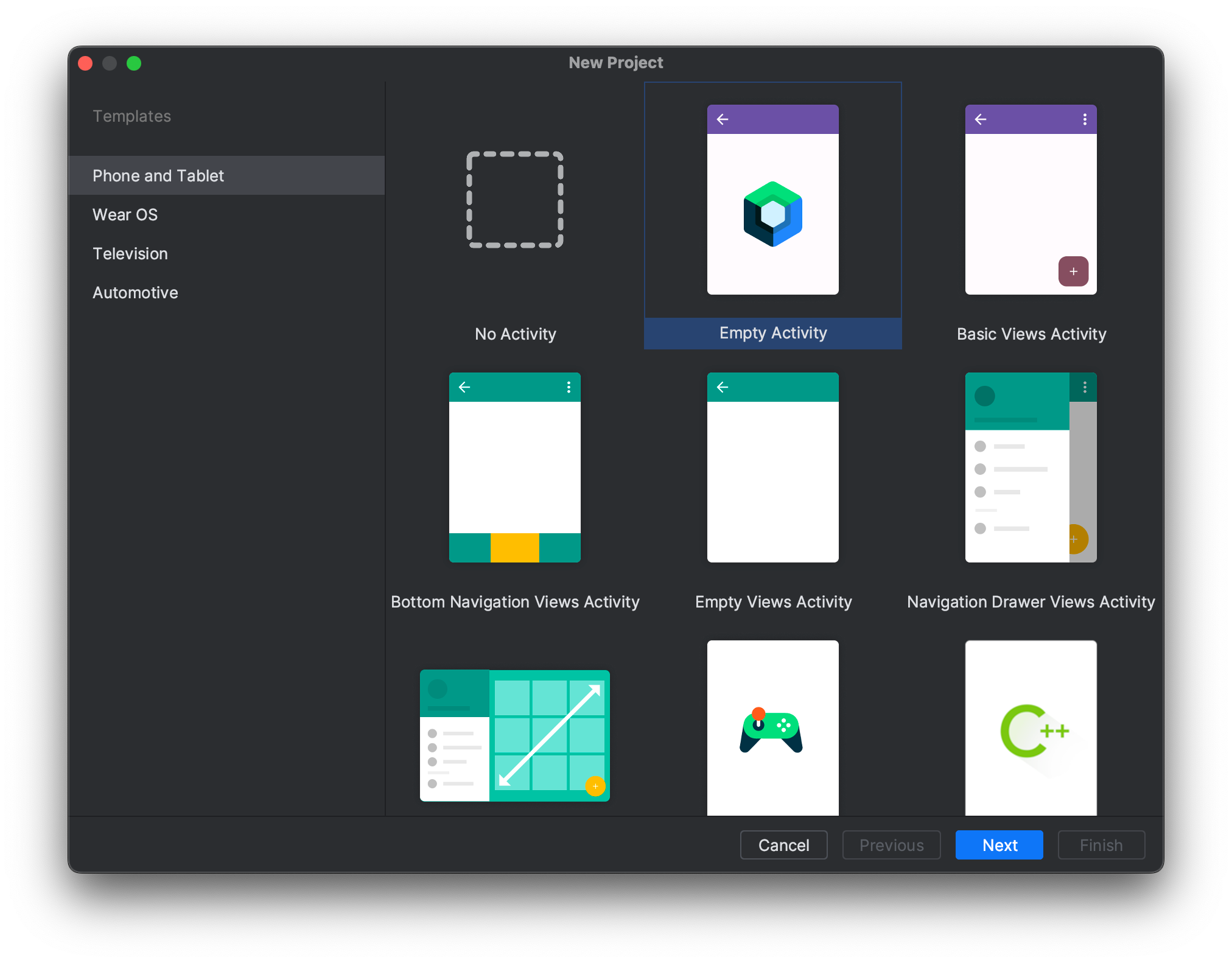
- Open a new project.
- Select an Empty Activity Project Template and give your app a name. This would create an empty Android project.
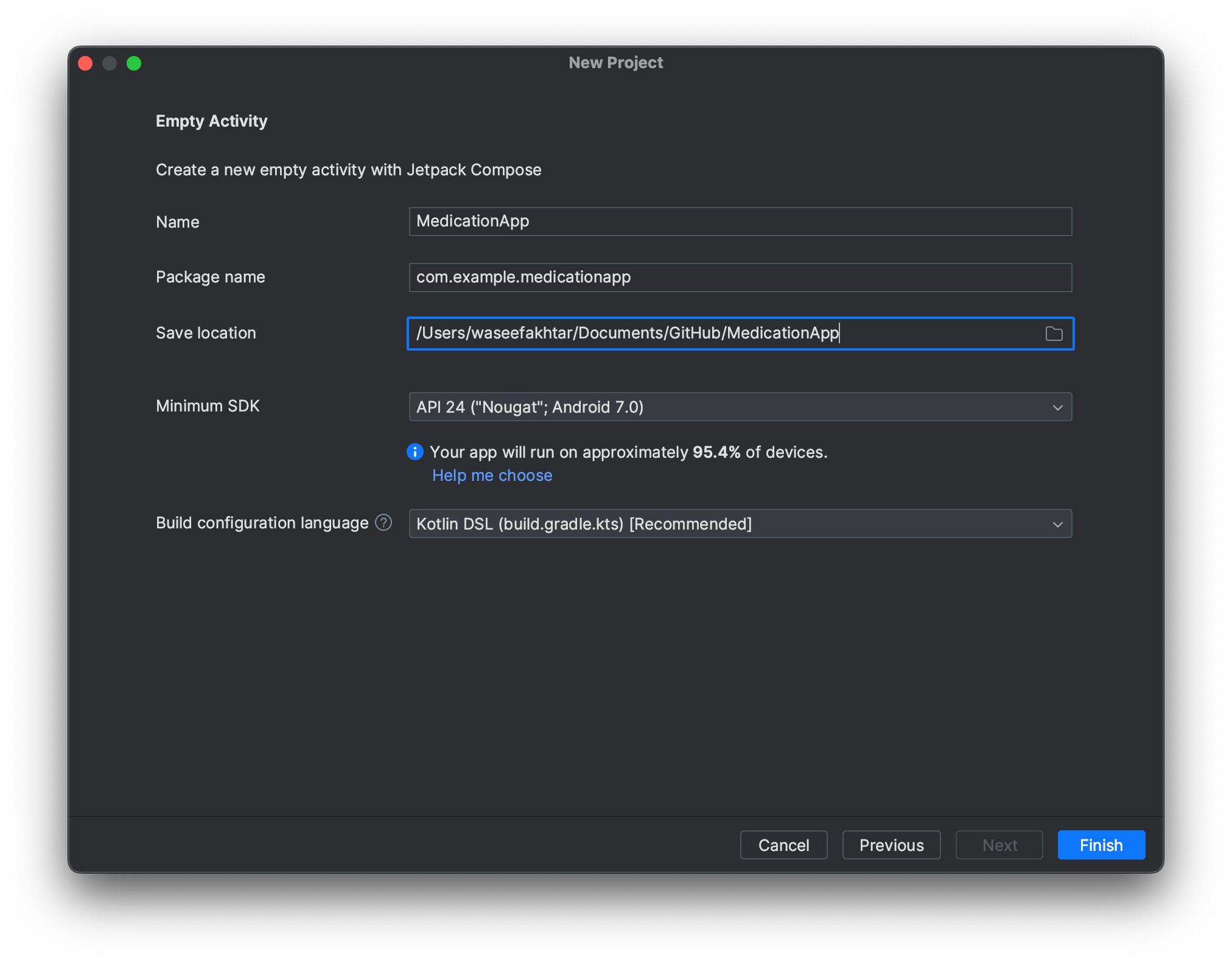
If set up from the same Android Studio version, you should have all the latest tools and dependencies added in your Gradle files already. But if not, here are the dependencies and their compatible versions that I use for my project.
Gradle (Module :app):
| plugins { | |
| id("com.android.application") | |
| id("org.jetbrains.kotlin.android") | |
| id("kotlin-kapt") | |
| id("kotlin-parcelize") | |
| } | |
| android { | |
| namespace = "com.example.medicationapp" | |
| compileSdk = 34 | |
| defaultConfig { | |
| applicationId = "com.example.medicationapp" | |
| minSdk = 24 | |
| targetSdk = 34 | |
| versionCode = 1 | |
| versionName = "1.0" | |
| testInstrumentationRunner = "androidx.test.runner.AndroidJUnitRunner" | |
| vectorDrawables { | |
| useSupportLibrary = true | |
| } | |
| } | |
| buildTypes { | |
| release { | |
| isMinifyEnabled = false | |
| proguardFiles( | |
| getDefaultProguardFile("proguard-android-optimize.txt"), | |
| "proguard-rules.pro" | |
| ) | |
| } | |
| } | |
| compileOptions { | |
| sourceCompatibility = JavaVersion.VERSION_17 | |
| targetCompatibility = JavaVersion.VERSION_17 | |
| } | |
| kotlinOptions { | |
| jvmTarget = "17" | |
| } | |
| buildFeatures { | |
| compose = true | |
| } | |
| composeOptions { | |
| kotlinCompilerExtensionVersion = "1.4.3" | |
| } | |
| packaging { | |
| resources { | |
| excludes += "/META-INF/{AL2.0,LGPL2.1}" | |
| } | |
| } | |
| } | |
| dependencies { | |
| implementation("androidx.core:core-ktx:1.10.1") | |
| implementation("androidx.lifecycle:lifecycle-runtime-ktx:2.6.1") | |
| implementation("androidx.activity:activity-compose:1.7.0") | |
| implementation(platform("androidx.compose:compose-bom:2023.03.00")) | |
| implementation("androidx.compose.ui:ui") | |
| implementation("androidx.compose.ui:ui-graphics") | |
| implementation("androidx.compose.ui:ui-tooling-preview") | |
| implementation("androidx.compose.material3:material3") | |
| testImplementation("junit:junit:4.13.2") | |
| androidTestImplementation("androidx.test.ext:junit:1.1.5") | |
| androidTestImplementation("androidx.test.espresso:espresso-core:3.5.1") | |
| androidTestImplementation(platform("androidx.compose:compose-bom:2023.03.00")) | |
| androidTestImplementation("androidx.compose.ui:ui-test-junit4") | |
| debugImplementation("androidx.compose.ui:ui-tooling") | |
| debugImplementation("androidx.compose.ui:ui-test-manifest") | |
| } |
Gradle (Project):
| plugins { | |
| id("com.android.application") version "8.2.0-beta01" apply false | |
| id("org.jetbrains.kotlin.android") version "1.8.10" apply false | |
| } |
OUR VIDEO RECOMMENDATION


Jobs
Regardless, if you don’t encounter any issues with later versions, you should keep them as is. The rule of thumb is that the newer and the stable the version of a dependency, the better. 🙂
Running the project 🏃♂️
Before we start writing any code, it’s always best to run our initial project to get an idea on what has already been set up for us and make sure there are no unknown bugs.
It’s also always a good idea to run your project after each change that you make in your code because of the same reasons above.
If you run your project at this stage, your app will build successfully and it will show up looking like this:

Upon the successful run, we’re now ready to get our hands dirty!
Structuring the App 🧱
In order to start writing our app, we need to first structure our app to what I call Jetpack Compose conventions since I’ve often seen it as a common structure among Google Codelabs.
First things first:
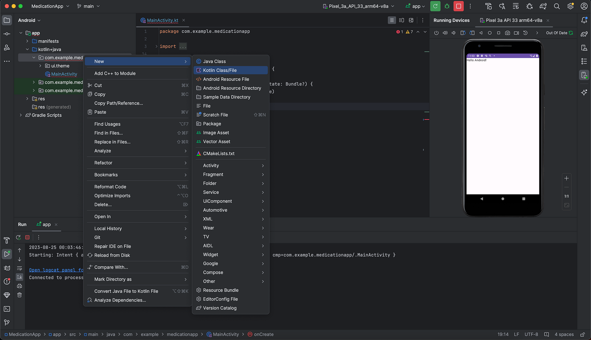
- Open
MainActivity.kt. - Create a new composable function under your
MainActivityclass. - Replace the body of
setContentwith just callingMedicationApp()which will create in a bit.
| override fun onCreate(savedInstanceState: Bundle?) { | |
| super.onCreate(savedInstanceState) | |
| setContent { | |
| MedicationApp() | |
| } | |
| } |
4. Create a new Kotlin file named MedicationApp (this is where the main content of the app will now go)

5. Inside the new class, write a new Composable function, which calls the MedicationAppTheme (that sets our style & theme for the app), and call the Surface composable function, which is a material design container for other composables where you can set the content size, elevation, and background color, etc.
For now, we keep it simple to go with, and inside the body of Surface, we call another composable AddMedicationScreen() which we will create in a bit.
| @Composable | |
| fun MedicationApp() { | |
| MedicationAppTheme { | |
| Surface( | |
| modifier = Modifier.fillMaxSize(), | |
| color = MaterialTheme.colorScheme.background | |
| ) { | |
| AddMedicationScreen() | |
| } | |
| } | |
| } |
The ‘Add Medication’ Form Sheet 💊
Now onto the main part of the app, the Add Medication screen.
- Create a new Kotlin file named
AddMedicationScreen.kt. - Inside the class, create a new Composable function, named AddMedicationScreen.
- Add a new Column with some padding for breathing space, and vertical scroll so the form is scrollable on small screen devices. Inside this, we’re going to have all the form elements.
- Add the first element as the title of the screen, so you’ll have the function looking something like this:
| @Composable | |
| fun AddMedicationScreen() { | |
| Column( | |
| modifier = Modifier | |
| .padding(16.dp, 16.dp) | |
| .verticalScroll(rememberScrollState()), | |
| verticalArrangement = Arrangement.spacedBy(8.dp) | |
| ) { | |
| Text( | |
| text = stringResource(id = R.string.add_medication), | |
| fontWeight = FontWeight.Bold, | |
| style = MaterialTheme.typography.displaySmall | |
| ) | |
| } |
Note: You’ll encounter that R.string.add_medication is not detectable. Upon clicking the bulb icon, you can create a new string value “Add Medication”, like so:


Medication Name — TextField
5. Next, we’re going to create a text field for the medication name, by creating a new text label as well as a text field where user can enter the medication name.
We’re also going to store the medication name as a value when the user enters it. For that we’ll create a new variable as rememberSaveable so that the value is stored as long as the screen’s lifecycle and it is not lost in case the screen rotates, or a foldable phone is unfolded/folded.
So we’ll create the variable first thing at the top of the body of AddMedicationScreen() function.
And then add label and the text field, like so:
Since the TextField is a part of Material Design 3 which is an experimental API as we write, we need to add an OptIn annotation at the top of our AddMedicationScreen function too.
So our code now looks something like this:
| @OptIn(ExperimentalMaterial3Api::class) | |
| @Composable | |
| fun AddMedicationScreen() { | |
| var medicationName by rememberSaveable { mutableStateOf("") } | |
| Column( | |
| modifier = Modifier | |
| .padding(16.dp, 16.dp) | |
| .verticalScroll(rememberScrollState()), | |
| verticalArrangement = Arrangement.spacedBy(8.dp) | |
| ) { | |
| Text( | |
| text = stringResource(id = R.string.add_medication), | |
| fontWeight = FontWeight.Bold, | |
| style = MaterialTheme.typography.displaySmall | |
| ) | |
| Spacer(modifier = Modifier.padding(8.dp)) | |
| Text( | |
| text = stringResource(id = R.string.medication_name), | |
| style = MaterialTheme.typography.bodyLarge | |
| ) | |
| TextField( | |
| modifier = Modifier.fillMaxWidth(), | |
| value = medicationName, | |
| onValueChange = { medicationName = it }, | |
| placeholder = { Text(text = "e.g. Hexamine") }, | |
| ) | |
| } |
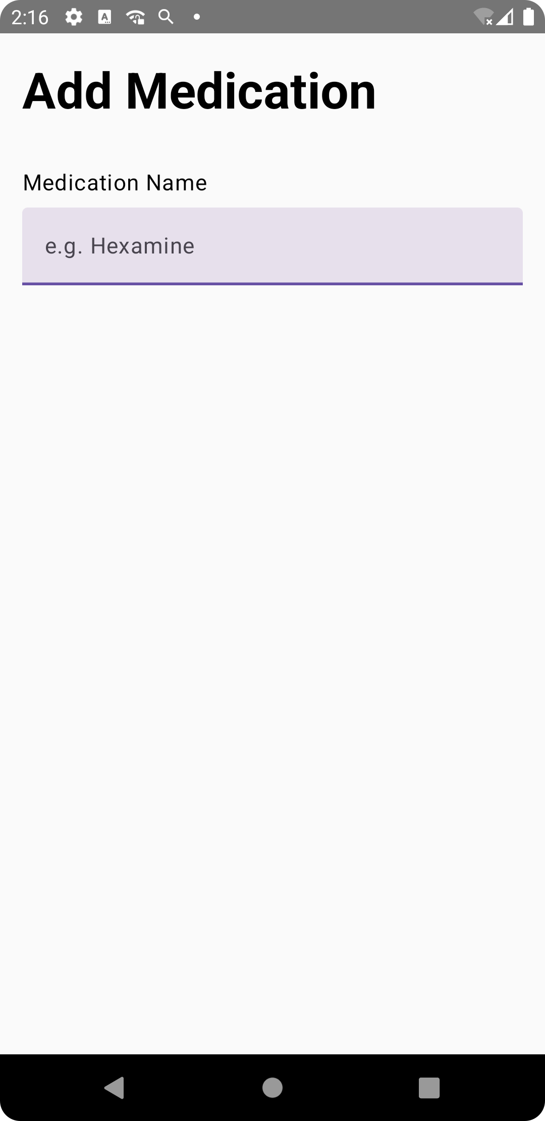
Upon running, our app looks like this:
6. Next up, getting number of dosage per day and the recurrence of medication, like so:
To make things look appealing, since dosage per day only requires at max a 2 digit number, it won’t take a lot of horizontal space, so we’re going to add Dosage per day and Recurrence fields on the same row.
Dosage Per Day — TextField
In dosage per day, we’re going to introduce a validation so that dosage per day doesn’t exceed 2 digits and shows an error in case the user violates it.
For that, we’re going to create a new rememberSaveable boolean variable check named isMaxDoseError and update its value as the value in the text field change.
Upon error, we show a text underneath the Dosage textfield.
We’ll also make sure the keyboard only shows numbers as input values when dosage per day is shown.
Recurrence — Dropdown Menu
As for Recurrence, since Recurrence will only have limited option, for instance, Daily, Weekly, Monthly. We can go for a dropdown menu with those options so it’s easy for users to select between them.
For that, we’re going to create an enum class called Recurrence, so it’s easy to keep it consistent across the app.
Let’s do that first so we can call upon the enum values when creating the input fields.
a) Create a new Kotlin class named, RecurrenceUtil.kt.
b) Inside the class, create the enum class, and then a list where all the all the enum entries, like so:
| enum class Recurrence { | |
| Daily, | |
| Weekly, | |
| Monthly | |
| } | |
| fun getRecurrenceList(): List<Recurrence> { | |
| val recurrenceList = mutableListOf<Recurrence>() | |
| recurrenceList.add(Recurrence.Daily) | |
| recurrenceList.add(Recurrence.Weekly) | |
| recurrenceList.add(Recurrence.Monthly) | |
| return recurrenceList | |
| } |
Once done, we can continue with the AddMedication screen.
6.1. First thing, create the rememberSaveable variables for both Dosage and Recurrence, giving them some default values.
6.2. Add a isMaxDoseError rememberSaveable variable.
6.4. Add a row to keep the fields in a single row, and then a column for each element (dosage and recurrence) since we always have two elements for each field: a label text on top of the input field.
With everything now explained, here’s how the new changes in the code will now look:
| @OptIn(ExperimentalMaterial3Api::class) | |
| @Composable | |
| fun AddMedicationScreen() { | |
| // Previously implememted. | |
| var numberOfDosage by rememberSaveable { mutableStateOf("1") } | |
| var recurrence by rememberSaveable { mutableStateOf(Recurrence.Daily.name) } | |
| Column( | |
| modifier = Modifier | |
| .padding(16.dp, 16.dp) | |
| .verticalScroll(rememberScrollState()), | |
| verticalArrangement = Arrangement.spacedBy(8.dp) | |
| ) { | |
| // Previously implememted. | |
| Spacer(modifier = Modifier.padding(4.dp)) | |
| var isMaxDoseError by rememberSaveable { mutableStateOf(false) } | |
| Row( | |
| horizontalArrangement = Arrangement.spacedBy(16.dp) | |
| ) { | |
| val maxDose = 3 | |
| Column( | |
| verticalArrangement = Arrangement.spacedBy(8.dp) | |
| ) { | |
| Text( | |
| text = stringResource(id = R.string.dosage), | |
| style = MaterialTheme.typography.bodyLarge | |
| ) | |
| TextField( | |
| modifier = Modifier.width(128.dp), | |
| value = numberOfDosage, | |
| onValueChange = { | |
| if (it.length < maxDose) { | |
| isMaxDoseError = false | |
| numberOfDosage = it | |
| } else { | |
| isMaxDoseError = true | |
| } | |
| }, | |
| trailingIcon = { | |
| if (isMaxDoseError) { | |
| Icon( | |
| imageVector = Icons.Filled.Info, | |
| contentDescription = "Error", | |
| tint = MaterialTheme.colorScheme.error | |
| ) | |
| } | |
| }, | |
| placeholder = { Text(text = "e.g. 1") }, | |
| isError = isMaxDoseError, | |
| keyboardOptions = KeyboardOptions(keyboardType = KeyboardType.Number) | |
| ) | |
| } | |
| RecurrenceDropdownMenu { recurrence = it } | |
| } | |
| if (isMaxDoseError) { | |
| Text( | |
| text = "You cannot have more than 99 dosage per day.", | |
| color = MaterialTheme.colorScheme.error, | |
| style = MaterialTheme.typography.bodySmall, | |
| ) | |
| } | |
| } | |
| } |
For the RecurrenceDropDownList, we implement another composable function underneath AddMedicationScreen composable, and it should look like this:
| @OptIn(ExperimentalMaterial3Api::class) | |
| @Composable | |
| fun RecurrenceDropdownMenu(recurrence: (String) -> Unit) { | |
| Column( | |
| verticalArrangement = Arrangement.spacedBy(8.dp) | |
| ) { | |
| Text( | |
| text = stringResource(id = R.string.recurrence), | |
| style = MaterialTheme.typography.bodyLarge | |
| ) | |
| val options = getRecurrenceList().map { it.name } | |
| var expanded by remember { mutableStateOf(false) } | |
| var selectedOptionText by remember { mutableStateOf(options[0]) } | |
| ExposedDropdownMenuBox( | |
| expanded = expanded, | |
| onExpandedChange = { expanded = !expanded }, | |
| ) { | |
| TextField( | |
| modifier = Modifier.menuAnchor(), | |
| readOnly = true, | |
| value = selectedOptionText, | |
| onValueChange = {}, | |
| trailingIcon = { ExposedDropdownMenuDefaults.TrailingIcon(expanded = expanded) }, | |
| colors = ExposedDropdownMenuDefaults.textFieldColors(), | |
| ) | |
| ExposedDropdownMenu( | |
| expanded = expanded, | |
| onDismissRequest = { expanded = false }, | |
| ) { | |
| options.forEach { selectionOption -> | |
| DropdownMenuItem( | |
| text = { Text(selectionOption) }, | |
| onClick = { | |
| selectedOptionText = selectionOption | |
| recurrence(selectionOption) | |
| expanded = false | |
| } | |
| ) | |
| } | |
| } | |
| } | |
| } | |
| } |
Note: At the time of writing this, with the latest Material Design 3, this is how the APIs are designed, but since there’s been a lot of API changes lately, this could affect how things are defined.
For instance, I noticed that my dropdown menu stopped working after updating material design version, and that was because they added a new requirement for it where one needed to add modifier = Modifier.menuAnchor() for dropdown menu to work.
In case some other behavioral changes or build issue occur in your case, just make sure you go through the material design docs for Jetpack Compose or search on StackOverflow for latest solutions.
End Date — TextField and DatePickerDialog
7. Next up, we need an end date from the user when the medication needs to be stopped so that they’re no longer be reminded about it.

To do this, we plan to show a Calendar / DatePickerDialog where user can select a future date as an end date for the medication.
As of creating this, I could not find a Calendar element from the Jetpack Compose / Material Design library.
So in our case, we’re going to use the DatePickerDialog from the Android SDK.
Then, we’re going to create a TextField composable and attach it to the DatePickerDialog in such a way that it listens to the interaction changes inside the DatePickerDialog i.e. we’re going to make use of a compose function called MutableInteractionSource.
Apart from that, it should be very similar to the rest of our form elements.
Let’s see how it looks in code.
| @OptIn(ExperimentalMaterial3Api::class) | |
| @Composable | |
| fun AddMedicationScreen() { | |
| // Previously implemented. | |
| var endDate by rememberSaveable { mutableStateOf(Date().time) } | |
| Column( | |
| modifier = Modifier | |
| .padding(16.dp, 16.dp) | |
| .verticalScroll(rememberScrollState()), | |
| verticalArrangement = Arrangement.spacedBy(8.dp) | |
| ) { | |
| // Previously implemented. | |
| Spacer(modifier = Modifier.padding(4.dp)) | |
| EndDateTextField { endDate = it } | |
| } | |
| } |
| @OptIn(ExperimentalMaterial3Api::class) | |
| @Composable | |
| fun EndDateTextField(endDate: (Long) -> Unit) { | |
| Text( | |
| text = stringResource(id = R.string.end_date), | |
| style = MaterialTheme.typography.bodyLarge | |
| ) | |
| val interactionSource = remember { MutableInteractionSource() } | |
| val isPressed: Boolean by interactionSource.collectIsPressedAsState() | |
| val currentDate = Date().toFormattedString() | |
| var selectedDate by rememberSaveable { mutableStateOf(currentDate) } | |
| val context = LocalContext.current | |
| val calendar = Calendar.getInstance() | |
| val year: Int = calendar.get(Calendar.YEAR) | |
| val month: Int = calendar.get(Calendar.MONTH) | |
| val day: Int = calendar.get(Calendar.DAY_OF_MONTH) | |
| calendar.time = Date() | |
| val datePickerDialog = | |
| DatePickerDialog(context, { _: DatePicker, year: Int, month: Int, dayOfMonth: Int -> | |
| val newDate = Calendar.getInstance() | |
| newDate.set(year, month, dayOfMonth) | |
| selectedDate = "${month.toMonthName()} $dayOfMonth, $year" | |
| endDate(newDate.timeInMillis) | |
| }, year, month, day) | |
| TextField( | |
| modifier = Modifier.fillMaxWidth(), | |
| readOnly = true, | |
| value = selectedDate, | |
| onValueChange = {}, | |
| trailingIcon = { Icons.Default.DateRange }, | |
| interactionSource = interactionSource | |
| ) | |
| if (isPressed) { | |
| datePickerDialog.show() | |
| } | |
| } | |
| fun Int.toMonthName(): String { | |
| return DateFormatSymbols().months[this] | |
| } | |
| fun Date.toFormattedString(): String { | |
| val simpleDateFormat = SimpleDateFormat("LLLL dd, yyyy", Locale.getDefault()) | |
| return simpleDateFormat.format(this) | |
| } |
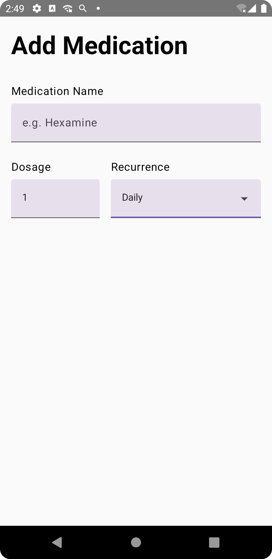
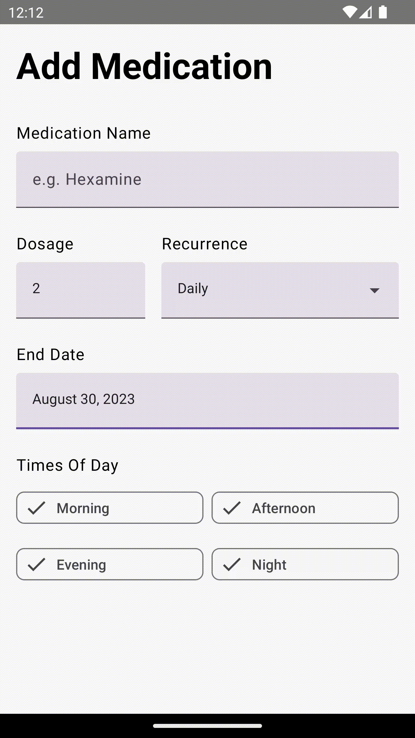
Upon running the app after this, we’re going to have the element working something like this:
Times of Day — FilterChip
7. Next up, we’re going to let user select at what times of day they need to be reminded about the medication, i.e. Morning, Afternoon, Evening, Night.
For this, we’re going explore a new Material component called FilterChip, whose purpose will be that the user selects one or more of them, like a checklist.
Since we have a limited options here, as well, we know what to do about it — i.e. create an enum with those entries.
So,
7.1. Create a new TimesOfDay.kt file.
7.2. Create a new enum, like so:
| enum class TimesOfDay { | |
| Morning, | |
| Afternoon, | |
| Evening, | |
| Night | |
| } |
We’re also going to keep a check on how many FilterChips can be selected at once, i.e. we should not allow the user to select more FilterChips than the number of dosage per day.
And in case user selects, we show a Toast error message explaining to the user.
For this validation, we need to keep a check of the number of selection of the FilterChips when the state of the FilterChip is changed.
So we need to create common helper methods, handleSelection and a showMaxSelectionToast that we can use for each of the FilterChip we’re going to add.
For each of the FilterChips, we’re also going to add a rememberSaveable variables like we have done for all the previous input fields before.
One final thing.
We’d also like the FilterChips to be evenly divided and not take too much or too little space on the screen. So we’re going to keep two FilterChips per row.
Let’s see how it works in code. 👇
| @OptIn(ExperimentalMaterial3Api::class) | |
| @Composable | |
| fun AddMedicationScreen() { | |
| // Previously implemented code. | |
| var isMorningSelected by rememberSaveable { mutableStateOf(false) } | |
| var isAfternoonSelected by rememberSaveable { mutableStateOf(false) } | |
| var isEveningSelected by rememberSaveable { mutableStateOf(false) } | |
| var isNightSelected by rememberSaveable { mutableStateOf(false) } | |
| Column( | |
| modifier = Modifier | |
| .padding(16.dp, 16.dp) | |
| .verticalScroll(rememberScrollState()), | |
| verticalArrangement = Arrangement.spacedBy(8.dp) | |
| ) { | |
| // Previously implemented code. | |
| Spacer(modifier = Modifier.padding(4.dp)) | |
| Text( | |
| text = stringResource(id = R.string.times_of_day), | |
| style = MaterialTheme.typography.bodyLarge | |
| ) | |
| var selectionCount by rememberSaveable { mutableStateOf(0) } | |
| val context = LocalContext.current | |
| Row( | |
| horizontalArrangement = Arrangement.spacedBy(8.dp) | |
| ) { | |
| FilterChip( | |
| modifier = Modifier | |
| .fillMaxWidth() | |
| .weight(1f), | |
| selected = isMorningSelected, | |
| onClick = { | |
| handleSelection( | |
| isSelected = isMorningSelected, | |
| selectionCount = selectionCount, | |
| canSelectMoreTimesOfDay = canSelectMoreTimesOfDay( | |
| selectionCount, | |
| numberOfDosage.toIntOrNull() ?: 0 | |
| ), | |
| onStateChange = { count, selected -> | |
| isMorningSelected = selected | |
| selectionCount = count | |
| }, | |
| onShowMaxSelectionError = { | |
| showMaxSelectionToast(numberOfDosage, context) | |
| } | |
| ) | |
| }, | |
| label = { Text(text = TimesOfDay.Morning.name) }, | |
| leadingIcon = { | |
| Icon( | |
| imageVector = Icons.Default.Done, | |
| contentDescription = "Selected" | |
| ) | |
| } | |
| ) | |
| FilterChip( | |
| modifier = Modifier | |
| .fillMaxWidth() | |
| .weight(1f), | |
| selected = isAfternoonSelected, | |
| onClick = { | |
| handleSelection( | |
| isSelected = isAfternoonSelected, | |
| selectionCount = selectionCount, | |
| canSelectMoreTimesOfDay = canSelectMoreTimesOfDay( | |
| selectionCount, | |
| numberOfDosage.toIntOrNull() ?: 0 | |
| ), | |
| onStateChange = { count, selected -> | |
| isAfternoonSelected = selected | |
| selectionCount = count | |
| }, | |
| onShowMaxSelectionError = { | |
| showMaxSelectionToast(numberOfDosage, context) | |
| } | |
| ) | |
| }, | |
| label = { Text(text = TimesOfDay.Afternoon.name) }, | |
| leadingIcon = { | |
| Icon( | |
| imageVector = Icons.Default.Done, | |
| contentDescription = "Selected" | |
| ) | |
| } | |
| ) | |
| } | |
| Row( | |
| horizontalArrangement = Arrangement.spacedBy(8.dp) | |
| ) { | |
| FilterChip( | |
| modifier = Modifier | |
| .fillMaxWidth() | |
| .weight(1f), | |
| selected = isEveningSelected, | |
| onClick = { | |
| handleSelection( | |
| isSelected = isEveningSelected, | |
| selectionCount = selectionCount, | |
| canSelectMoreTimesOfDay = canSelectMoreTimesOfDay( | |
| selectionCount, | |
| numberOfDosage.toIntOrNull() ?: 0 | |
| ), | |
| onStateChange = { count, selected -> | |
| isEveningSelected = selected | |
| selectionCount = count | |
| }, | |
| onShowMaxSelectionError = { | |
| showMaxSelectionToast(numberOfDosage, context) | |
| } | |
| ) | |
| }, | |
| label = { Text(text = TimesOfDay.Evening.name) }, | |
| leadingIcon = { | |
| Icon( | |
| imageVector = Icons.Default.Done, | |
| contentDescription = "Selected" | |
| ) | |
| } | |
| ) | |
| FilterChip( | |
| modifier = Modifier | |
| .fillMaxWidth() | |
| .weight(1f), | |
| selected = isNightSelected, | |
| onClick = { | |
| handleSelection( | |
| isSelected = isNightSelected, | |
| selectionCount = selectionCount, | |
| canSelectMoreTimesOfDay = canSelectMoreTimesOfDay( | |
| selectionCount, | |
| numberOfDosage.toIntOrNull() ?: 0 | |
| ), | |
| onStateChange = { count, selected -> | |
| isNightSelected = selected | |
| selectionCount = count | |
| }, | |
| onShowMaxSelectionError = { | |
| showMaxSelectionToast(numberOfDosage, context) | |
| } | |
| ) | |
| }, | |
| label = { Text(text = TimesOfDay.Night.name) }, | |
| leadingIcon = { | |
| Icon( | |
| imageVector = Icons.Default.Done, | |
| contentDescription = "Selected" | |
| ) | |
| } | |
| ) | |
| } | |
| } | |
| } |
With these common helper functions that we use with each of our FilterChips.
| private fun handleSelection( | |
| isSelected: Boolean, | |
| selectionCount: Int, | |
| canSelectMoreTimesOfDay: Boolean, | |
| onStateChange: (Int, Boolean) -> Unit, | |
| onShowMaxSelectionError: () -> Unit | |
| ) { | |
| if (isSelected) { | |
| onStateChange(selectionCount - 1, !isSelected) | |
| } else { | |
| if (canSelectMoreTimesOfDay) { | |
| onStateChange(selectionCount + 1, !isSelected) | |
| } else { | |
| onShowMaxSelectionError() | |
| } | |
| } | |
| } | |
| private fun canSelectMoreTimesOfDay(selectionCount: Int, numberOfDosage: Int): Boolean { | |
| return selectionCount < numberOfDosage | |
| } |
And with this error function that shows a message when max selection is exceeded.
| private fun showMaxSelectionToast( | |
| numberOfDosage: String, | |
| context: Context | |
| ) { | |
| Toast.makeText( | |
| context, | |
| "You're selecting ${(numberOfDosage.toIntOrNull() ?: 0) + 1} time(s) of days which is more than the number of dosage.", | |
| Toast.LENGTH_LONG | |
| ).show() | |
| } |
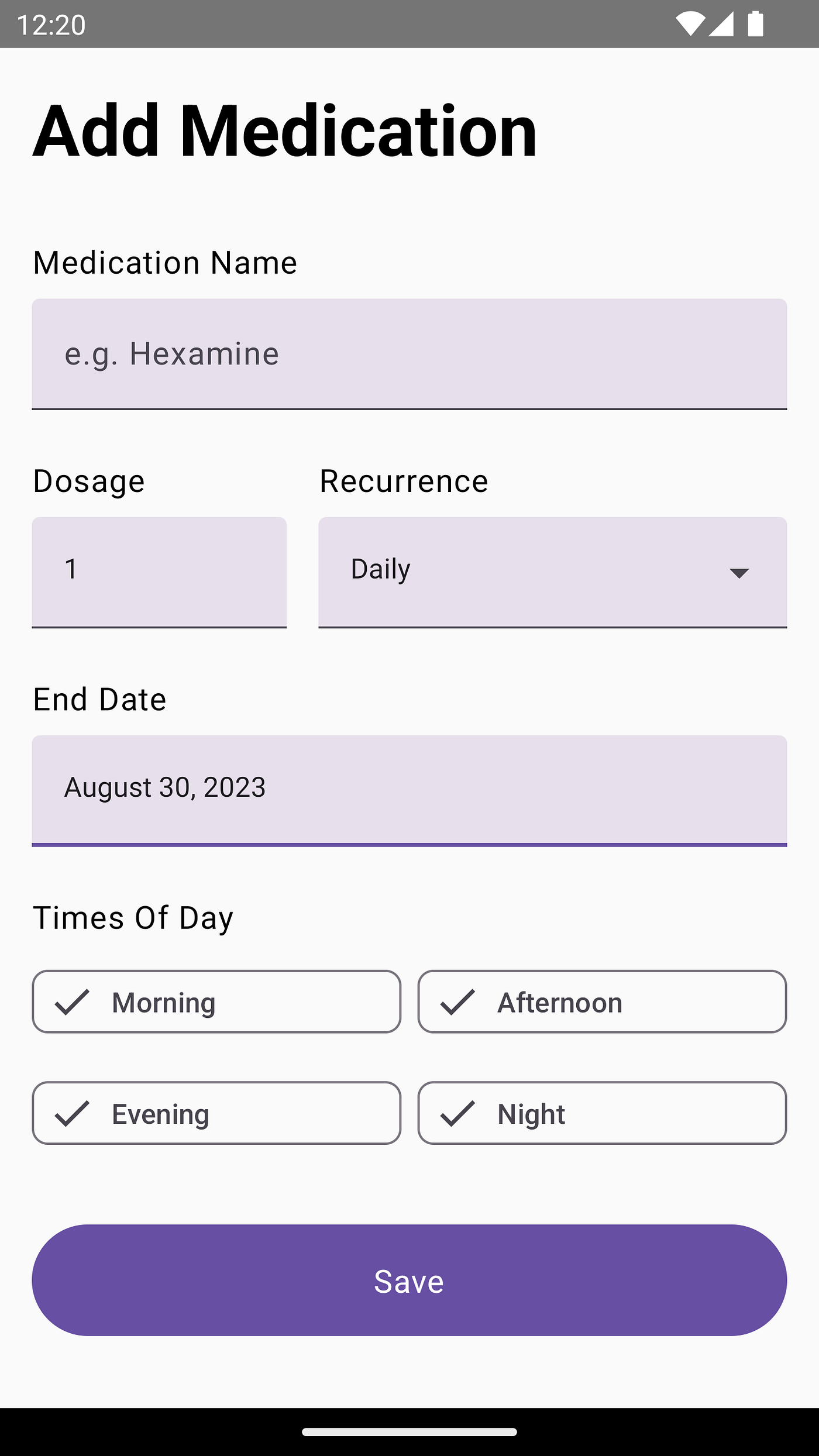
Upon running the app at this stage, you’ll have it looking something like this:
Add Medication — Button
And we’re almost done with all our form elements.
The only element remaining, a button.
The purpose of which will be that the user will press it in order to:
- Check that none of the mandatory input fields are empty or have an invalid value.
- Show an error message in case one of the value is invalid.
- Carry all the values to either the next screen or store locally.
Since #3 is out of the scope of this blog post and we’ve already crossed the 2000th word mark on this blog post, we’re not going to go further into #3 and rather just look at how the validation will be performed by the button.
Let’s see how it looks in code.
| @OptIn(ExperimentalMaterial3Api::class) | |
| @Composable | |
| fun AddMedicationScreen() { | |
| // Previously implemented code. | |
| Column( | |
| modifier = Modifier | |
| .padding(16.dp, 16.dp) | |
| .verticalScroll(rememberScrollState()), | |
| verticalArrangement = Arrangement.spacedBy(8.dp) | |
| ) { | |
| // Previously implemented code. | |
| Spacer(modifier = Modifier.padding(8.dp)) | |
| Button( | |
| modifier = Modifier | |
| .fillMaxWidth() | |
| .height(56.dp) | |
| .align(Alignment.CenterHorizontally), | |
| onClick = { | |
| validateMedication( | |
| name = medicationName, | |
| dosage = numberOfDosage.toIntOrNull() ?: 0, | |
| recurrence = recurrence, | |
| endDate = endDate, | |
| morningSelection = isMorningSelected, | |
| afternoonSelection = isAfternoonSelected, | |
| eveningSelection = isEveningSelected, | |
| nightSelection = isNightSelected, | |
| onInvalidate = { | |
| Toast.makeText( | |
| context, | |
| context.getString(R.string.value_is_empty, context.getString(it)), | |
| Toast.LENGTH_LONG | |
| ).show() | |
| }, | |
| onValidate = { | |
| // TODO: Navigate to next screen / Store medication info | |
| Toast.makeText( | |
| context, | |
| context.getString(R.string.success), | |
| Toast.LENGTH_LONG | |
| ).show() | |
| } | |
| ) | |
| }, | |
| shape = MaterialTheme.shapes.extraLarge | |
| ) { | |
| Text( | |
| text = stringResource(id = R.string.save), | |
| style = MaterialTheme.typography.bodyLarge | |
| ) | |
| } | |
| } | |
| } |
With this helper function that checks validation for every input field.
| private fun validateMedication( | |
| name: String, | |
| dosage: Int, | |
| recurrence: String, | |
| endDate: Long, | |
| morningSelection: Boolean, | |
| afternoonSelection: Boolean, | |
| eveningSelection: Boolean, | |
| nightSelection: Boolean, | |
| onInvalidate: (Int) -> Unit, | |
| onValidate: () -> Unit | |
| ) { | |
| if (name.isEmpty()) { | |
| onInvalidate(R.string.medication_name) | |
| return | |
| } | |
| if (dosage < 1) { | |
| onInvalidate(R.string.dosage) | |
| return | |
| } | |
| if (endDate < 1) { | |
| onInvalidate(R.string.end_date) | |
| return | |
| } | |
| if (!morningSelection && !afternoonSelection && !eveningSelection && !nightSelection) { | |
| onInvalidate(R.string.times_of_day) | |
| return | |
| } | |
| val timesOfDay = mutableListOf<TimesOfDay>() | |
| if (morningSelection) timesOfDay.add(TimesOfDay.Morning) | |
| if (afternoonSelection) timesOfDay.add(TimesOfDay.Afternoon) | |
| if (eveningSelection) timesOfDay.add(TimesOfDay.Evening) | |
| if (nightSelection) timesOfDay.add(TimesOfDay.Night) | |
| // TODO: Out of scope for this blog post. | |
| onValidate() | |
| } |
Upon running the app, this is how it is going to look and function:
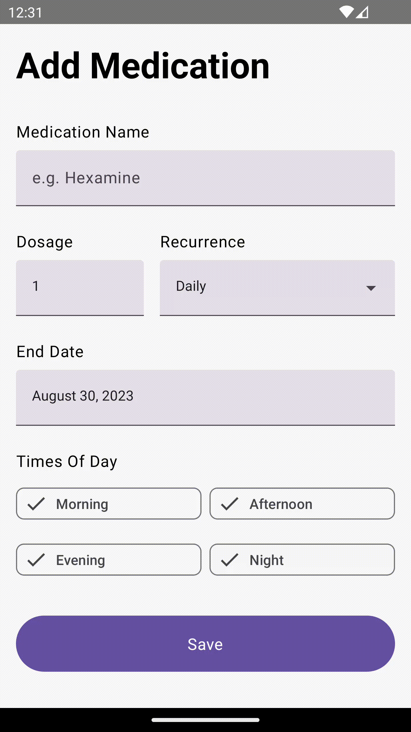
And voilà! we’re done creating our Add Medication form using Jetpack Compose and Material Design 3.
To recap, here are all the components that we explored in this blog post:
- TextField
- TextField with input type as Number only.
- ExposedDropdownMenuBox
- DatePickerDialog
- FilterChip
- Button
Source code for the Final Version
Since this form is a part of my work-in-progress side project called, you can have a look at its source code to see how it’s implemented with a more broader scope on where form values go next and how they’re saved to Room Database and retrieved back from it.
Awesome that you came this far! 👏 Now I’d love to know what the most annoying part of this post was or if it was of any help to you. Either ways, you can drop me a DM on: www.twitter.com/waseefakhtar ✌️
If you enjoyed this, chances are, you might be interested in another other blog post tutorial about Jetpack Compose that I published, as well:
Happy coding! 💻
This article was previously published on proandroiddev.com


